Using color selectors
Sometimes, apps want to prompt users to select a color. For example, an app for creating patterns might want to prompt users to select the colors for a pattern. To ensure a consistent user experience, apps can use the Apps SDK to open a built-in color selector flyout and detect the selection of colors.
Our design guidelines help you create a high-quality app that easily passes app review.

Features
- A familiar user experience that's deeply integrated with Canva.
- Integrated with Brand Kit(opens in a new tab or window), helping teams to remain on-brand.
- Canva Pro(opens in a new tab or window) users automatically get access to Pro-only features.
The color selector feature works within different Canva design types, such as Presentations and Docs. See Feature support for more information.
The user experience
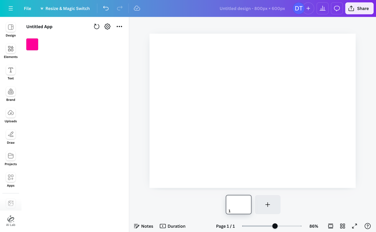
Apps are responsible for determining how a color selector opens, but a common pattern is to open the selector when a user clicks a Swatch component.

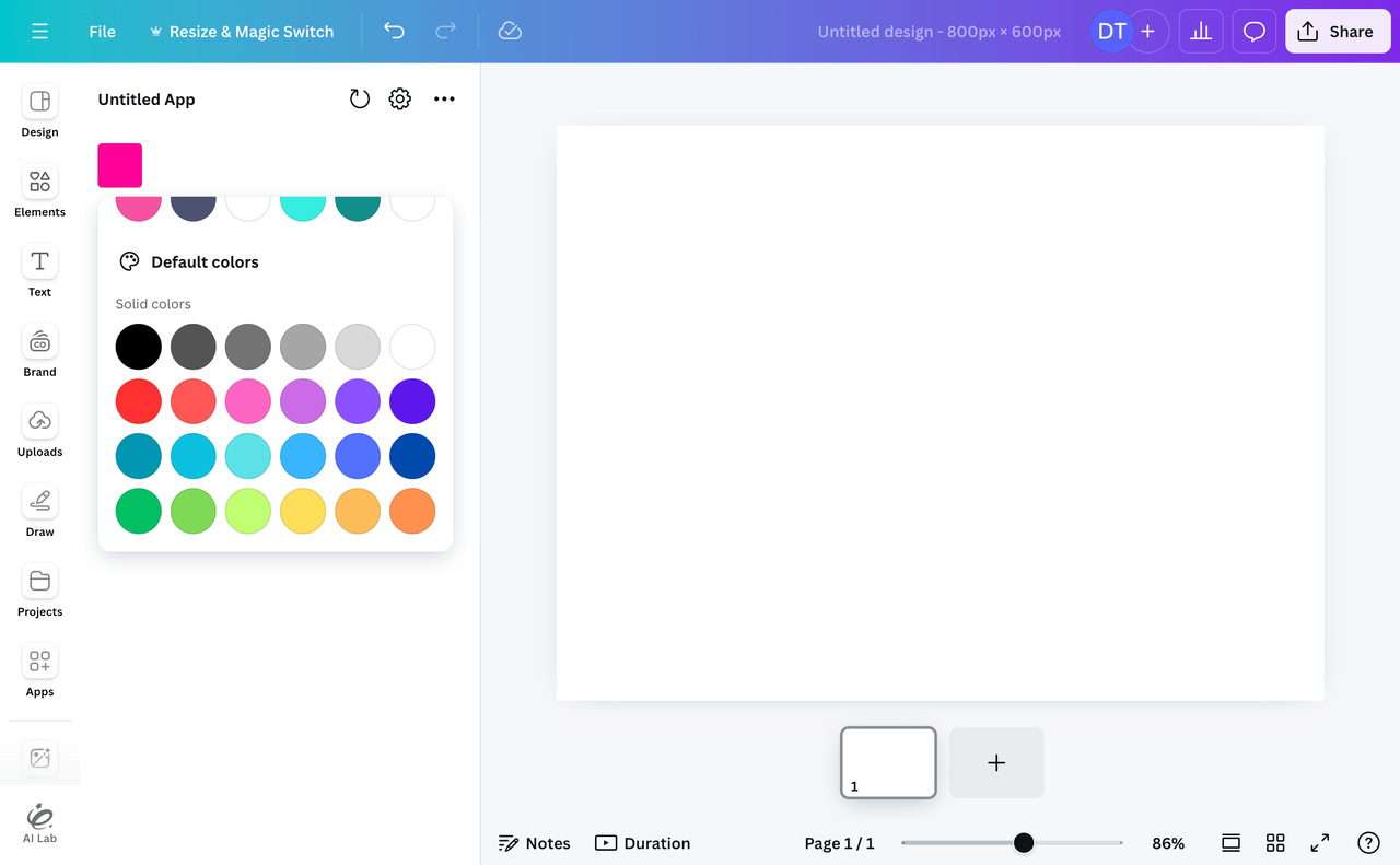
The color selector itself appears in a flyout interface that's "pinned" to the element that opened it. The exact position of the flyout is calculated and controlled by Canva.

Users can select document colors, Brand Kit colors, or default colors. If non-breaking features are added to the color selector in the future, they will be automatically available to apps without requiring code changes.
While the color selector is open, an invisible overlay is rendered on top of the app. This overlay blocks interactions with the app, such as clicking or scrolling, until the color selector is closed.
Color selection scopes
The color selector can be configured with one or more scopes. These scopes determine the user experience. At the moment, "solid" is the only supported scope. When enabled, this scope allows the user to select solid colors.
An example of a scope that will be supported in the future is the "palette" scope. This scope will allow users to select color palettes — that is, combinations of colors.
How to open a color selector
Step 1: Enable the required scopes
In the Developer Portal, enable the following scopes:
canva:brandkit:readcanva:design:content:read
In the future, the Apps SDK will throw an error if the required scopes aren't enabled.
To learn more, see Configuring scopes.
Step 2: Set up an anchor
An anchor is the element to which the color selector will be "pinned" when it's open. This could be a custom component, but we generally recommend using an App UI Kit component, such as the Swatch component:
import { Rows, Swatch } from "@canva/app-ui-kit";import * as React from "react";import * as styles from "styles/components.css";export function App() {return (<div className={styles.scrollContainer}><Rows spacing="1u"><Swatchfill={["#ff0099"]}onClick={() => {// code goes here}}/></Rows></div>);}
Step 3: Open the color selector
-
Import the
openColorSelectormethod from the@canva/assetpackage:import { openColorSelector } from "@canva/asset";TSX -
In the
onClickhandler, get the position and dimensions of the anchor:<Swatchfill={["#ff0099"]}onClick={async (event) => {const anchor = event.currentTarget.getBoundingClientRect();}}/>TSX -
Register a callback with the
openColorSelectormethod, passing in the position and dimensions of the anchor as the first argument, and setting the scope and callback as the second argument:<Swatchfill={["#ff0099"]}onClick={async (event) => {const anchor = event.currentTarget.getBoundingClientRect();await openColorSelector(anchor, {scopes: ["solid"],onColorSelect: (event) => {console.log(event.selection);},});}}/>TSXThe callback receives an object as its only argument. This object contains information about the color selection event.
Step 4: Handle the color selection
-
Set up a state variable for tracking the currently selected color:
const [color, setColor] = React.useState<string>("#ff0099");TSX -
Pass the color state into the
Swatchcomponent and, in theonClickhandler, update the state variable:<Swatchfill={[color]}onClick={async (event) => {const anchor = event.currentTarget.getBoundingClientRect();await openColorSelector(anchor, {scopes: ["solid"],onColorSelect: (event) => {if (event.selection.type === "solid") {setColor(event.selection.hexString);}},});}}/>TSX
(Optional) Step 5: Handle multiple colors
Sometimes, apps need to render multiple selectable colors, such as by rendering multiple Swatch components.
The problem is, when a user opens a color selector, the color that's displayed as selected defaults to the most recently selected color, even if the most recent color was selected via a different selector. This leads to the following bug:
- In Color Selector #1, the user selects a color.
- In Color Selector #2, the color from Color Selector #1 is display as selected.
To solve this problem, explicitly define the color to display as selected for each color selector:
<Swatchfill={[color]}onClick={async (event) => {const anchor = event.currentTarget.getBoundingClientRect();await openColorSelector(anchor, {scopes: ["solid"],selectedColor: color? {type: "solid",hexString: color,}: undefined,onColorSelect: (event) => {console.log(event.selection);},});}}/>
Here, we're passing the previously selected color into the openColorSelector method via the selectedColor property, or a value of undefined if there isn't a previously selected color.
The selectedColor property is not required if an app only renders one selectable color.
(Optional) Step 6: Close the color selector
The openColorSelector method returns a Promise that, once resolved, returns a function. This function closes the color selector flyout:
// Open the color selectorconst closeColorSelector = await openColorSelector(anchor, {scopes: ["solid"],onColorSelect: (event) => {if (event.selection.type === "solid") {setColor(event.selection.hexString);}},});// Close the color selectorcloseColorSelector();
Most apps don't need to call this function. The color selector automatically closes when the user clicks outside of the flyout, and this is usually the best behavior. Even so, this function is sometimes a useful escape hatch.
To use this function, it often makes sense to store the function in a state variable so that it can be called throughout the lifecycle of the app. To store and then call the function from a state variable:
-
Import the
CloseColorSelectorFntype:import { CloseColorSelectorFn, openColorSelector } from "@canva/asset";TSX -
Create a state variable for storing the function:
const [closeColorSelector, setCloseColorSelector] =setState<CloseColorSelectorFn>();TSX -
Store the function returned by the
openColorSelectormethod:const closingFn = await openColorSelector(anchor, {scopes: ["solid"],onColorSelect: (event) => {if (event.selection.type === "solid") {setColor(event.selection.hexString);}},});setCloseColorSelectorFn(() => closingFn);TSXIf you set a state variable to a function, React will assume the function is an initializer function. You can account for this behavior by passing in an arrow function. To learn more, see the official docs(opens in a new tab or window).
-
Elsewhere in the app, call the
closeColorSelectormethod:closeColorSelector?.();TSXHere, we're using the
?symbol becausecloseColorSelectorwill beundefineduntil the color selector is opened for the first time.
API reference
Code sample
import { Rows, Swatch } from "@canva/app-ui-kit";import { openColorSelector } from "@canva/asset";import * as React from "react";import * as styles from "styles/components.css";import { useFeatureSupport } from "@canva/app-hooks";export function App() {const [color, setColor] = React.useState<string>("#ff0099");const isSupported = useFeatureSupport();async function handleClick(event) {if (isSupported(openColorSelector)) {const anchor = event.currentTarget.getBoundingClientRect();await openColorSelector(anchor, {scopes: ["solid"],onColorSelect: (event) => {if (event.selection.type === "solid") {setColor(event.selection.hexString);}},});}}return (<div className={styles.scrollContainer}><Rows spacing="1u"><Swatchfill={[color]}onClick={handleClick}disabled={!isSupported(openColorSelector)}/></Rows></div>);}