Design guidelines
Foundations are similar to design tokens in that they are the smallest atomic components that form the cornerstone of any design system. They start as simple and foundational — such as colors and icons — and are arranged and combined to create larger and more complex components.
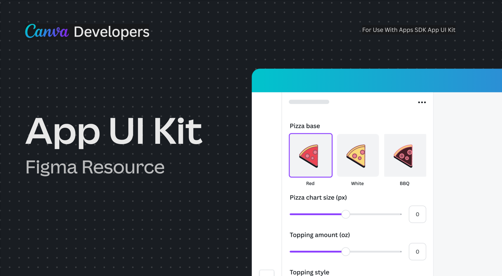
We've published a Figma library of Canva components(opens in a new tab or window) from our own design system, so you can focus on creating high-quality and consistent solutions for users.
When designing and building new apps, use the style of Canva's existing components as much as possible — it helps maintain consistency.
Building unique components
If you find that your app requires a component that our example apps in the starter kit repo or the Figma library has not provided example styling for, try:
- Using our tokens, like functional color palettes, icons, and spacing principles, to build your own. We can help provide feedback on these components before and during the review process.
- Raising a component request. Our team reviews every request, and these requests help us better understand what kinds of challenges developers run into and help identify gaps in our component library so we can improve in the future.