Loading
Loading indicators are an important way to provide feedback to users when a process is taking place. Common examples include:
- Loading the app when data is being fetched.
- A process is occurring, such as export, saving, or payment.
For an example of how to implement this pattern, see the Storybook(opens in a new tab or window).
Types of loading indicators
We have three types of loading indicators:
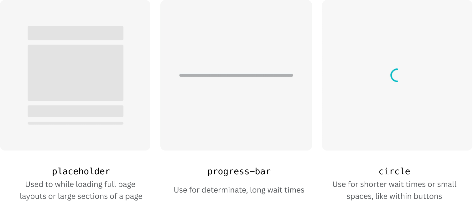
When to use
Placeholders
Use placeholders in place of content while it's being loaded. They help reduce cognitive load and give an indication of what users should expect once the content has loaded. Where possible, use placeholders instead of alternative loading methods, such as spinners.
Placeholders consist of basic shapes, such as circles and rectangles, and are used in a way that represents the structure of the loading content.

To create a new placeholder, import existing placeholders, either the basic shapes or those created by others, and arrange them as needed. Modify the size and color of the placeholders to allow you to recreate any existing component.
The basic placeholder shapes:

By default, all placeholders have a flashing animation. Multiple placeholders can be orchestrated to flash in sequence using the index prop.
You can access all of the basic shape placeholders through the App UI Kit's Placeholder component. Or, if you're loading text content, use TextPlaceholder or TitlePlaceholder.
Progress bars
Bar progress indicators are helpful when the waiting time could be 5 seconds or more. Having a determinate state provides more incentive for users to stick around longer.
You can find a pre-built ProgressBar in the App UI Kit.
Animated circle loaders
Circle loading indicators are helpful for shorter wait times and are perfect for more confined spaces, such as buttons.
You can find a circular LoadingIndicator in the App UI Kit.