Typography
Our typefaces
Typography forms a large part of the look and feel of our product. We use two different typefaces for our product: Canva Sans Display and Canva Sans.
Our typeface family ranges from accessible to playful, from buttons to billboards. Canva Sans and Canva Sans Display are our headline fonts, full of playfulness and humanity.
The basics
The best way to use typography in your app is through our pre-built Text and Title components, available in the App UI Kit.
Text components are intended for use in body content, and Title components are intended for headings and subheadings — they use semantic HTML tags (p, h1 … h6, etc.) accordingly and come in a variety of sizes:
Text and Title variations of the same size are designed to pair well.
Variations | |
|---|---|
Size | xsmall, small, medium, large, xlarge |
Weight | regular, medium, bold |
Titles and headings
For medium and large titles and headings, use Canva Sans Display (Title). This typeface is bolder and more distinctive.
Name | Size |
|---|---|
Title medium | 20px |
Title large | 24px |
For small and extra-small titles, use Canva Sans (Title).
Name | Size |
|---|---|
Title xsmall | 14px |
Title small | 16px |
Body and paragraph text
Use Canva Sans (Text) for body text.
Name | Size |
|---|---|
Text xsmall | 10px |
Text small | 12px |
Text medium | 14px |
Text large | 16px |
Do
- Opt for
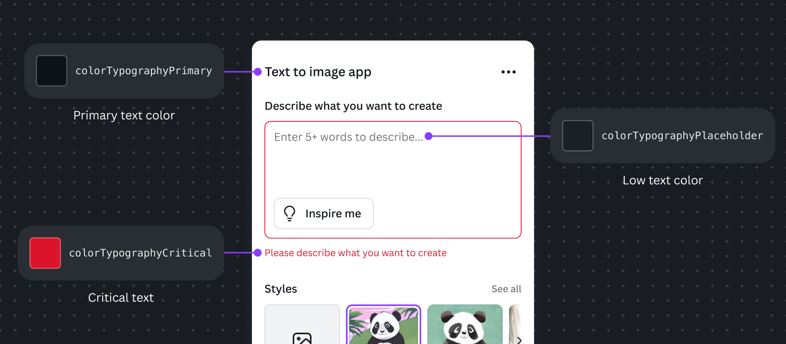
TextandTitlecomponents over custom typography elements. - Use typography-specific functional colors, for example,
colorTypographyTertiaryto make text more subtle, andcolorTypographyPlaceholderfor placeholder text. - Pair like-sized title and body text sizes.
Don't
- Underline text for emphasis (except in links). Consider using bold or a larger font size instead.
- Use inconsistent spacing for similar components (for example, keep spacing between the labels and their components consistently at 4px).
- Set colors directly. Use the prop in
TextorTitlecomponents from the App UI Kit.