Colors
Color is one of the foundational tools in Canva’s design system. It’s used in almost every component and is a powerful tool for providing hierarchy and guiding users toward particular functionality or features.
For the complete list of colors exposed by the App UI Kit, see Colors.
Functional colors
We use "functional" color names, which define colors based on their role in the interface. Functional colors make it easier to select the most appropriate colors for any scenario your user might encounter using your app.
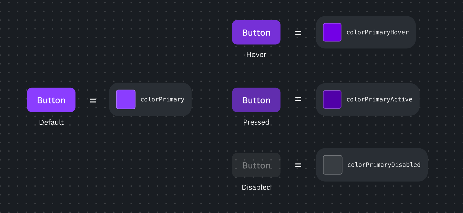
We use different shades or variants of these base functional colors to communicate a component's state (e.g., active, hover, disabled).
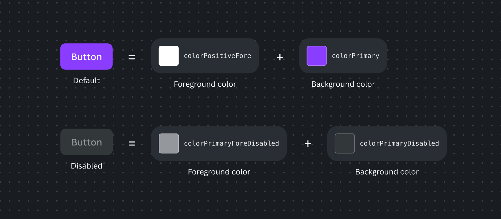
Functional colors can be accompanied by complementary colors, like foreground colors that are meant to pair perfectly with the primary base colors. For example:
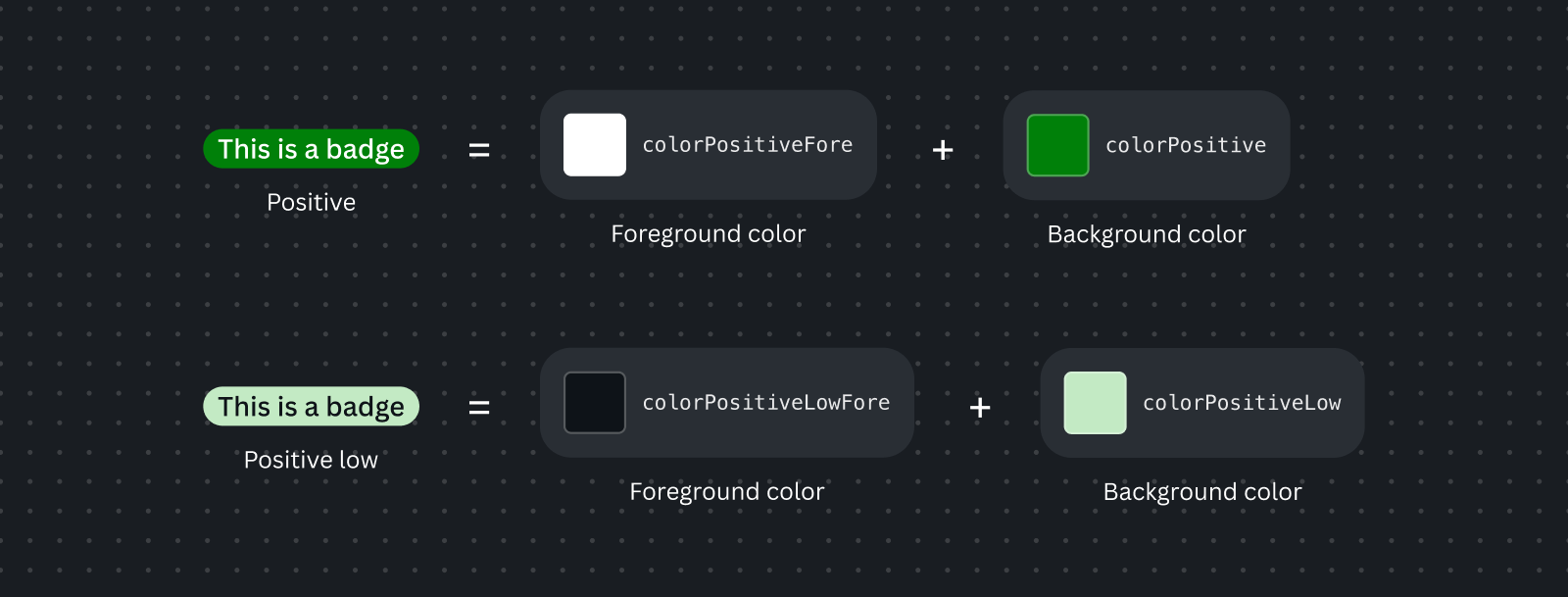
Some functional colors, like the ones shown below, have low-coloring options, which are more subdued than their primary base functional colors.
Best practices
- Use Canva's functional colors to design your app rather than defining custom colors. Your app will appear in dark mode the majority of the time, but it can also appear in light mode. Using functional colors will help your app stay on brand and allow it to handle theming, as functional colors will display the appropriate color based on the theme.
Usage guidelines
- You can access colors through the UI Kit, by using design tokens in your CSS (through custom variables) or importing them directly in TypeScript/JavaScript.
- When you use the UI Kit's
AppUiProvider, these color tokens will be automatically themed. - Pair functional colors with appropriate complementary colors from their set when needed. For example,
colorPrimarywithcolorPrimaryFore. - Make sure you plan for sufficient color contrast, accounting for accessibility. If you're using the appropriate functional colors, then this is taken care of automatically.