Accessibility
Accessibility, commonly referred to as a11y, is the practice of making the web usable for people with disabilities, including visual, auditory, physical, speech, cognitive, language, learning, and neurological disabilities.
That said, accessibility enhancements to your app will benefit an even wider range of Canva users, including:
- Older people whose abilities are changing with age
- People who are in less than ideal environments, such as brightly lit outdoor settings or on public transport
- Power users who prefer to navigate with keyboard interactions.
Best practices
All apps need to satisfy a baseline of accessibility UX concerns. Ask yourself the following questions while building and testing your app to ensure it meets baseline requirements.
Checklist
-
At minimum, run the Chrome DevTools Lighthouse(opens in a new tab or window) accessibility audit tool on your app. Use 'snapshot' and 'desktop' mode.
-
Are there any relationships between components that need to be codified in HTML attributes?
- Common examples include a button that opens a flyout or a button that expands an area like an accordion, tab, or panel. If so, you usually need to set IDs and share them between components. This helps screen reader users interpret the visual relationship. For a button that opens a flyout, the flyout needs an
id, and thatidneeds to be shared with the button’saria-controlsattribute as well as the booleanaria-expandedattribute.
- Common examples include a button that opens a flyout or a button that expands an area like an accordion, tab, or panel. If so, you usually need to set IDs and share them between components. This helps screen reader users interpret the visual relationship. For a button that opens a flyout, the flyout needs an
-
Are the visual relationships and order expressible in a logical way that matches the DOM?
-
Are there appropriate semantic HTML elements that provide a sensible information hierarchy (for example, sections and headings)?
-
Do all interactive components have labels? Do those labels make sense out of context, and where context is unavoidable, not rely only on visual relationships?
- If visible labels are adjacent to an element, it should be wired up with
FormFieldor some equivalent that defines IDs andaria-labelledby. - If there is no visible label, set the element with an
ariaLabel. - Placeholders are insufficient as labels. Placeholders are ignored if there is already text in it, and some screen readers ignore it completely due to how websites misuse it.
- If visible labels are adjacent to an element, it should be wired up with
-
Do all interactive components support all input modalities such as keyboard-only, touch-only, and mouse-only modes?
-
Any elements that appear on hover should also appear on focus. The element should be reachable by tabbing or some other sensible keyboard interaction.
-
Is the click radius sufficiently big, or could it be larger?
-
-
Do all media elements have a text alternative (for example, describing the media or describing the onClick action)?
- It’s preferable to describe the onClick action over the media if both are applicable. If the media element is decorative or paired with content that already describes it, it’s better left as an empty string.
-
Are all necessary states visually and programmatically defined for every single interactive component? If the design is solely using design system components, the answer is automatically yes.
- All default, hover, active, and focus states for interactive components must be defined and distinct (the focus state can be, and often is, the same as the hover state).
- All focus states should also support outline in keyboard mode.
- If a disabled state is defined, you should style it, both visually and with the
not-allowedcursor. - For hover states, make sure it’s only visible when
.hoverSupportedis true. This is to avoid the hover state lingering on touch devices.
-
Will animated elements provide a visible stop or pause mechanism if they autoplay and run for more than 5 seconds (looping counts)?
- Animating elements that loop or go on for a long time are disorienting for some users. Please work with product or design to reconsider whether it’s necessary in the first place. If this must be used, you should wire it up with the user accessibility setting
autoplayVideos.
- Animating elements that loop or go on for a long time are disorienting for some users. Please work with product or design to reconsider whether it’s necessary in the first place. If this must be used, you should wire it up with the user accessibility setting
General guidelines
Resources
- Intro to the Web Content Accessibility Guidelines (WCAG) international standard(opens in a new tab or window)
- The A11y Project(opens in a new tab or window)
- CSS-Tricks' accessibility article archive(opens in a new tab or window)
Use semantic HTML
Semantic HTML is the foundation of accessibility in a web application. Using the various native HTML elements to communicate the intent of elements gives us some degree of accessibility for free by making our content more understandable. We can get a long way by simply ensuring we’re using the semantically correct HTML elements.
Semantic elements clearly define their content and include elements such as: <form>, <table>, <p>, <h1>, and <article>. A non-semantic element says nothing about its content and includes elements like <div> and <span>.
Common pitfalls
- Don't accidentally insert
<div>elements in React, particularly when working with tables and lists. - Use
<button>tags only for things that should obviously be buttons.
Reference
- MDN has a good intro to web accessibility guide(opens in a new tab or window) detailing the importance of using the correct tags.
- MDN has an HTML elements reference(opens in a new tab or window) with the full list of currently supported elements and their tags.
- The React documentation has Semantic HTML(opens in a new tab or window) guidelines on the specifics for React components.
Supplement semantics with ARIA
It’s not always possible to entirely define the structure of a page or individual components with HTML alone. In those cases, we resort to ARIA tags.
Common pitfalls
- Don't rely on ARIA attributes instead of using the semantically correct tag.
Reference
- Mozilla has a good intro to ARIA guide(opens in a new tab or window)
Ensure you're using accessible colors
Your app should meet WCAG 2.0 AA(opens in a new tab or window) requirements for color contrast. What that means is providing adequate color contrast between text and the background. Keep in mind this can be influenced by other factors such as font size. You can test contrast using a tool such as contrast-ratio.com(opens in a new tab or window).
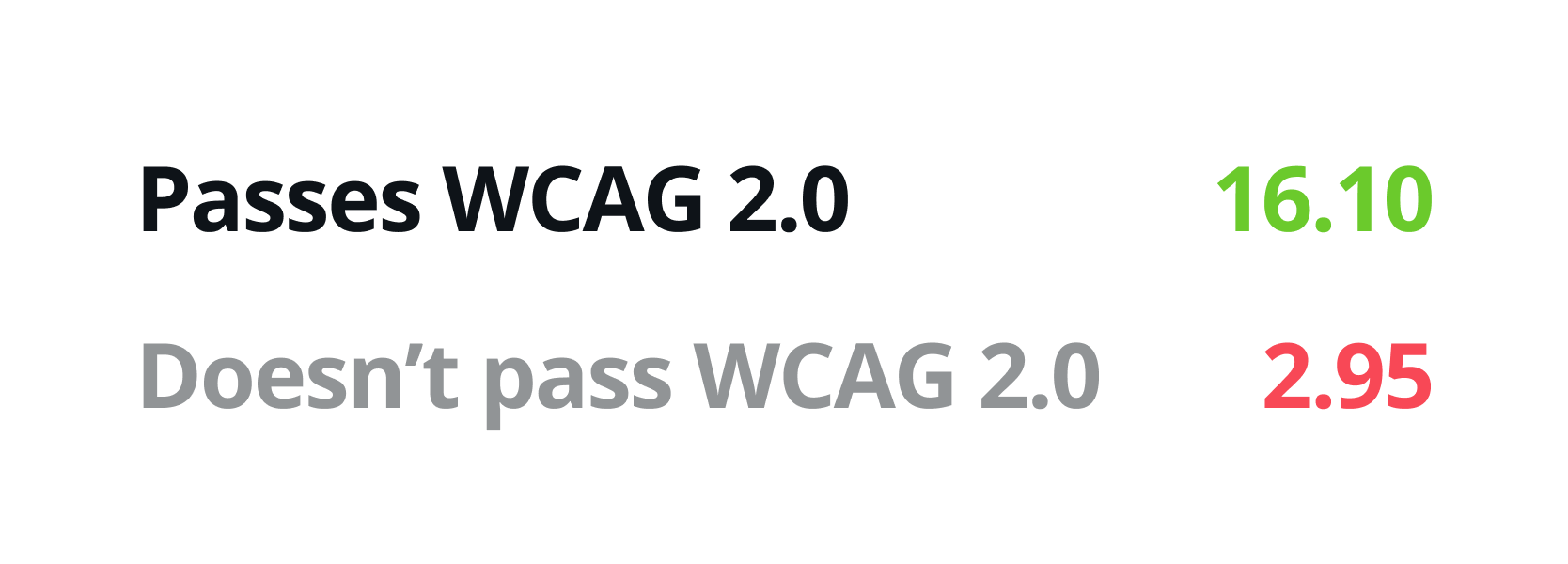
The complementary sets of functional colors provided in the App UI Kit already meet these standards.
Reference
- Check color contrast using a tool like Color Contrast Checker(opens in a new tab or window)
- Test color blindness using a tool like Color Oracle(opens in a new tab or window)
Enable keyboard navigation
All interactive parts of your app should be accessible by keyboard, using the expected keyboard shortcuts.
Specifically, this means that components must be reachable and operable using only your keyboard. The focus order must be logical and match the DOM order, and use tabbable elements (<a>, <button>, <input>, and so on).
Keyboard shortcuts
Expected baseline keyboard handlers for navigating Canva are as follows:
Shortcut | Action |
|---|---|
Tab | Move forward between focus elements |
Shift + tab | Move backwards between focus elements |
Enter | Enter a context and visit links |
Escape | Exit a context |
Common pitfalls
- Use only the correct HTML tags to mark up components.
- Watch for any unintended deviations in more complex components, such as search inputs.
Focus
Proper focus control helps people navigate Canva using a keyboard (or other accessibility device). That’s useful for those using screen reader and other assistive technologies, but also novice and power users of all kinds.
There are two key parts of controlling focus: enabling intuitive navigating between elements and ensuring there are visual affordances which highlight the currently focused element.
Whenever you’re building interactions, ask yourself, “Where should the focus go after the user triggers an action?”
Common pitfalls
- Don't disable the default focus state styles without providing a suitable replacement.
- Use only the correct HTML tags to mark up a page, particularly landmark roles such as
<main>and<aside>.
Reference
- Be careful when changing CSS outlines(opens in a new tab or window)
- Manage focus in React(opens in a new tab or window)