Design guidelines
Fundamentals
Color selection
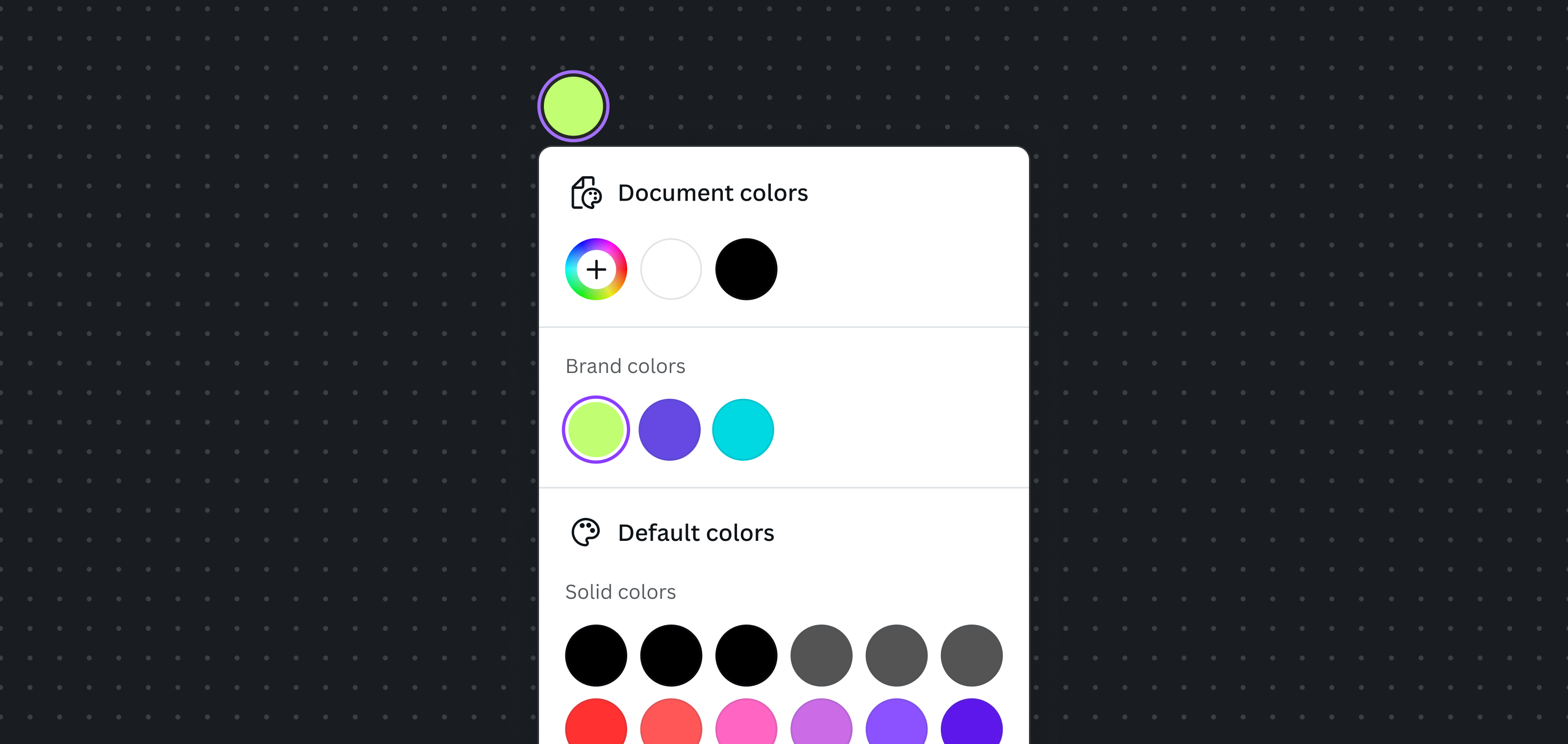
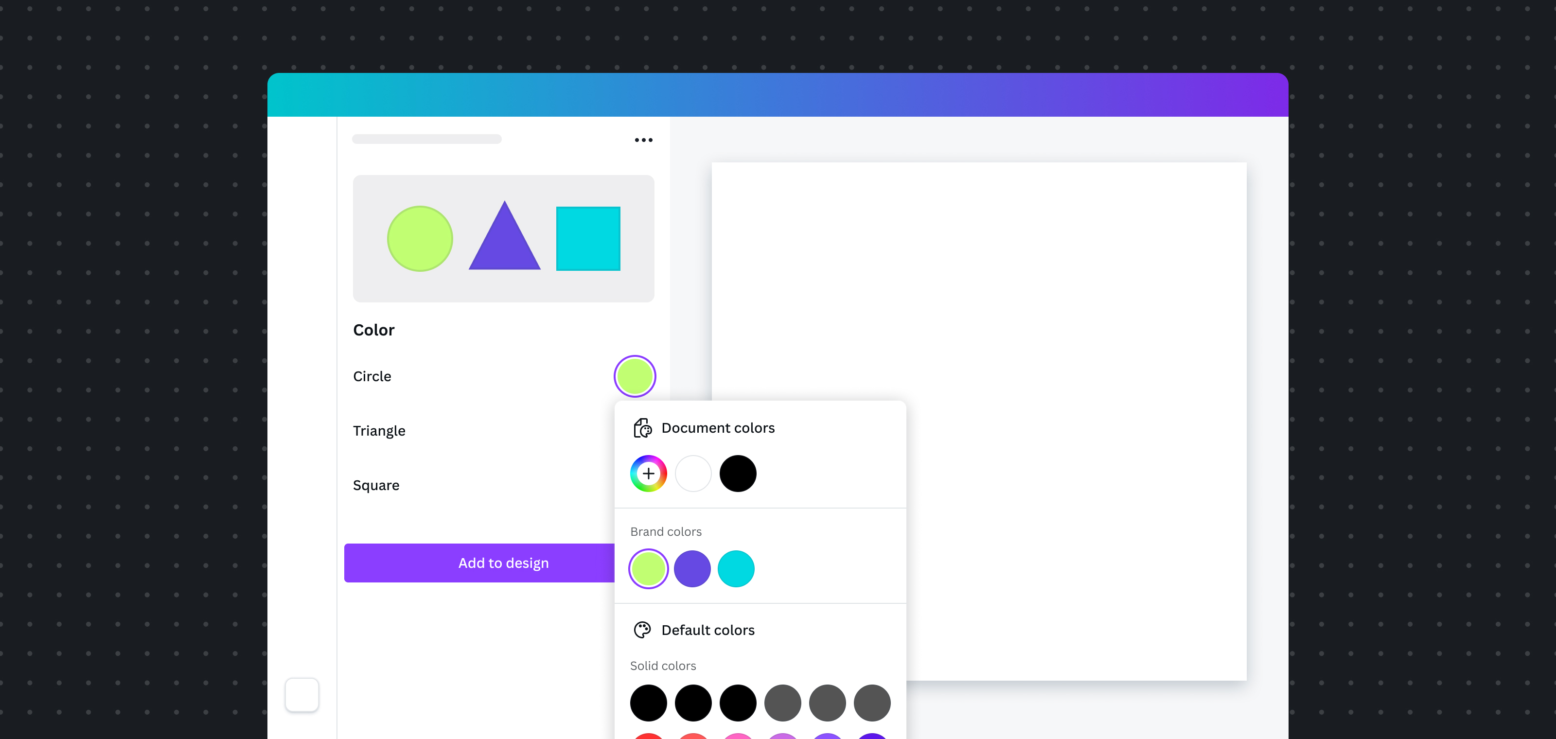
How to use the color selector flyout.

To help users choose the right color, use the color selector flyout. This allows users to:
- Use Document colors
- Use Brand Kit colors
- Use Default colors
- Add new colors
- Pick a color from the design, using an eye dropper
- Enter a hexadecimal color code
Open the color selector

- Do use a Swatch(opens in a new tab or window) component to open the flyout.
- Consider labelling the color swatch to help users understand which color they're adjusting.
- Consider labelling a group of color swatches instead of individual ones, if your app provides a set of preset colors.
- Consider using a custom UI component to open the color flyout only when it's truly essential to your app. The interaction should be easy for users to understand.
Preview the color
- Do provide users with a way to preview their color selection.
- Avoid obstructing the preview with the color selector flyout. It's typically better to place the preview above the color swatch trigger button.