Design guidelines
Fundamentals
Overlays
Guidelines for interactive image editing overlays.
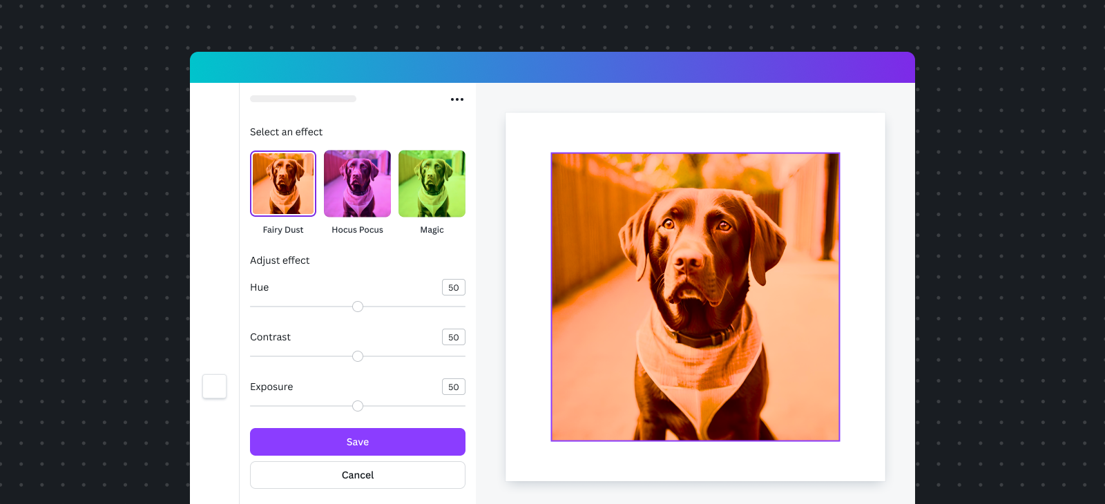
An overlay is an interactive editing surface placed on top of a selected image. It lets users edit images and immediately preview their changes.
Common use cases for an overlay include, but aren’t limited to:
- Adding filters
- Blurring
- Adjusting
- Editing colors
- Cropping
- In-painting
Some Apps SDK features won't work in an overlay. See Feature support for more information.
Selecting an image
Overlays work on selected raster images, so it's important to prompt users to choose the right image type.
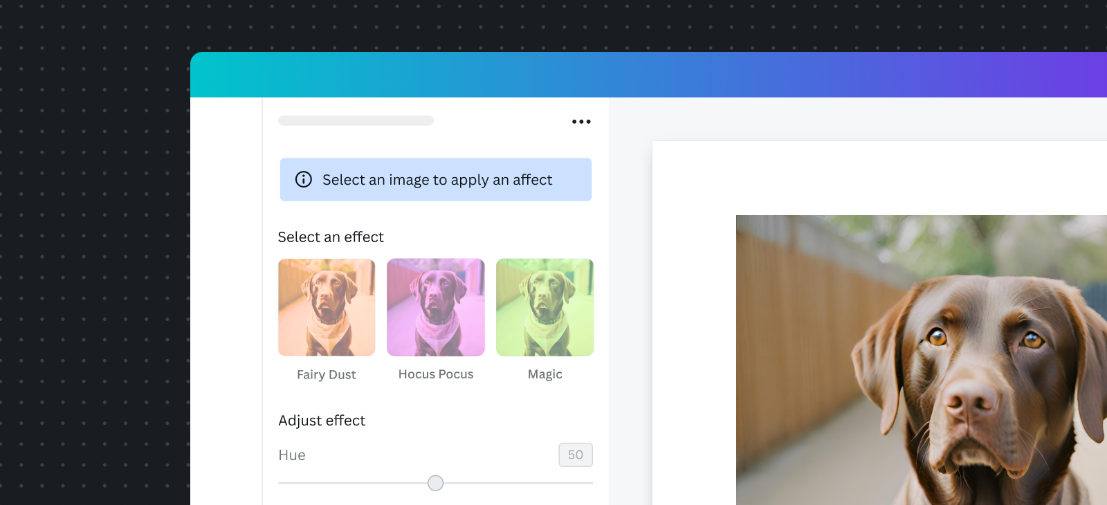
- Do show clear instructions that prompt users to select an image.
- Do display a critical alert informing users if the chosen media type is not supported.
- Don’t make users guess what they need to do to get started.
Learn more about Selection guidelines.
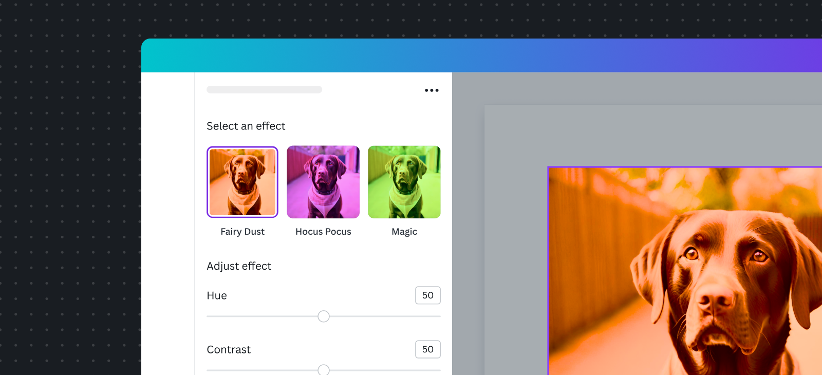
Opening overlays
When an overlay is opened, remember the following important considerations:
- Images can’t be moved or resized while the overlay is open.
- A dark layer appears around the image, isolating it from the rest of the design.
- Clicking outside the selected image closes the overlay and discards any changes.
Triggering the overlay
- Do use a meaningful UI component to trigger the overlay’s opening.
- Consider adding a label to the UI component to indicate its main function. For example: Edit image, Effect name, Add X effect, Draw on image.
- Don’t open the overlay automatically when first opening the app.
- Don’t automatically open the overlay when the user selects an image.
- Don’t use labels like “Open overlay” or other technical jargon that users might not be familiar with.
Adding UI to the overlays
- Do use the object panel to house the main UI of your app.
- Do follow Canva’s design guidelines and tokens when building any custom UI components.
- Don’t obscure the view of the selected image in the overlay.
- Avoid adding UI components to the overlay, as it will be challenging to position the UI components when an image is cropped. In addition, if the image is flipped, then the UI will also be flipped.
- Consider using interactive UI components on mouse event interactions. For example, a brush or pencil for a painting app. Keep in mind that if the image is originally flipped, then a UI component will also appear flipped.
Loading
When opening or saving overlays, it's important to maintain consistency with our native loading experience. Follow these guidelines for best results:
- Do display the LoadingIndicator(opens in a new tab or window) in the primary button when saving changes in the overlay.
- Don’t use placeholder shapes as loading states in the overlay.
Learn more about Loading guidelines.
Preview
- Do display edits to the overlay as they’re made.
Saving changes
How to save:
- Do use a primary button to allow users to save any edits made in the overlay.
- Do use a secondary button to cancel any edits made in the overlay.
- Do ensure these buttons are visible at all times while the user is editing the image.
- Aim for saving times under 5 seconds. If a process takes longer, the overlay will be terminated and changes will be discarded.
Undoing changes:
- Consider adding a Reset changes button to enable users to restart their edits.
- Consider adding Undo functionality to your app, letting users revert the last change made.
- Avoid relying on the native Undo functionality, because this will undo the entire set of changes made in the app.