Design guidelines
Fundamentals
Spacing
Consistent spacing helps arrange the content of a screen in a clean and predictable way.
Consistent spacing across our pages and components creates a polished experience that’s easy for users to visually scan and understand.
For the complete list of spacings exposed by the App UI Kit, see Spacing.
Best practices
Individual elements should only control spacing inside their boundary through padding (that is, with the App UI Kit Box component).
For spacing between elements, you should:
- Apply padding on the parent container (with
Box). - Use layout components (for example,
Rows,Columns) and set spacing on those.
Do
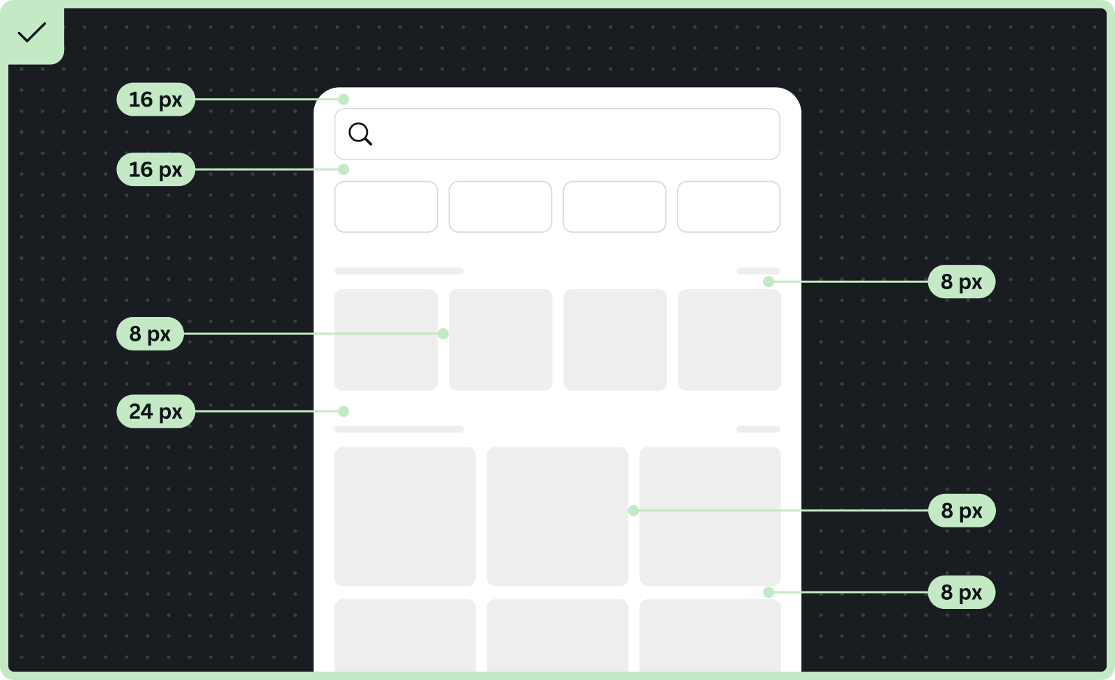
- Iframe margins should be 16px across all devices.
- Spacing above and below a search bar should be 16px.
- Use smaller spacing between related components in a section. For example, spacing between content in a grid and carousel section should be 8px.
- Use larger spacing to communicate separation between components or sections. For example, the distance between each section (search pills, carousels, results) should be 24px.
Don’t
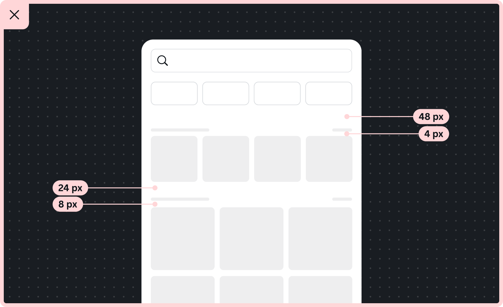
- Use inconsistent spacing for similar components (for example, keep spacing between the labels and their components consistently at 4px).
- Use margins on individual elements — spacing between elements should be managed by spacing in layout components.