App listing guidelines
When a public app is released to the world, it gets its own listing in Canva and the Apps Marketplace. This listing can drive attention and engagement to the app. We have created guidelines to help you craft compelling written content and visual assets, so that you can clearly communicate what your app can do for people, and what problem it will solve.
You can customize the content that appears on the app listing via the App listing details pages in the Developer Portal. This must be done before submitting your app for review. Once your app has been approved for release, you can make further changes by creating a new version of it.
Where will the app listing be shown?
The app listing is seen in various places in Canva and the Apps Marketplace.
Apps Marketplace homepage
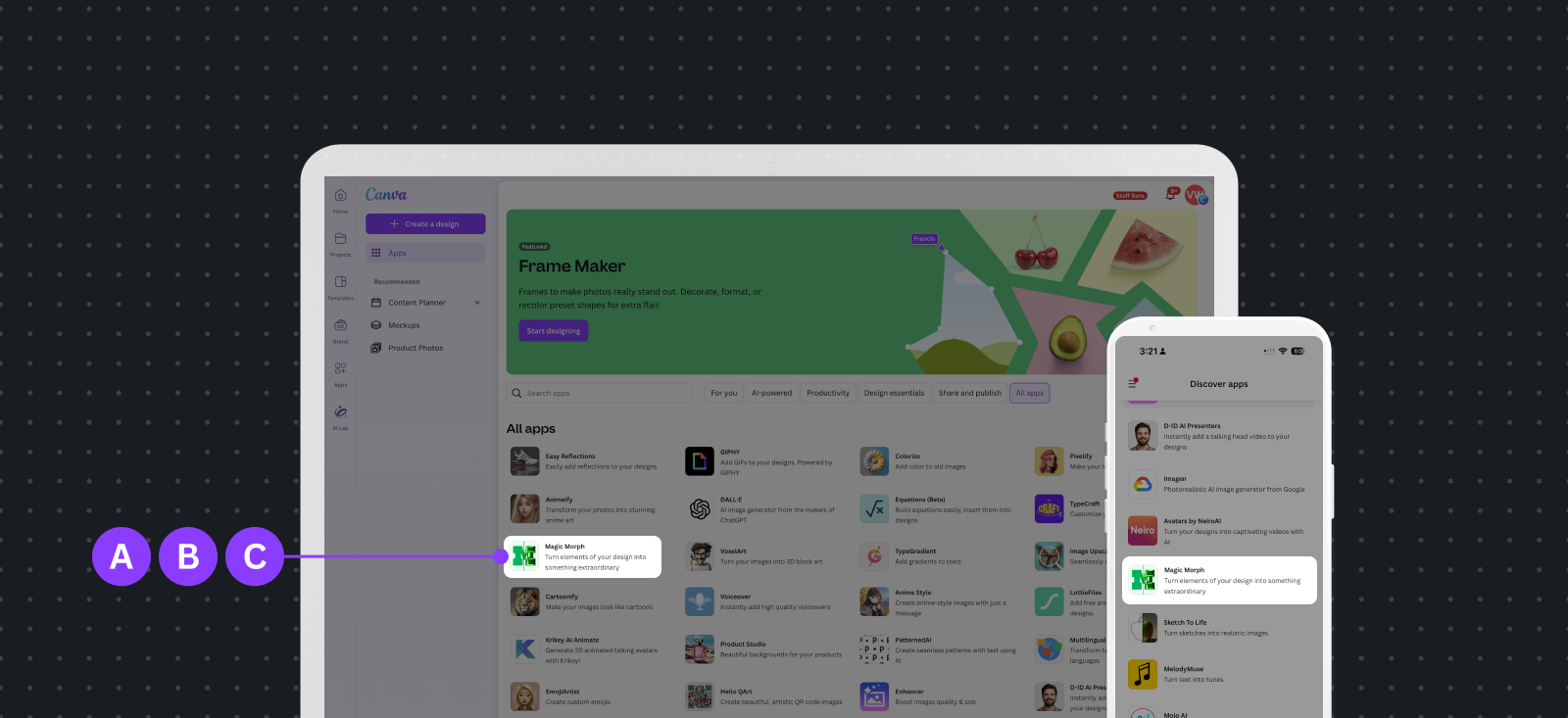
A App icon: The visual representation of your app in the Apps Marketplace.
B App name: The app name sets up your brand.
C Short description: Explains what the app does at a glance.
App listing modal
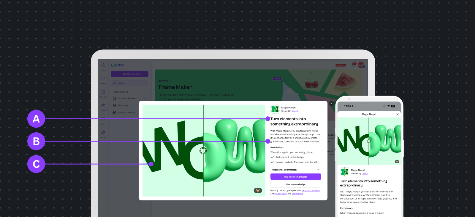
A Tagline: Highlight the key use case for your app.
B Description: An opportunity to describe your app in more detail.
C Featured image: The visual representation of the functionality that your app provides.
App panel
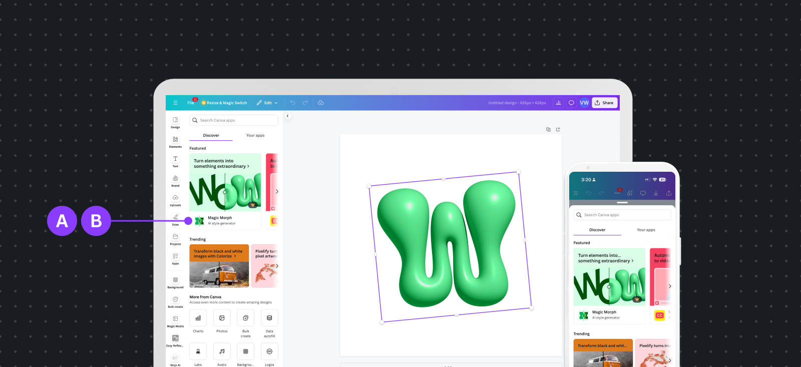
A Featured image: The visual representation of your app's functionality.
B Tagline: Highlight the key use case for your app.
C Description: An opportunity to describe your app in more detail.
App listing in panel
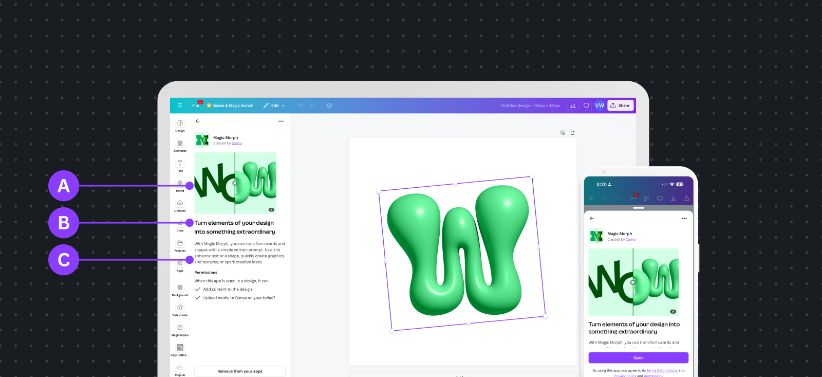
A App icon: The visual representation of your app in the Apps Marketplace.
B App name: The app name sets up your brand.
App policy and support links
Your app listing requires several URLs to provide users with support and policy information. For more information, see App policy and support links.