App icon guidelines
The app icon is the visual representation of your app in the Apps Marketplace. Designing an app icon is all about balance. You want it to be both unique and recognizable, while also adapting to different shapes and levels of detail. Maintaining visual consistency is key to a strong user experience.
- Keep it simple: When creating icons for your app, simplicity is key. Use a unique concept or element to represent your app and avoid adding too many details. Keep the background simple to put emphasis on the primary image, and avoid overfilling the icon with content.
- Use graphic images instead of photos for icons: Create graphics to highlight key features. Avoid using photos that may lose detail when viewed at a small size.
- Design it in a full-bleed square image: Use the 1:1 ratio, with a specific size of 512px x 512px. Using this format will ensure that your app icon will be consistently sized, if used in different parts of the platform.
- Avoid adding text to your icon: Minimize the use of text unless essential for your brand or user experience.
Only use content that you have the rights to use. For example, don't use celebrity images or names.
App icon keyline template
Template link and use case | Example |
|---|---|
Template(opens in a new tab or window): Shows a guide where you can populate the entire asset space, or you can design and position artwork elements such as logos onto the keyline grid. | 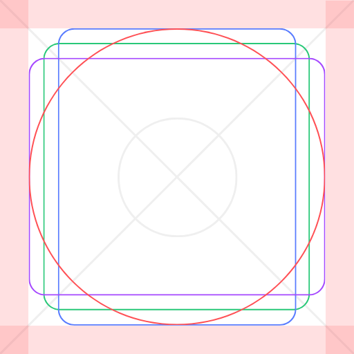 |
Do
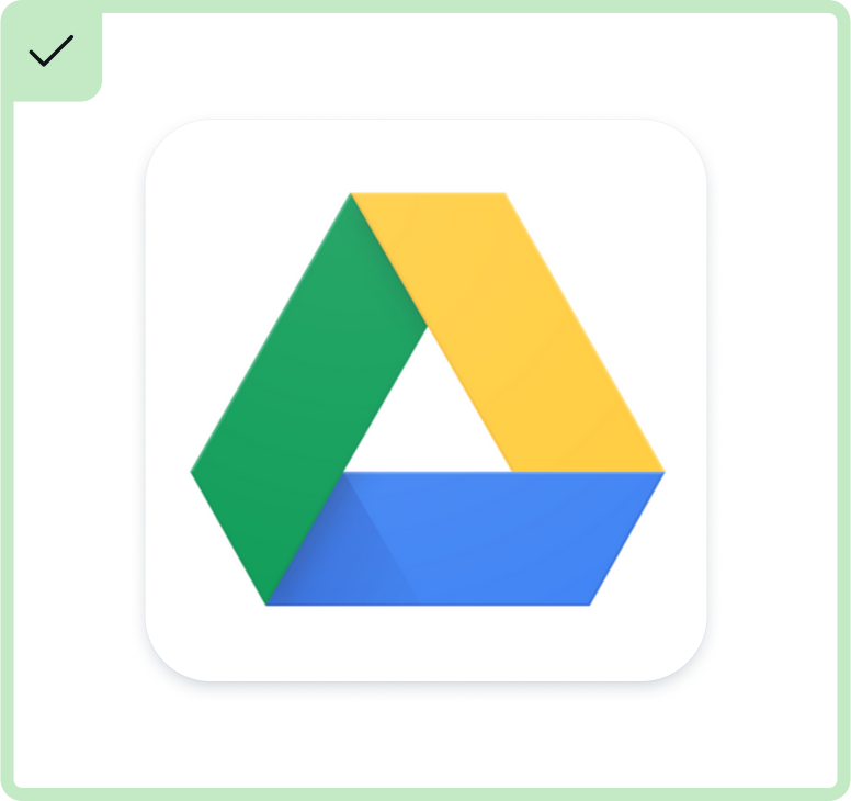
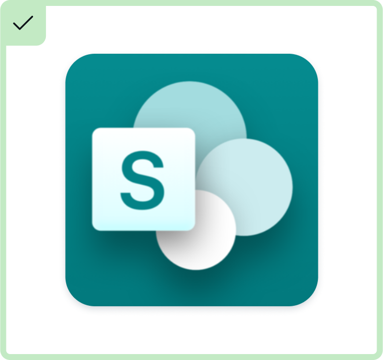
DO incorporate recognizable brand elements, like logos or specific colors, to leverage strong brand associations.
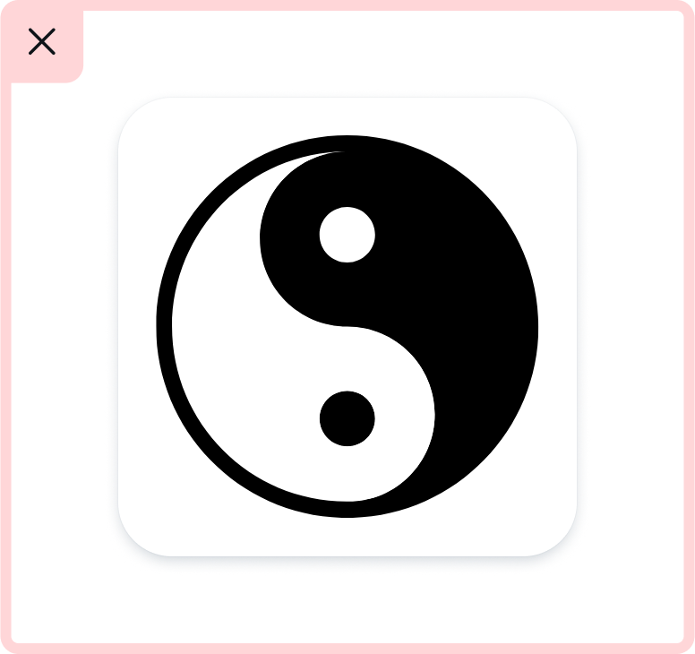
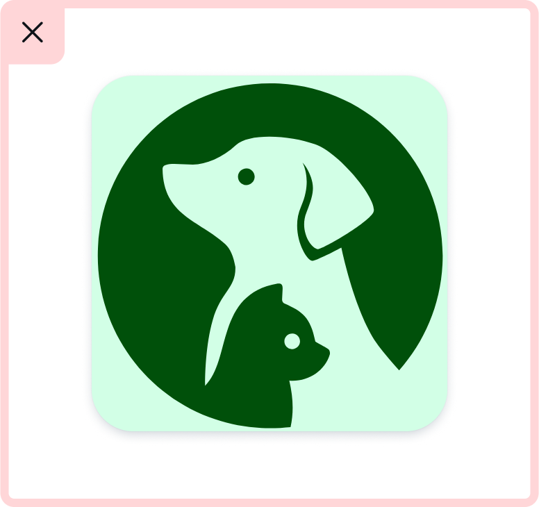
DO use graphics reflective of the app’s output.
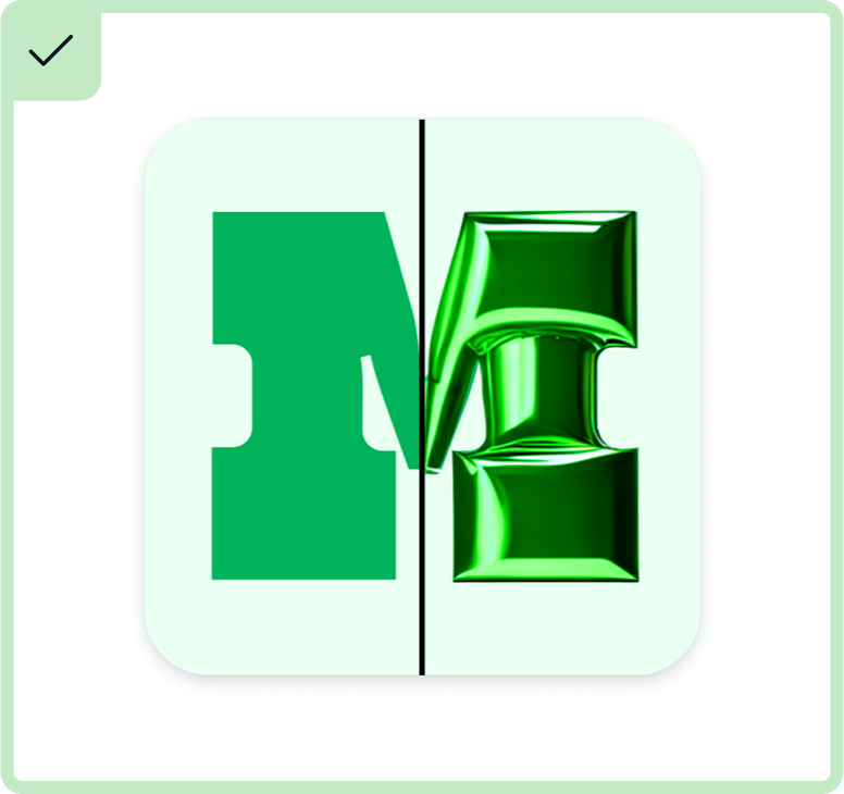
DO opt for a split-screen layout if showcasing before/after states helps convey the app's function.
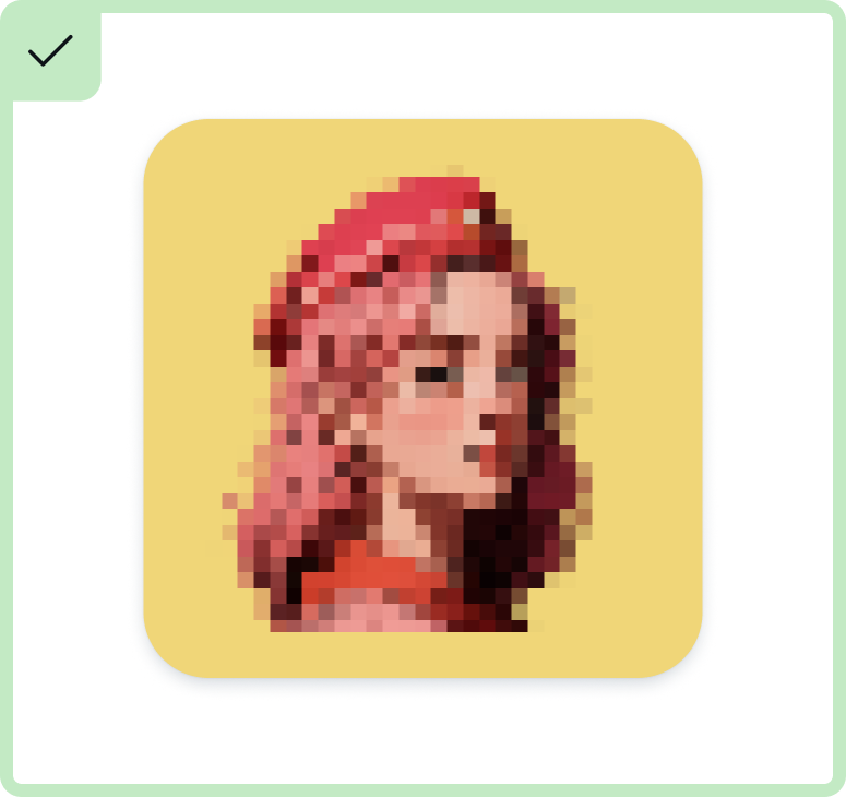
DO exaggerate output details to aid recognition of the app's function at a glance.
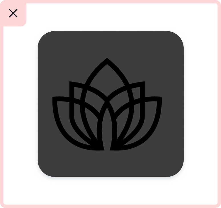
DO consider the legibility of line-based graphics at a smaller scale.
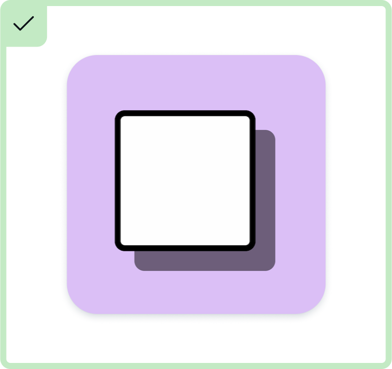
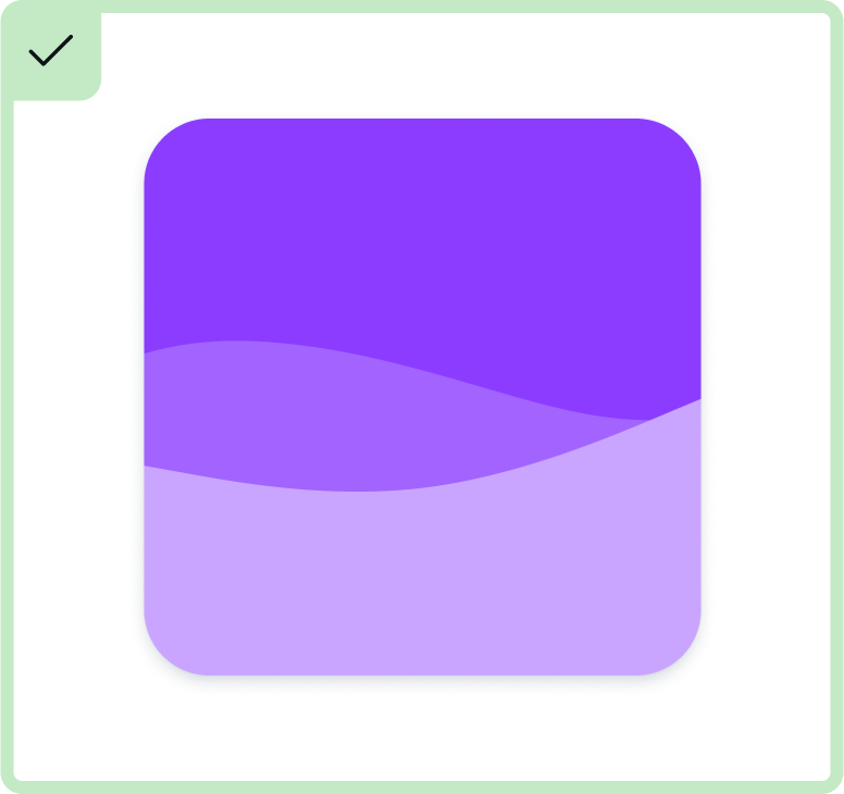
DO prioritize clean lines and forms.
DO choose a background color that complements the foreground elements.
DO pair highly visual or intricate backgrounds with simple foregrounds or logos.
Don't
DON'T overcrowd the app icon with unnecessary details, complicating the design.
DON'T use low-contrast colors or thin lines, risking legibility at a small scale.
DON'T add a border radius to the background, as it may result in a double-border effect when a border gets applied in Canva.
DON'T use cultural references that may not be universally understood. This helps ensure inclusivity and helps prevent misinterpretations.
DON'T use transparent backgrounds. This will avoid contrast issues when viewed in light and dark mode.
DON'T make icon elements larger than the keyline guide suggests (view the app icon keyline template(opens in a new tab or window)).
DON'T use photos that don’t convey much about the app and lose detail when scaled down.
DON'T use text unless it’s part of the logo.