Featured image guidelines
A featured image is the visual representation of your app's functionality. The user sees this image in various places in Canva and the Apps Marketplace.
- Maximum of 2 images: A featured image is a maximum of 2 separate images in a carousel, depending on the app's complexity.
- 2400 x 1800 pixels: A featured image should be 2400 x 1800 pixels with a 4:3 aspect ratio.
Only use content that you have the rights to use. For example, don't use celebrity images or names.
Style selection
When deciding on how to showcase your app, choose from one of the three options:
- 1x featured image (Editorial)
- 1x featured image (Contextual)
- 2x featured image viewed in a carousel (Editorial + Contextual)
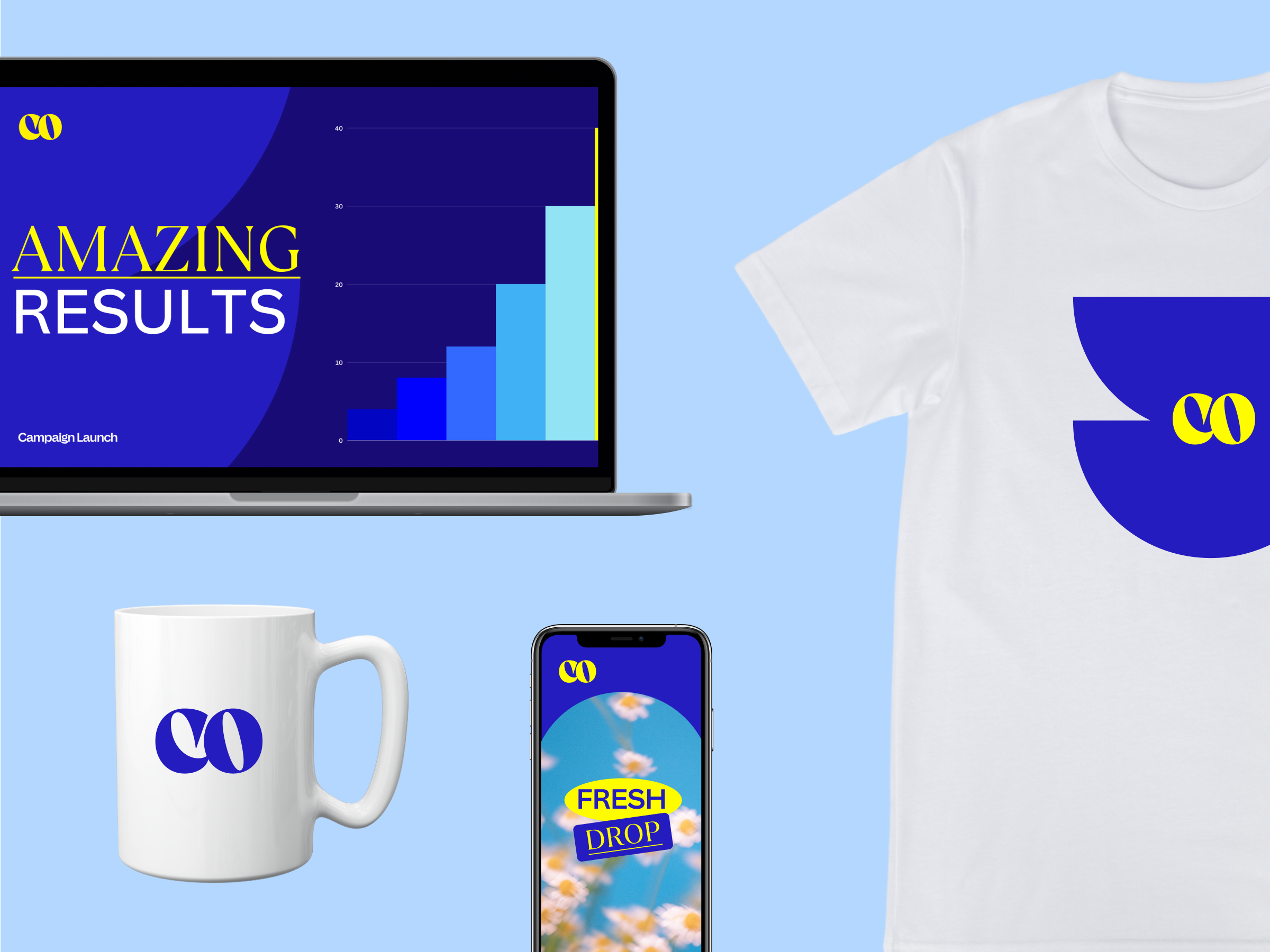
Editorial: We call this approach editorial, because the aesthetic feels like something you'd see in editorial design. It's bold, graphic, and meant to grab your attention. The editorial approach focuses on the app functionality by showcasing the final product.
Contextual: We call this approach contextual, because it's all about showcasing the app in action within Canva. Like the editorial approach, it is bold and graphic, but has more detail by using the UI to create context for the user.
Featured image templates
To help you get started, we've designed a library of Canva templates. You can use these to create your featured image or as inspiration to create your own.
Editorial
Template link and use case | Example |
|---|---|
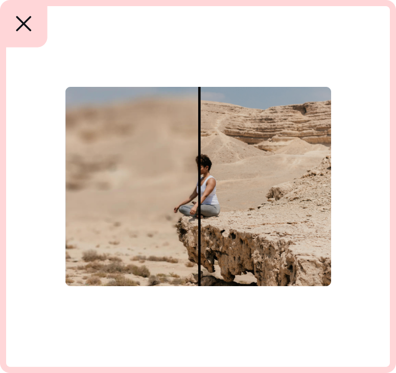
Template 1(opens in a new tab or window): Use for before & after cases. | 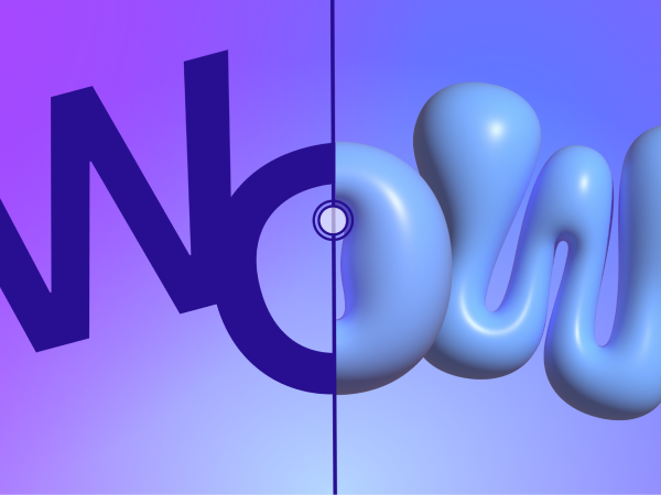 |
Template 2(opens in a new tab or window): Consider using this for applications that generate multiple images or videos. |  |
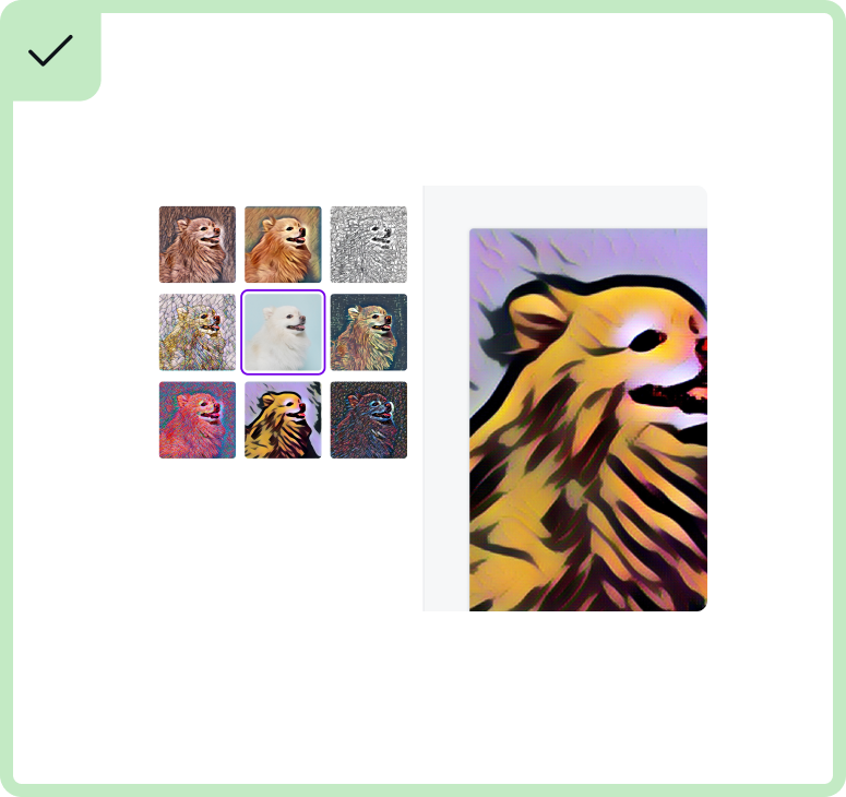
Template 3(opens in a new tab or window): Use to show different effects, showcase generated images, etc. | 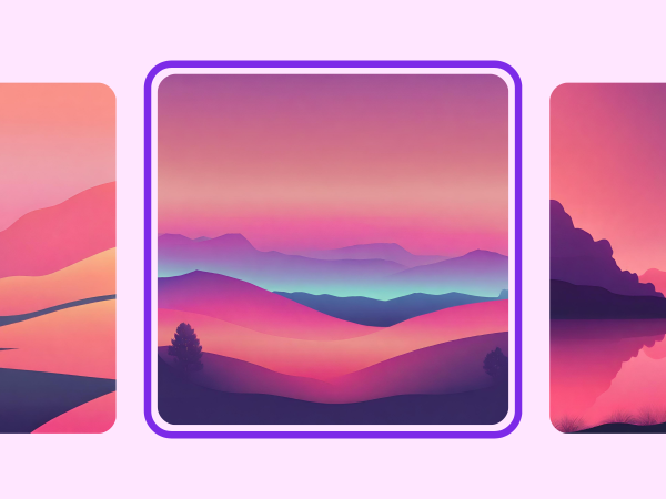 |
Template 4(opens in a new tab or window): Best to use for cloud-based apps that show file systems. | 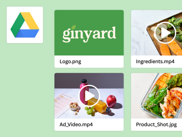 |
Template 5(opens in a new tab or window): Best to use for apps that need text prompts to generate something. | 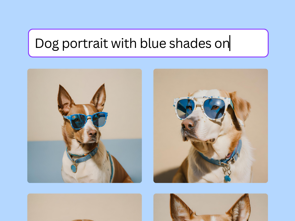 |
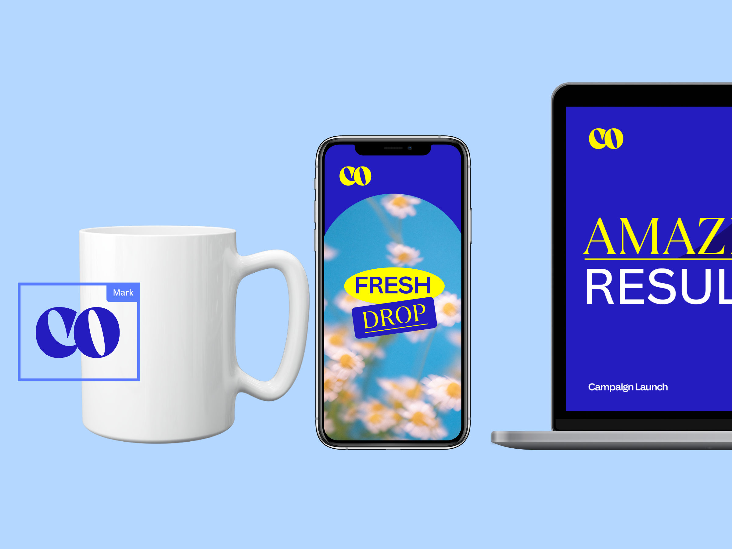
Contextual
Template link and use case | Example |
|---|---|
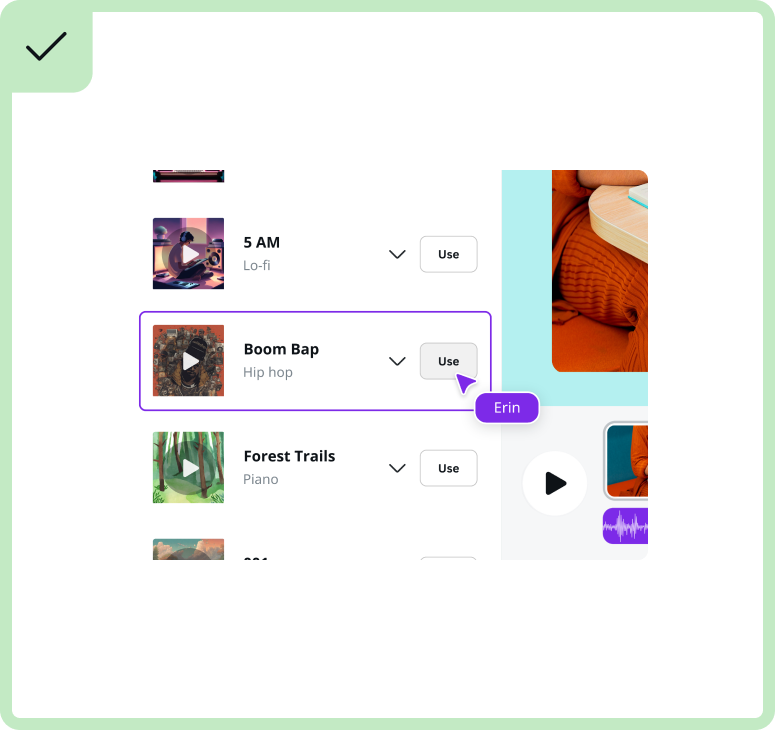
Template 6(opens in a new tab or window): Best to use for video based apps, and to show more details on the object panel | 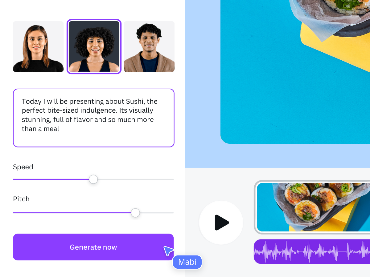 |
Template 7(opens in a new tab or window): Best to use for audio based apps | 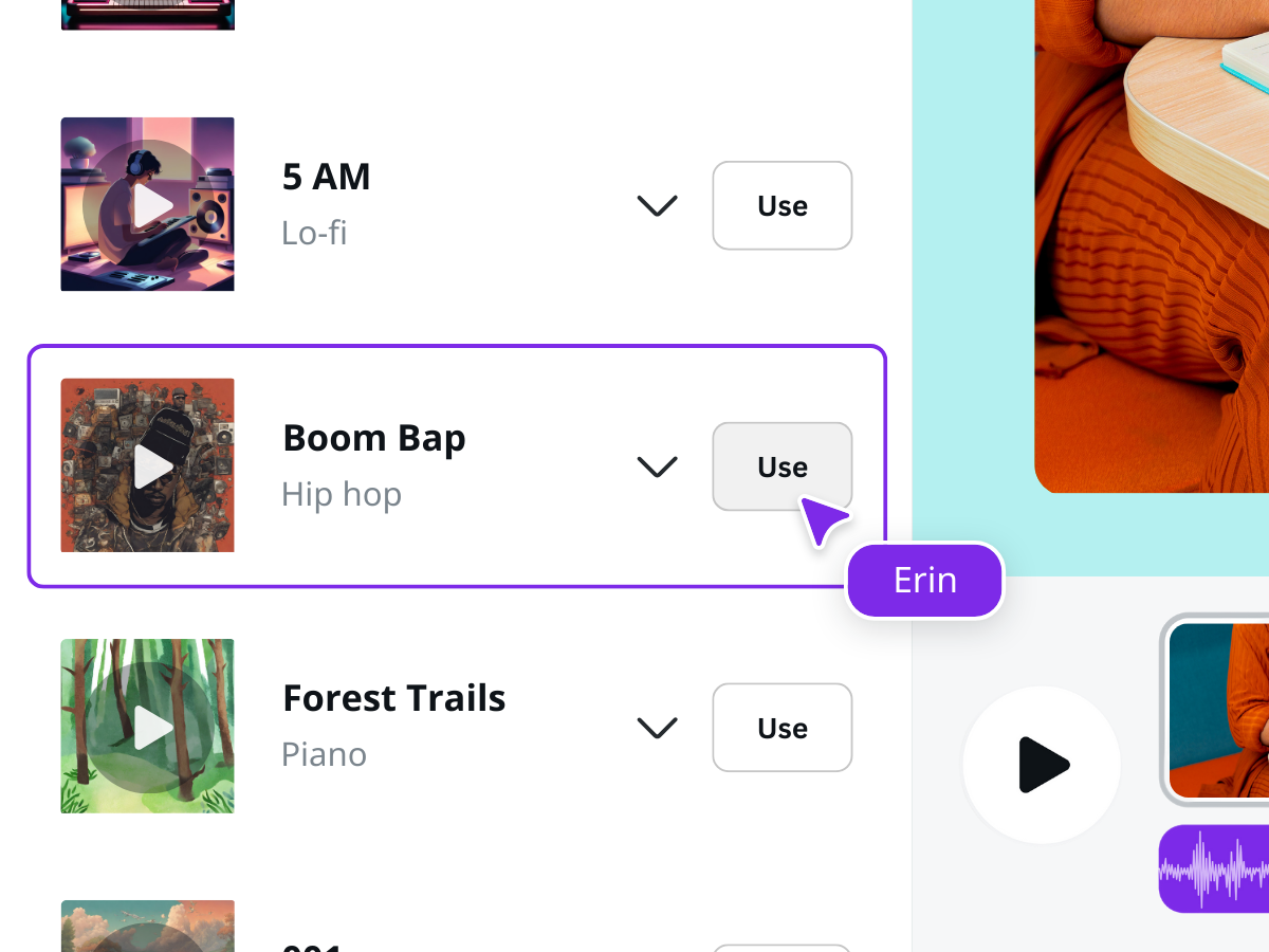 |
Template 8(opens in a new tab or window): Best to use for audio based apps | 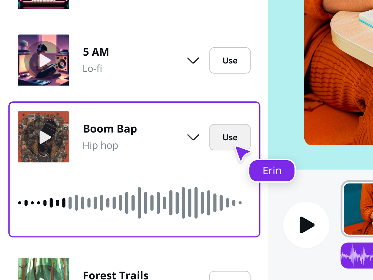 |
Template 9(opens in a new tab or window): Best to use for image based apps that show vertical images | 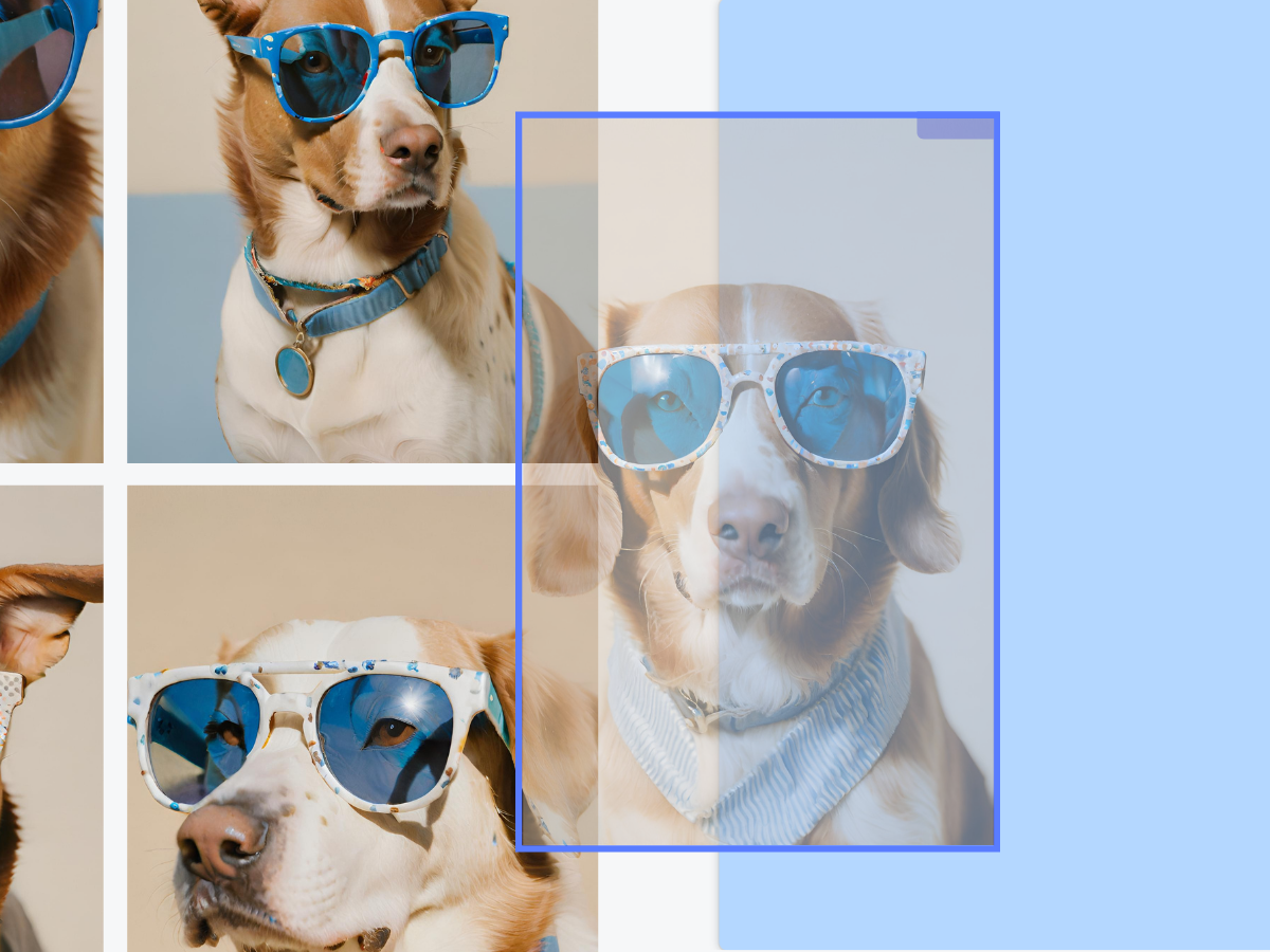 |
Template 10(opens in a new tab or window): Best to use for image based apps that show horizontal images | 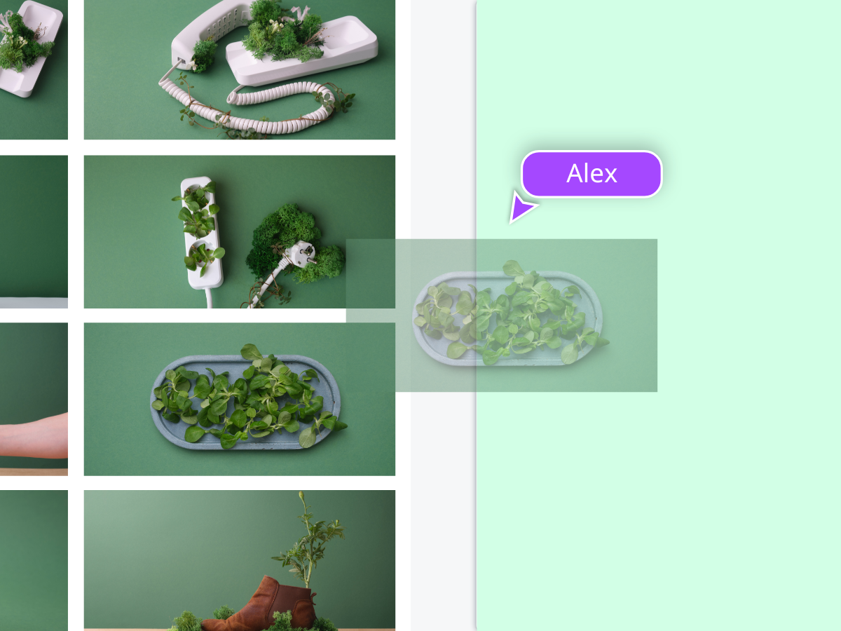 |
Template 11(opens in a new tab or window): Best to use for integrated apps | 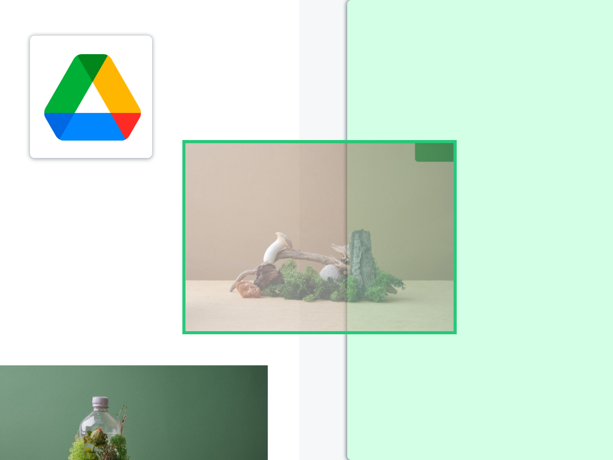 |
Template 12(opens in a new tab or window): Best to use for photo editing apps that show the controls | 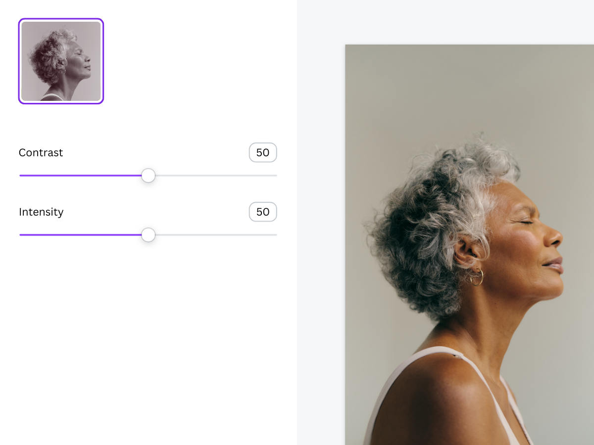 |
Template 13(opens in a new tab or window): Best to use for photo editing filters that show multiple choices | 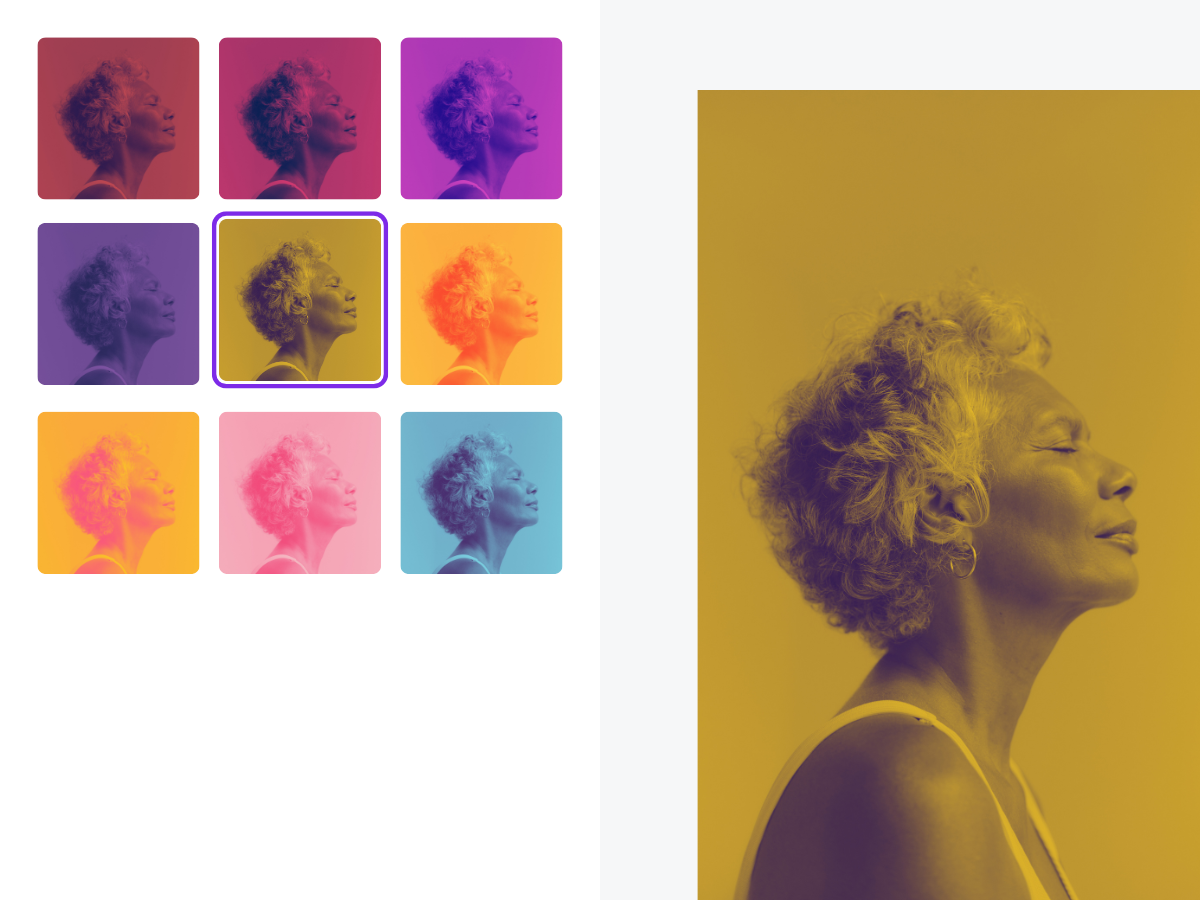 |
Template 14(opens in a new tab or window): Blank editor template you can use to suit your own app |  |
Do
DO add only a few elements to the thumbnail to make it bigger and clearer.
DO ensure the object panel (left) is the right color, select a harmonious palette, and use a lighter background.
DO keep text to a minimum for text heavy apps. Look for a focal point.
DO opt for a simple and bold approach to scaling and cropping images, to highlight app functionality.
DO use Canva’s colors in harmonious sets, making the visuals feel cohesive.
DO use the featured image as an opportunity to highlight your app’s hero feature.
DO display content that captivates and engages potential users, motivating them to use your app.
DO showcase accurate UI (as seen within the product).
Don't
DON'T put too many elements within the thumbnail so that they become hard to see at small sizes.
DON'T make the object panel (left) a color other than dark grey. DON'T combine non-harmonious Canva colors, such as blue, green, and yellow.
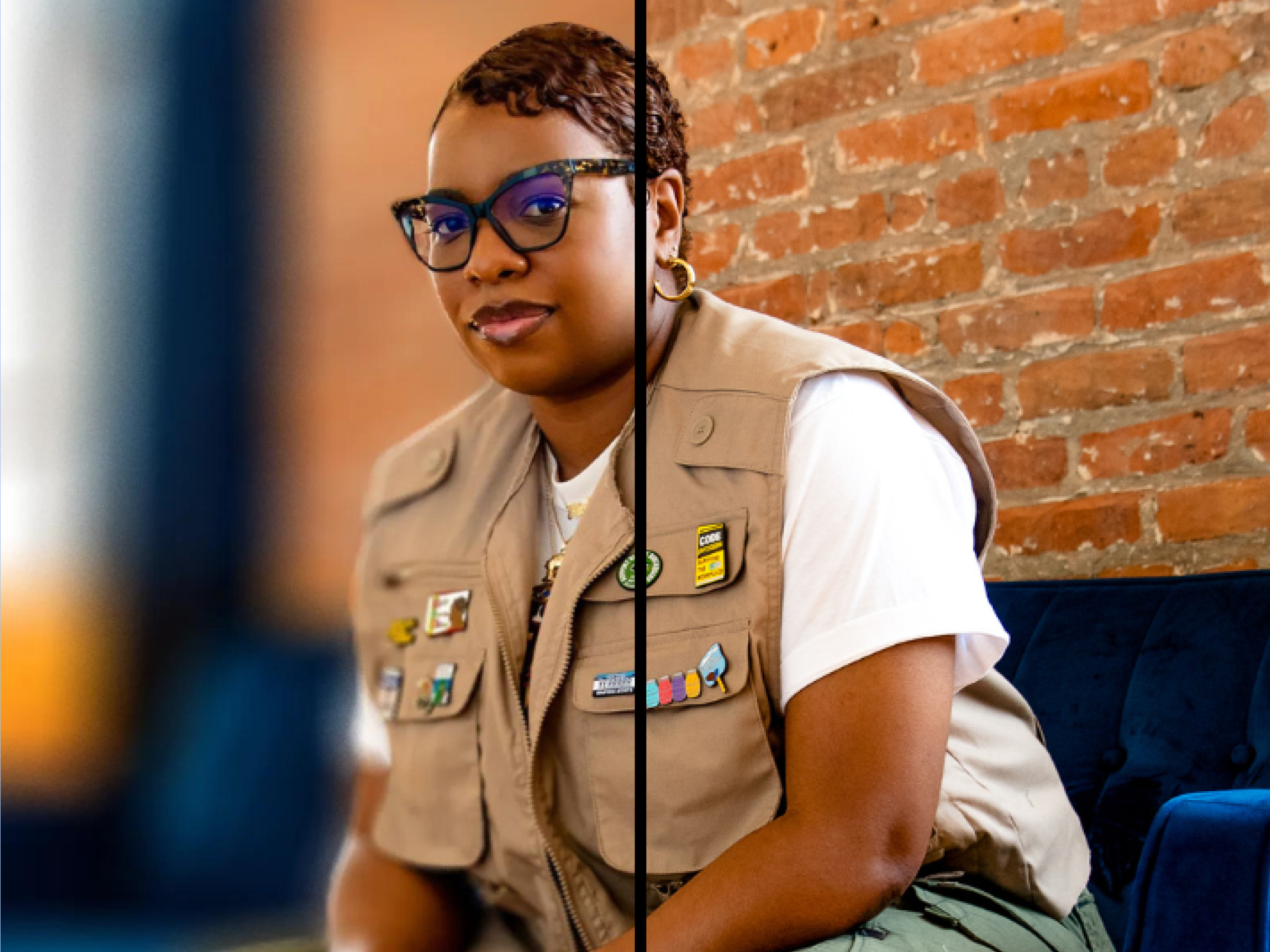
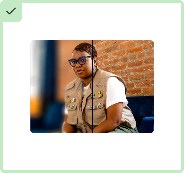
DON'T choose a focal point that is too small. Instead, opt for something bigger to create impact and clarity. DON'T crop the focal point (woman's head) in the split screen.
DON'T abstract the UI by layering floating elements.
DON'T oversimplify the UI and DON'T use grey bars to represent text.

DON'T add written content to the featured image unless it’s crucial for showing the feature of the app.
DON'T alter the UI or deconstruct the UI.
DON'T show the whole browser or Canva UI - find a focal point.
Color
Canva has an established color palette, which developers are welcome to use. From the example below we use the Mid and Light colors for background colours. Avoid using the darker colors for the background, as they are too heavy in the digital space.
If you have your own brand colors you are welcome to use these, especially if your brand is well established.
Dark | Mid | Light |
|---|---|---|
#00500A | #28C878 | #D2FFE6 |
#280F91 | #597CFF | #B4D7FF |
#3C0F78 | #A548FF | #E1C3FF |
#69005A | #D269E6 | #F0CDFF |
#FF5055 | #FFA5F0 | #FFE6FF |
#6E0F2D | #FF877D | #FFD7DC |
#FF7828 | #FFD200 | #FFFACD |
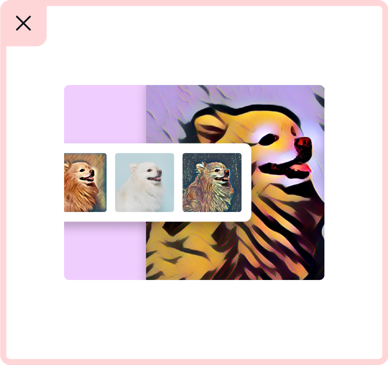
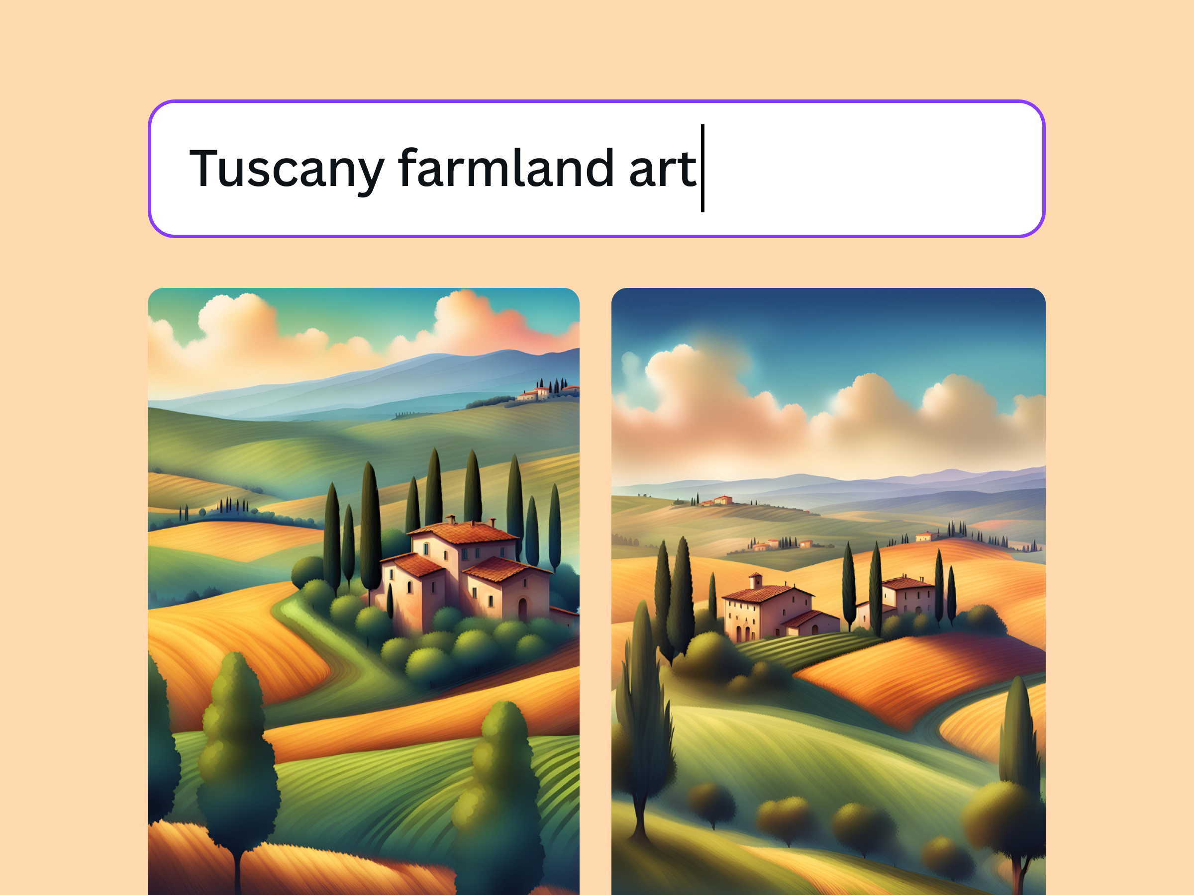
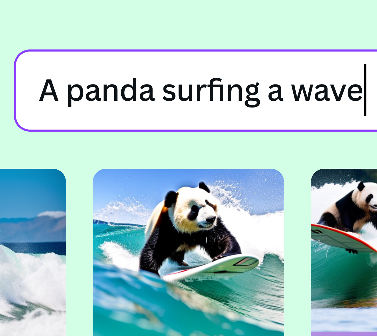
Text in images
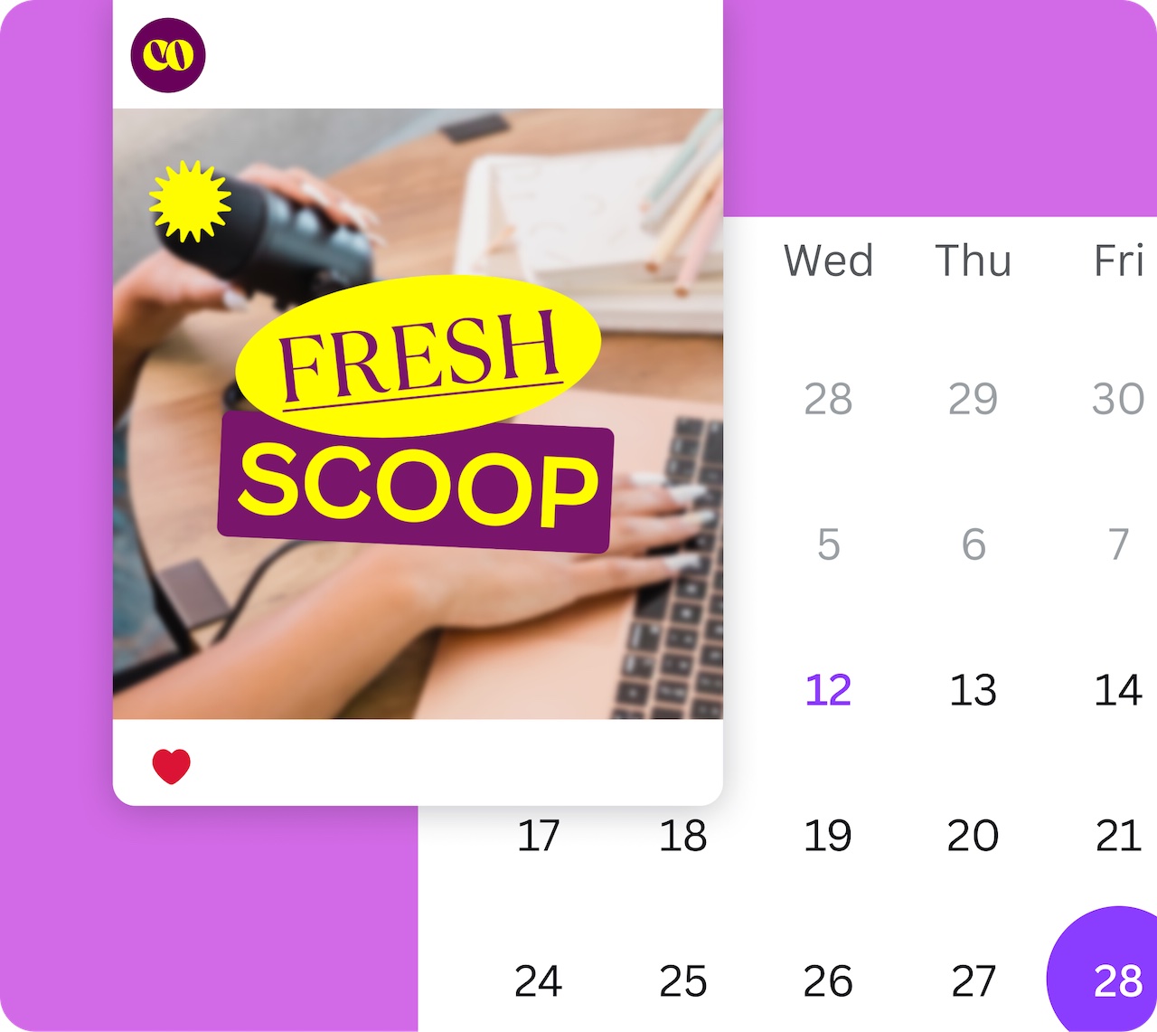
As Canva has a global audience, we need to consider every locale. Avoid using text within your image unless it is necessary to show the function of the app. An example of this is Canva's Text to Image app (below).
Without the text, it would be unclear what the relevance of these images are to the app. When using text is necessary, try to keep it to a minimum by using just enough to convey the function of your app.
Showing UI
The way we show UI plays an important role in illustrating the functionality of an app.
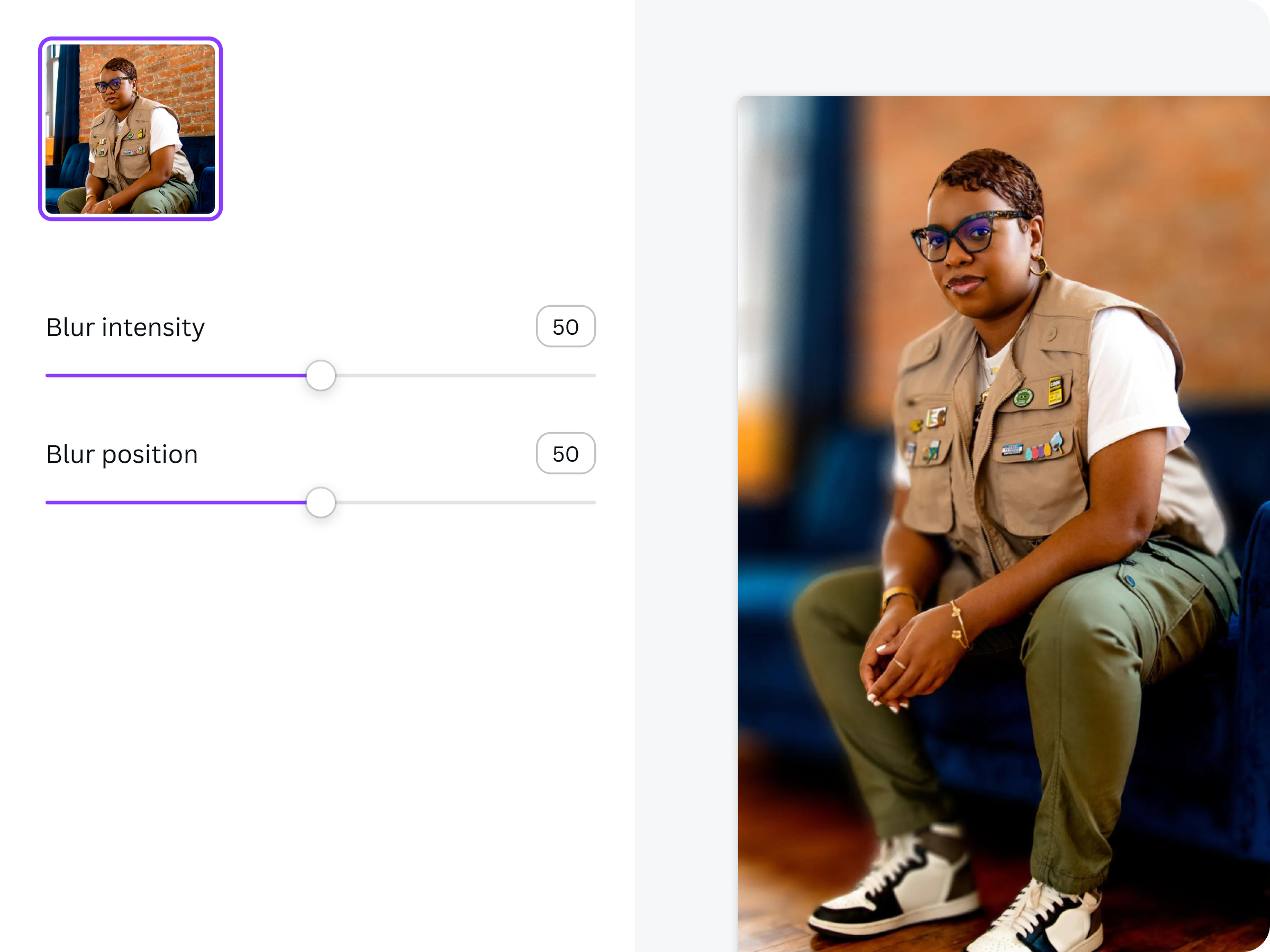
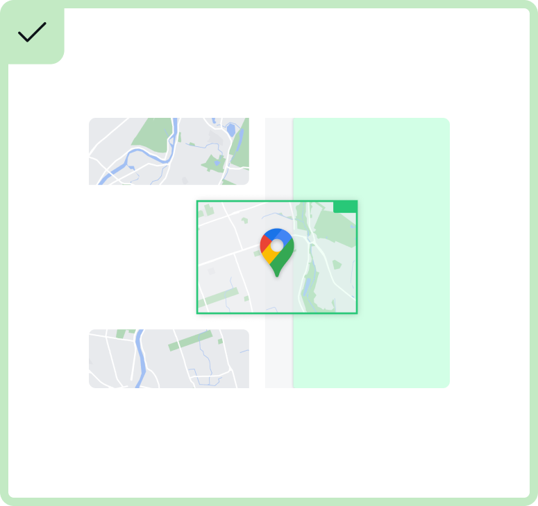
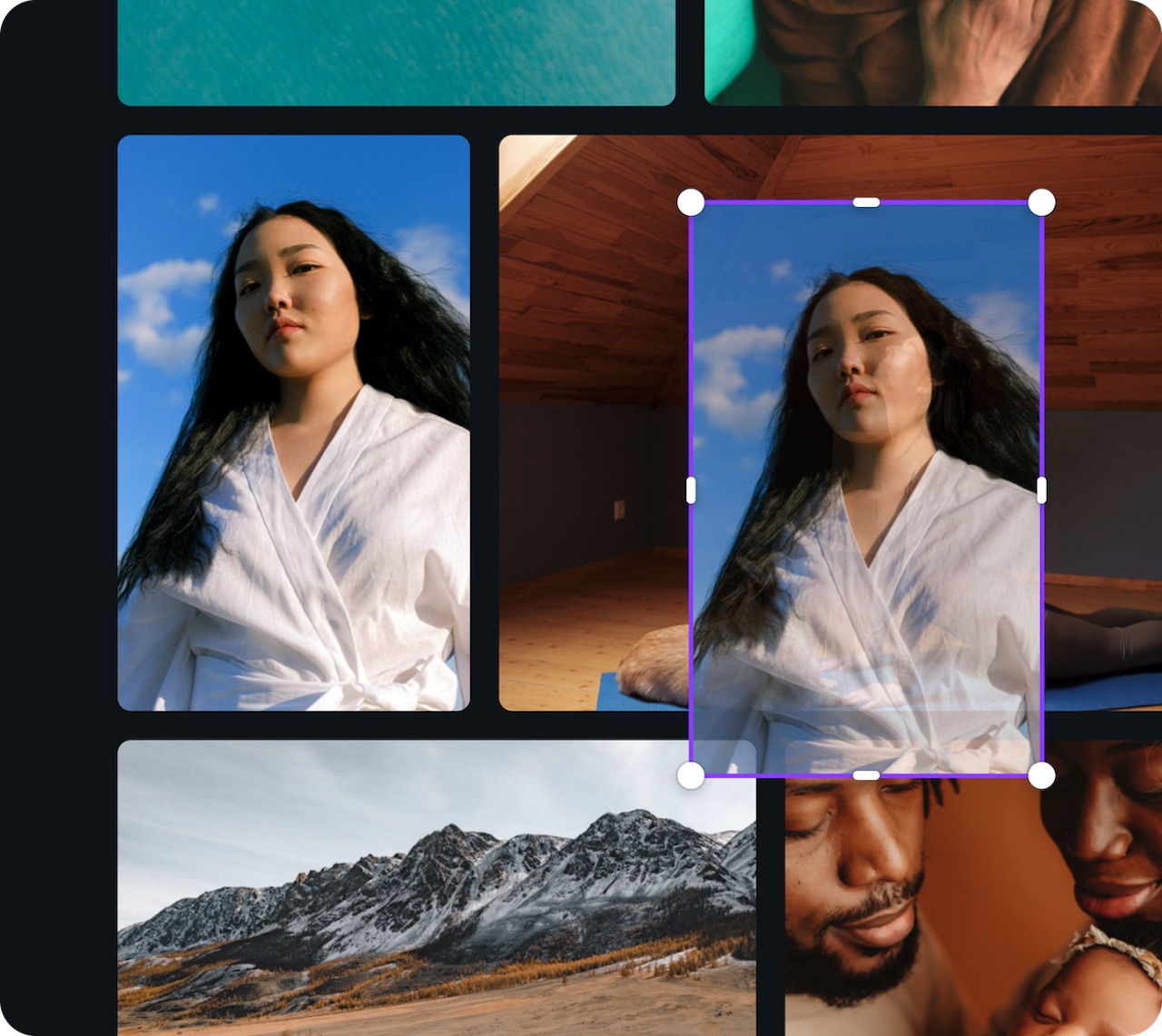
Find a focal point: With limited space and short attention spans, we should always have a focal point when showing UI. Less is more, so focus on the functionality and what you're trying to communicate.
Play with scale: We don't need to see the full Canva editor to understand the app or product functionality. Cropping in on the feature is a good way to create impact, especially within smaller formats.
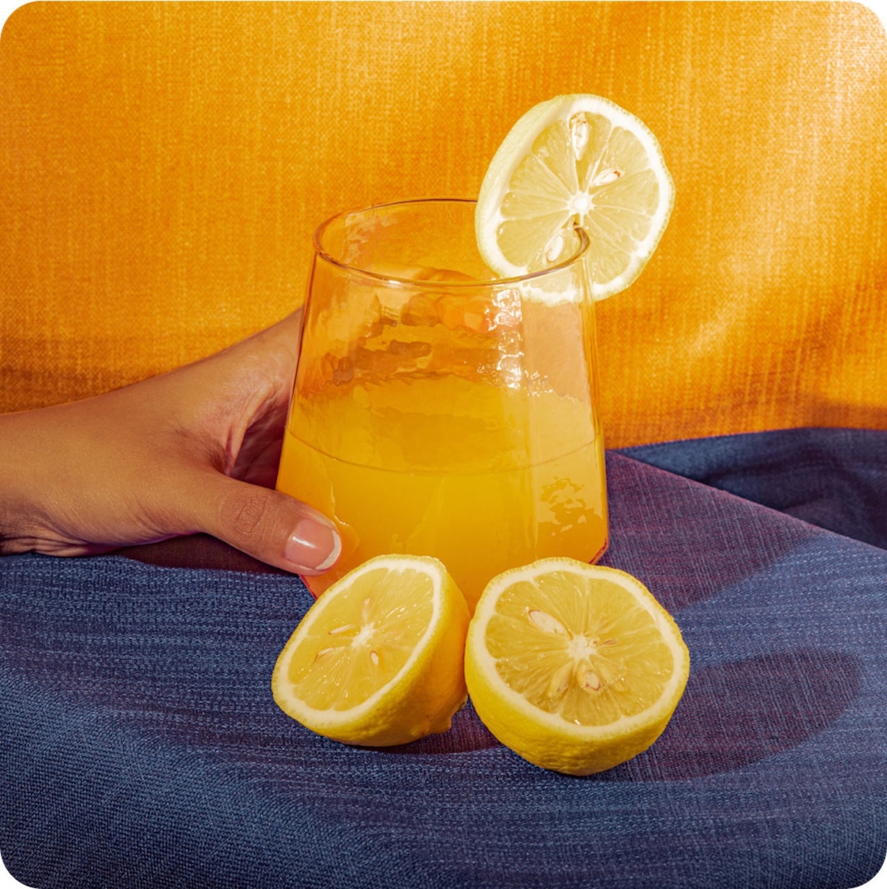
Be selective: When selecting photography or other graphic elements, a considered approach is important in creating an elevated look and feel. A good starting point is to select images that have uncluttered backgrounds and a focal point.
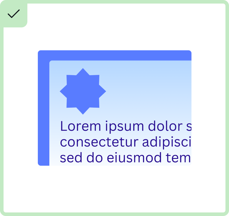
Add some color: Don't be afraid to use color to add some vibrance. Feel free to use Canva's playground brand palette or your own colors. Where appropriate, you can use the Canva doc type colors to create product affinity.
In motion: Designing layouts that look like they are in motion can feel more dynamic and less static. It can also act as a demonstration on how to use the product feature.
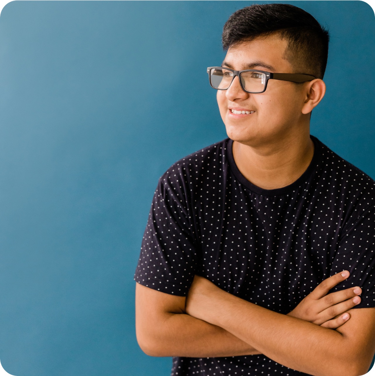
Photography
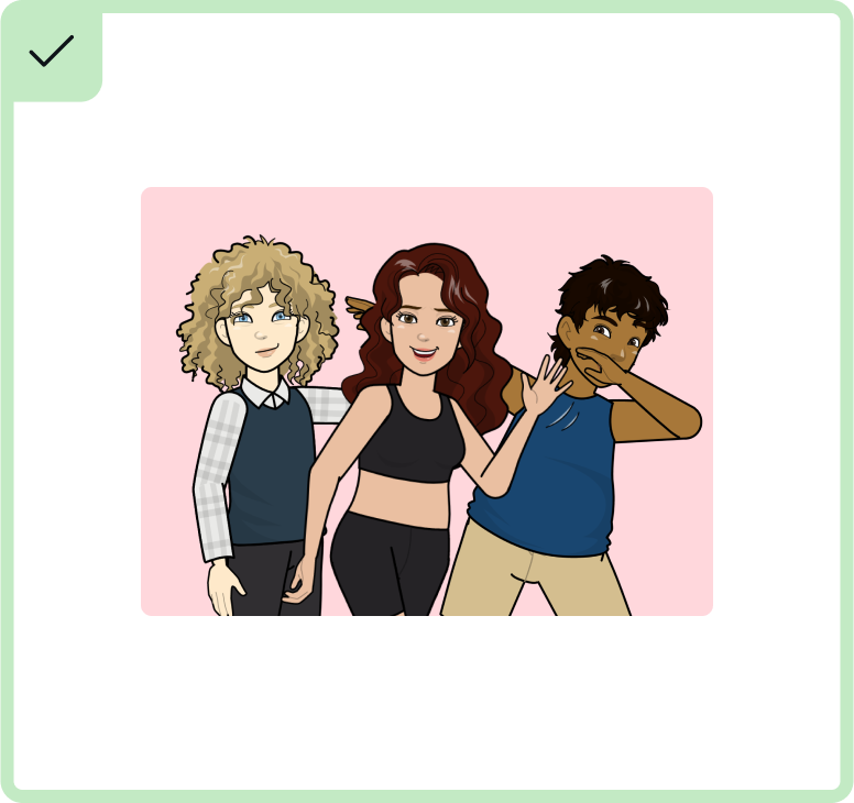
It's important to select the right image that most effectively shows the app's functionality.
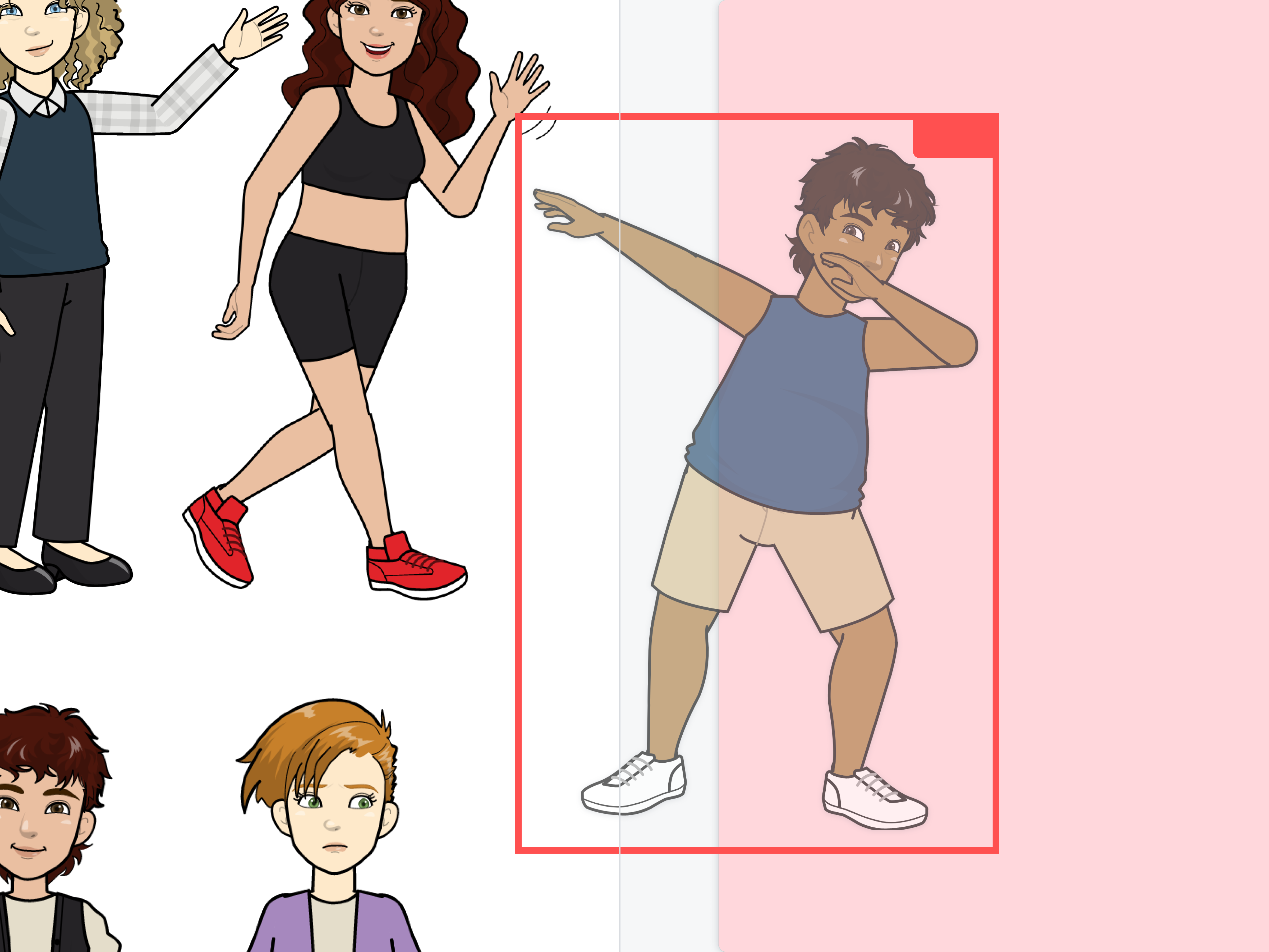
Find a focal point: There should be a focal point when selecting an image. Remember that less is more.
Clean and uncluttered: Selecting photography that has uncluttered backgrounds allows the focus to be on the subject matter.
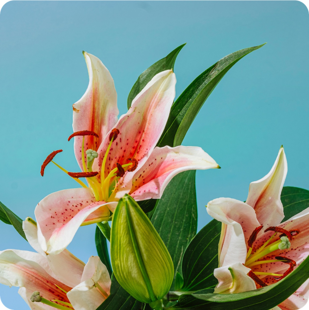
Light and bright: Selecting photography that feels light and breezy (vs dark and dim) creates clarity, especially at smaller sizes.
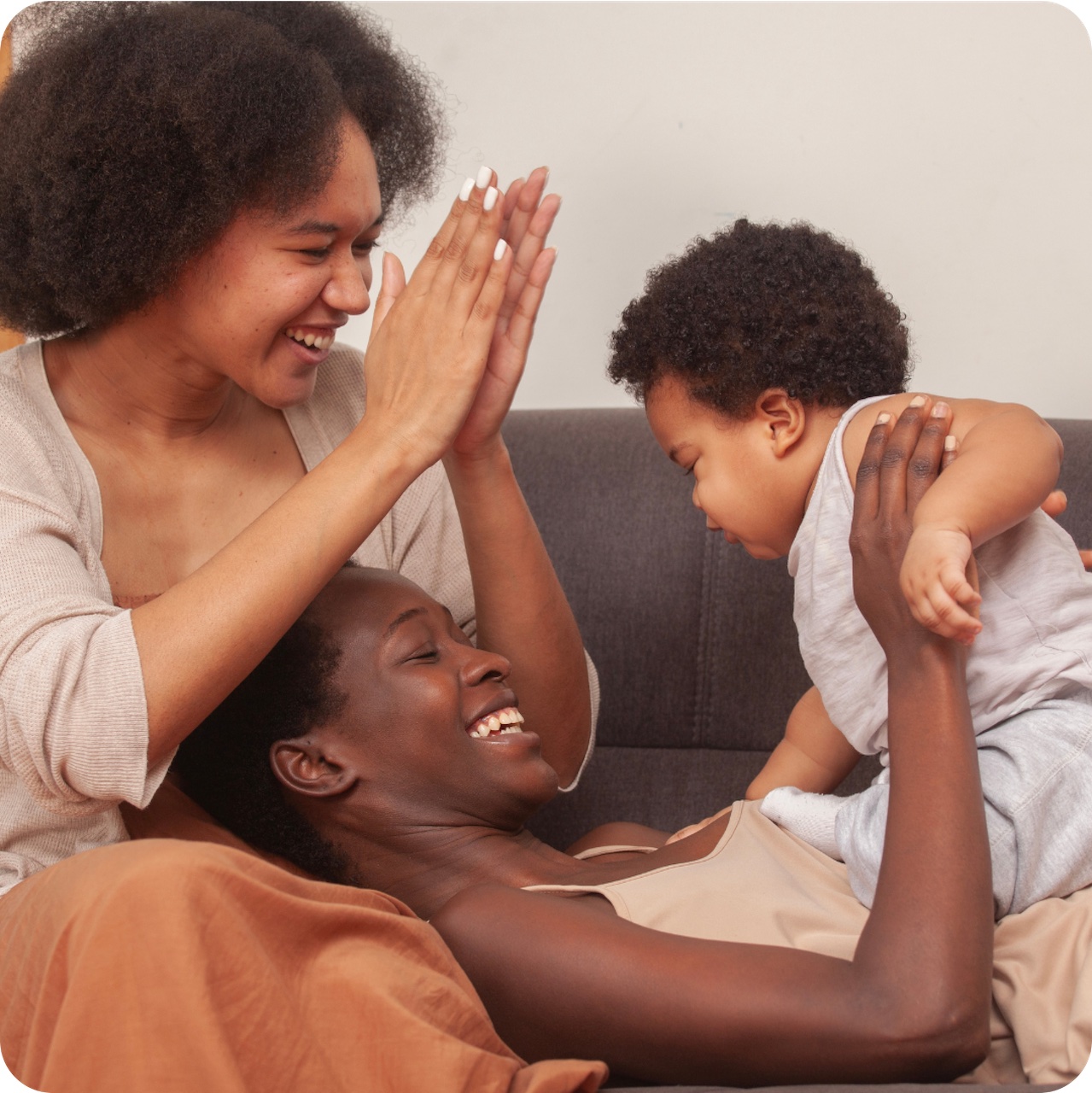
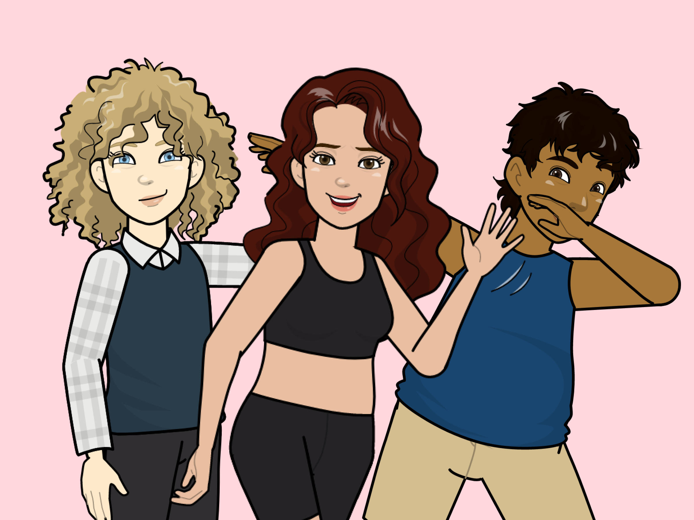
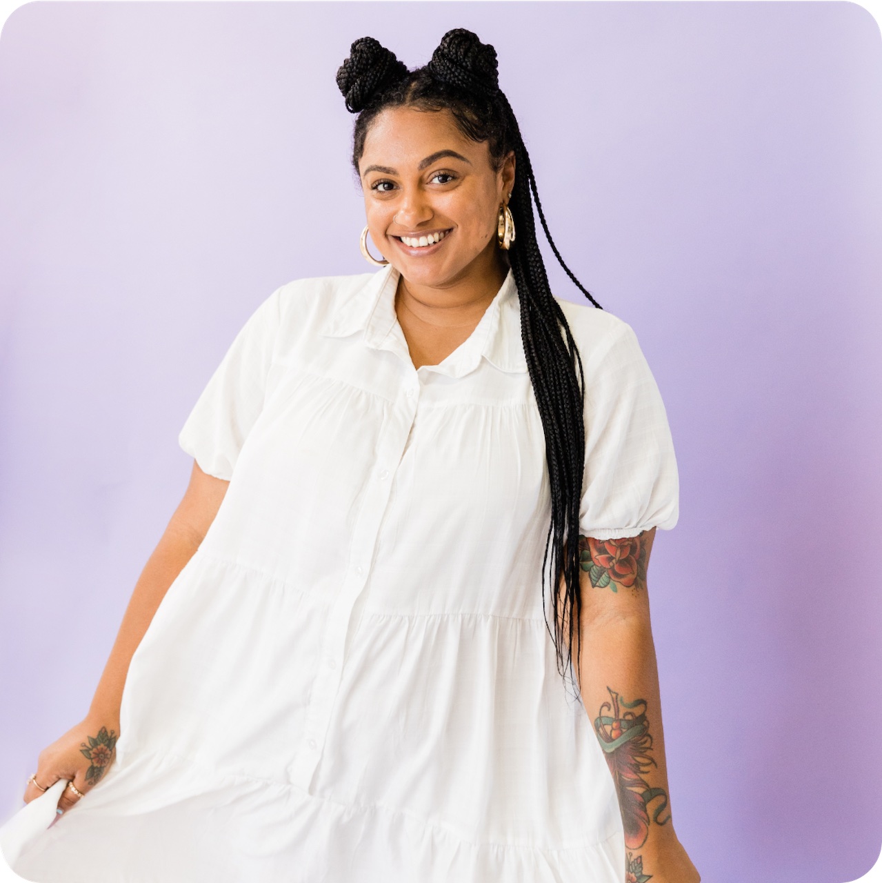
Diversity: To ensure we are being inclusive and representing the spectrum of Canva users, include people of different backgrounds, age, and genders.
Canva imagery: Make sure you are using licensed imagery, whether from your own sources or within Canva.