Design guidelines for premium apps
This article is for apps that have been accepted into the Premium Apps Program(opens in a new tab or window). If your app hasn't been accepted into the program, this article does not apply to you.
In the Canva ecosystem, the Premium Apps Program is a way to include your app into the Canva subscription (for example, Canva Pro, Teams, Enterprise).
Monetization options
There are three monetization options in the Premium App Program:
- Gated: all of your app's features are only available with paid Canva plans including Education and Non-Profit.
- Freemium: your app's core features are available with Canva Free. Premium features come with paid plans including Education and Non-Profit.
- Credit-based: your app provides a starter quota of credits. When credits run out, premium features are unlocked by upgrading to a paid Canva plan.
Provide frictionless access
To ensure a native and seamless experience, we should not require users to perform additional logins (such as off-platform logins) to access the app's features. Users on paid Canva plans should always get access to all the premium features. If an additional login is required to access your app's premium features, please consult with our team to explore how we can integrate.
Gated premium apps
For completely gated Premium Apps, remove any paywalls that currently exist in the apps, as well as any off-platform login requirements or credit systems. All features in the app should be accessible to Canva users on paid plans.
Canva's internal teams will manage adding the premium crown to the app icon and gating the app for paid users.
Visualizing premium features in freemium or credit-based apps
Non-gated Premium apps should follow Canva's native design pattern to distinguish premium features. We use the premium crown icon and pro badge components, sometimes supplemented with a tooltip, as the indication for what the user gets as part of their current Canva plan. Users should be able to take action to upgrade their Canva plan within the immediate proximity of a premium crown icon. To learn more, see UI requirements.
Free users are prompted with the account upgrade dialog immediately after clicking on a premium feature. This dialog provides the user with information about upgrading and a call-to-action to complete the upgrade. Therefore, the app's design should focus on the user's task, and let the upgrade dialog handle the upgrade and conversion experience.
Example app use cases
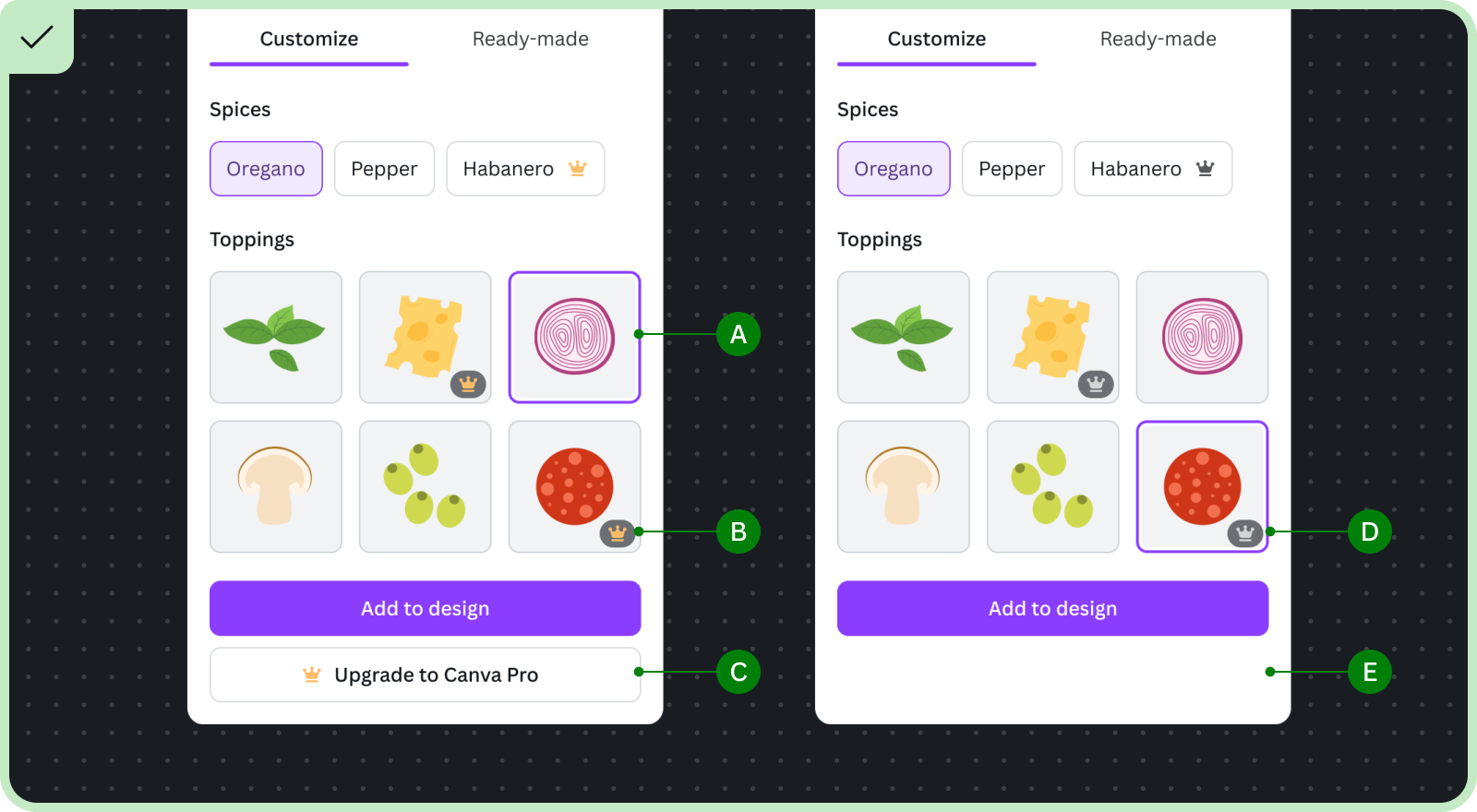
Feature-limited apps
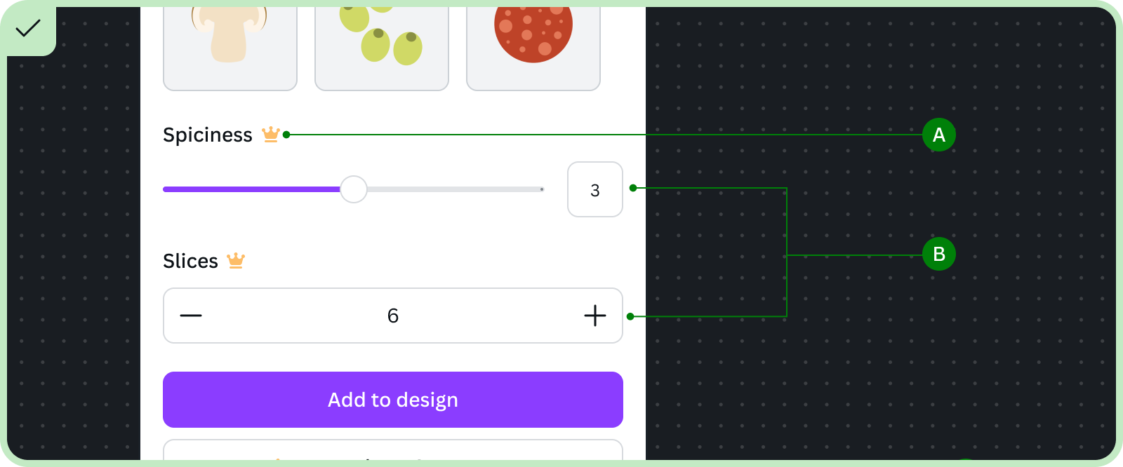
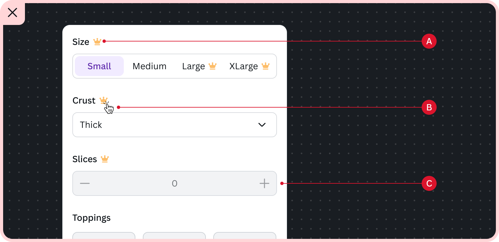
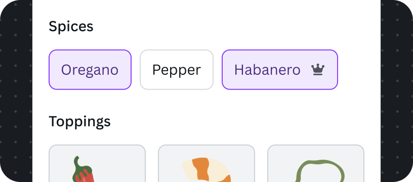
The premium crown icon is placed at the end of component labels to highlight premium capabilities.
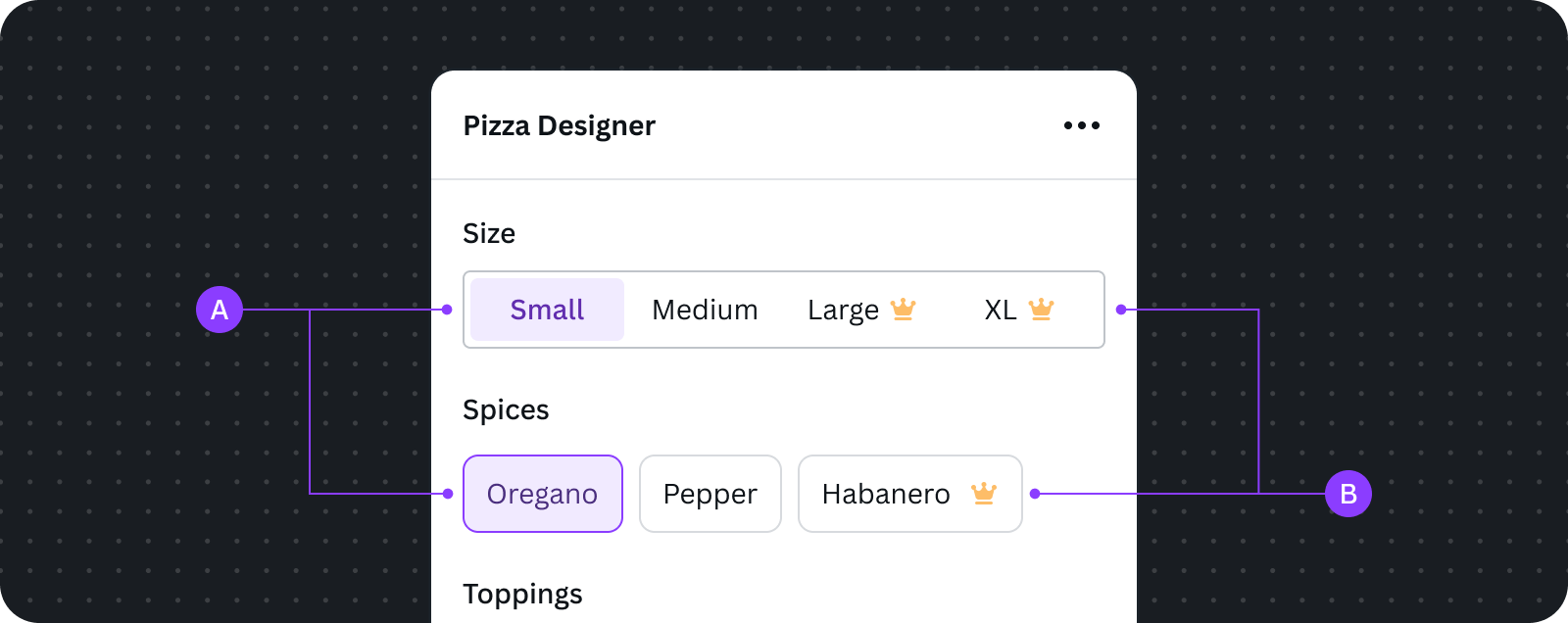
The above example shows free and premium features as configurations blended together in a component. This aligns with how Canva natively displays free and premium features together.
A Free features available for use
B Premium features and capabilities are visible to everyone, but only users on paid Canva plans can use them
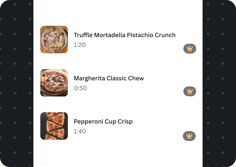
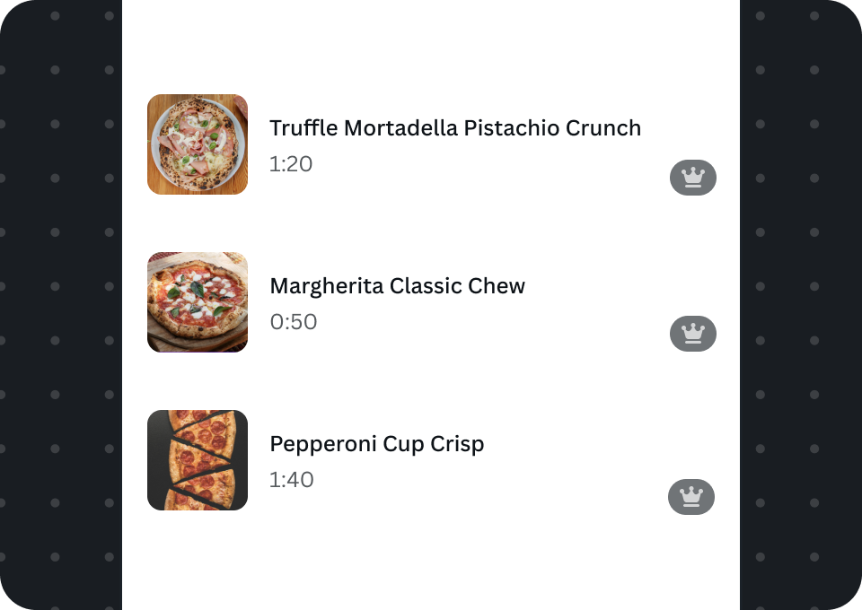
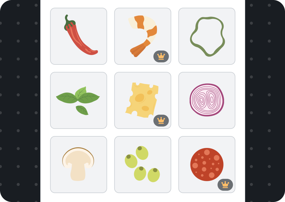
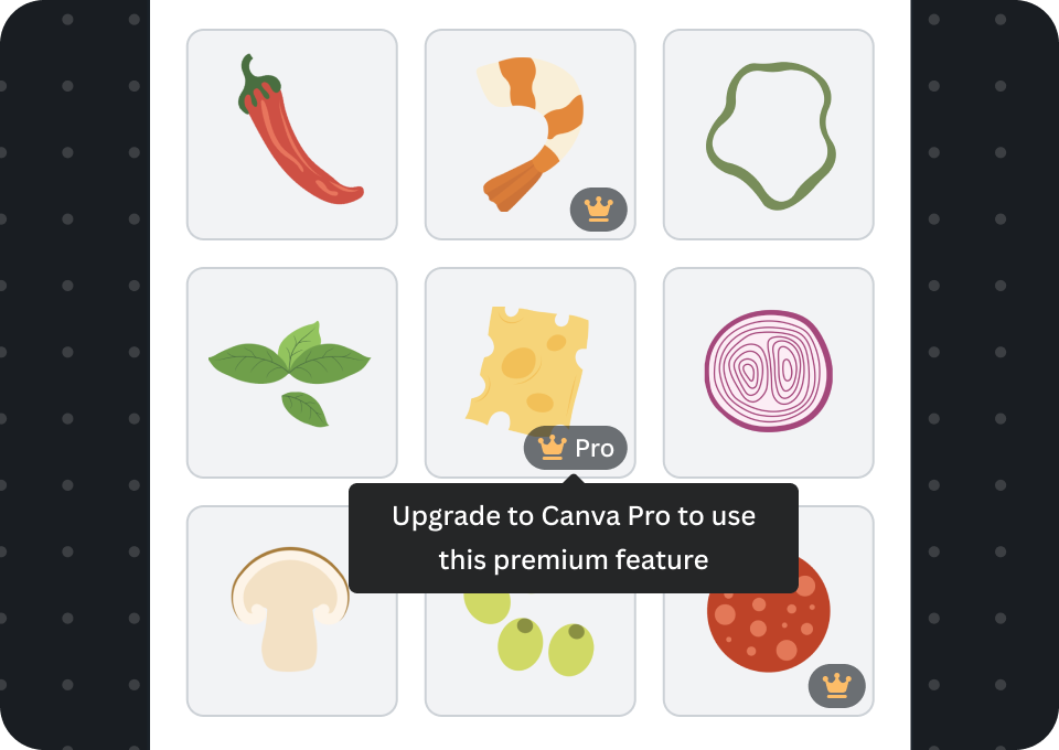
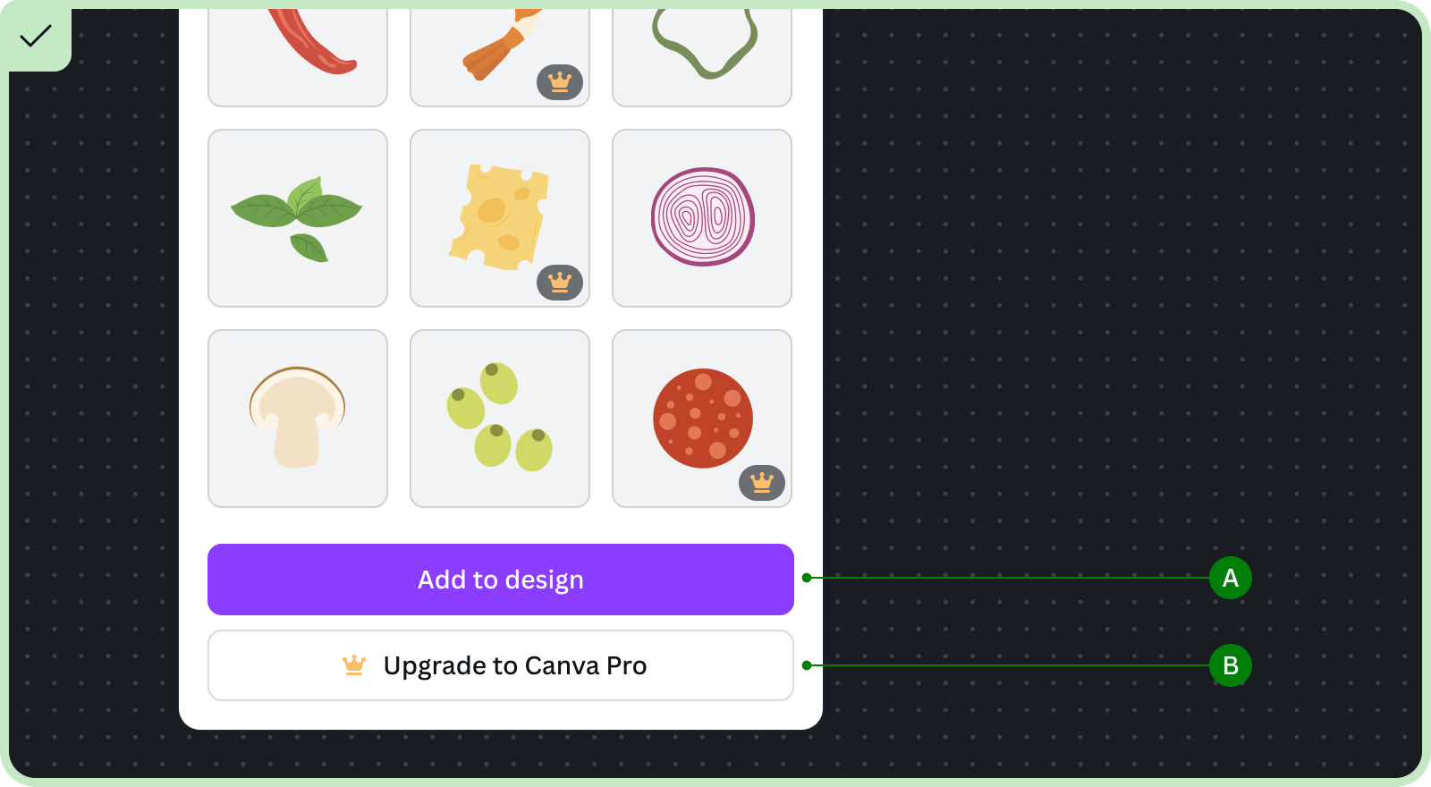
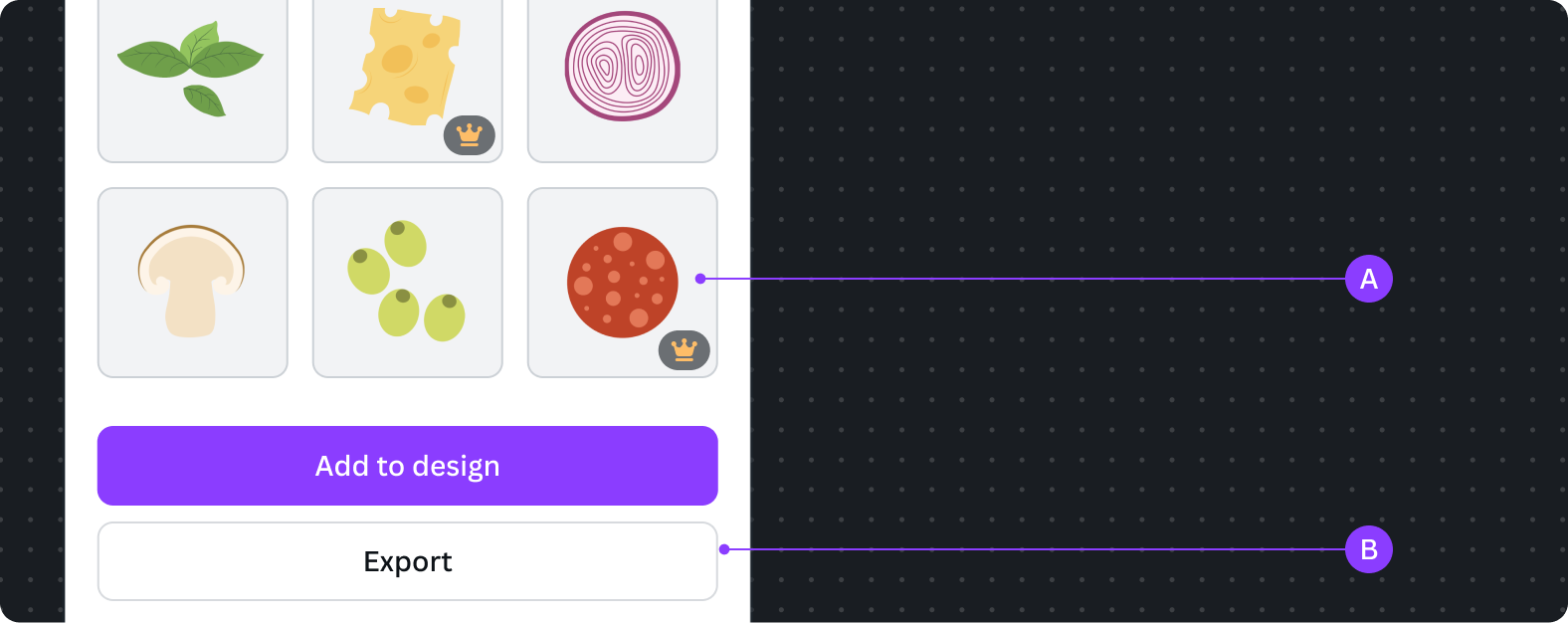
Content-limited apps
Pro badges are placed on the bottom right corner of the components to indicate they're premium content.
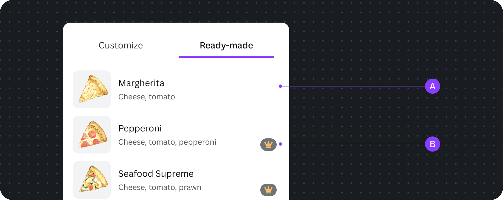
The above example shows free and premium content as cards blended together in a list. This aligns with how Canva natively displays free and premium content together.
A Free content
B Premium content, which is visible to everyone, but only users on paid Canva plans can use them
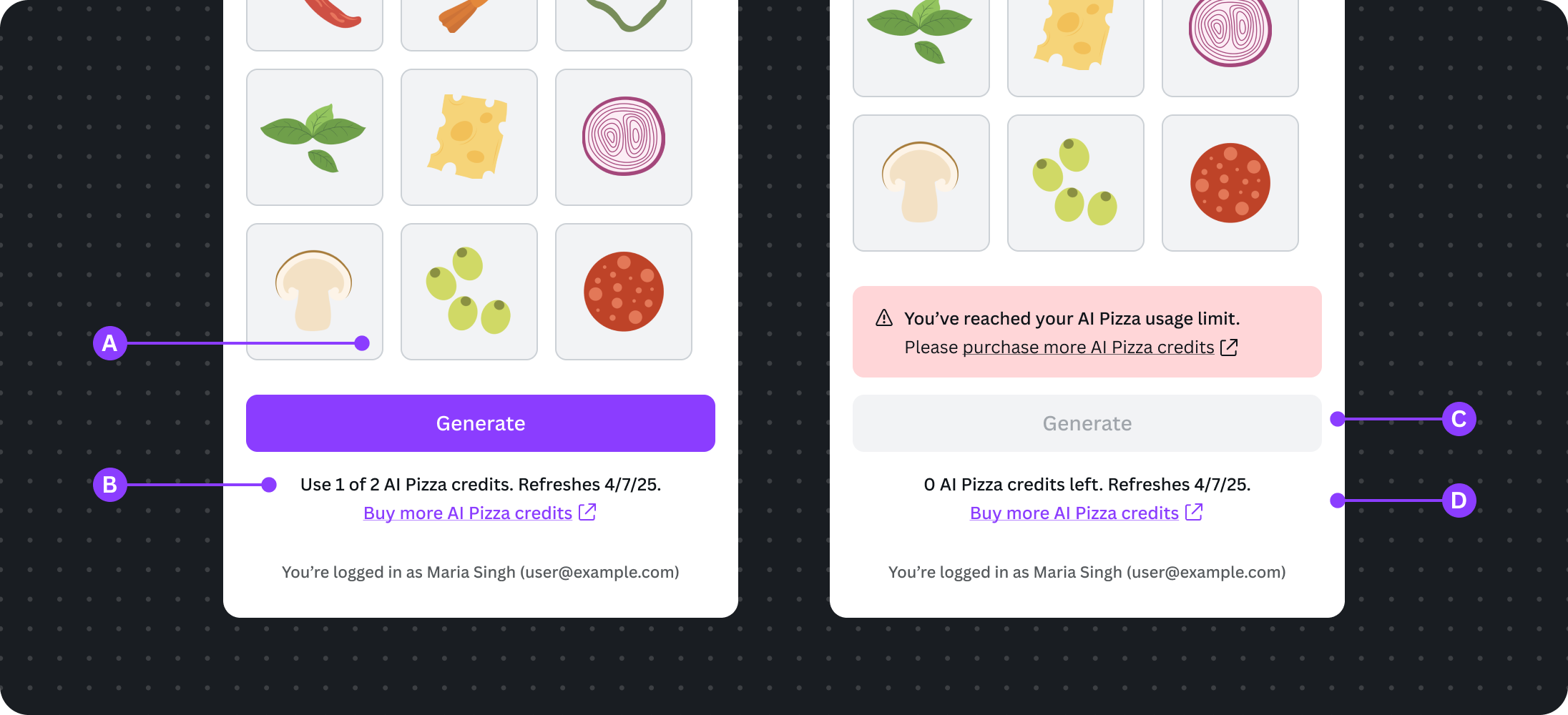
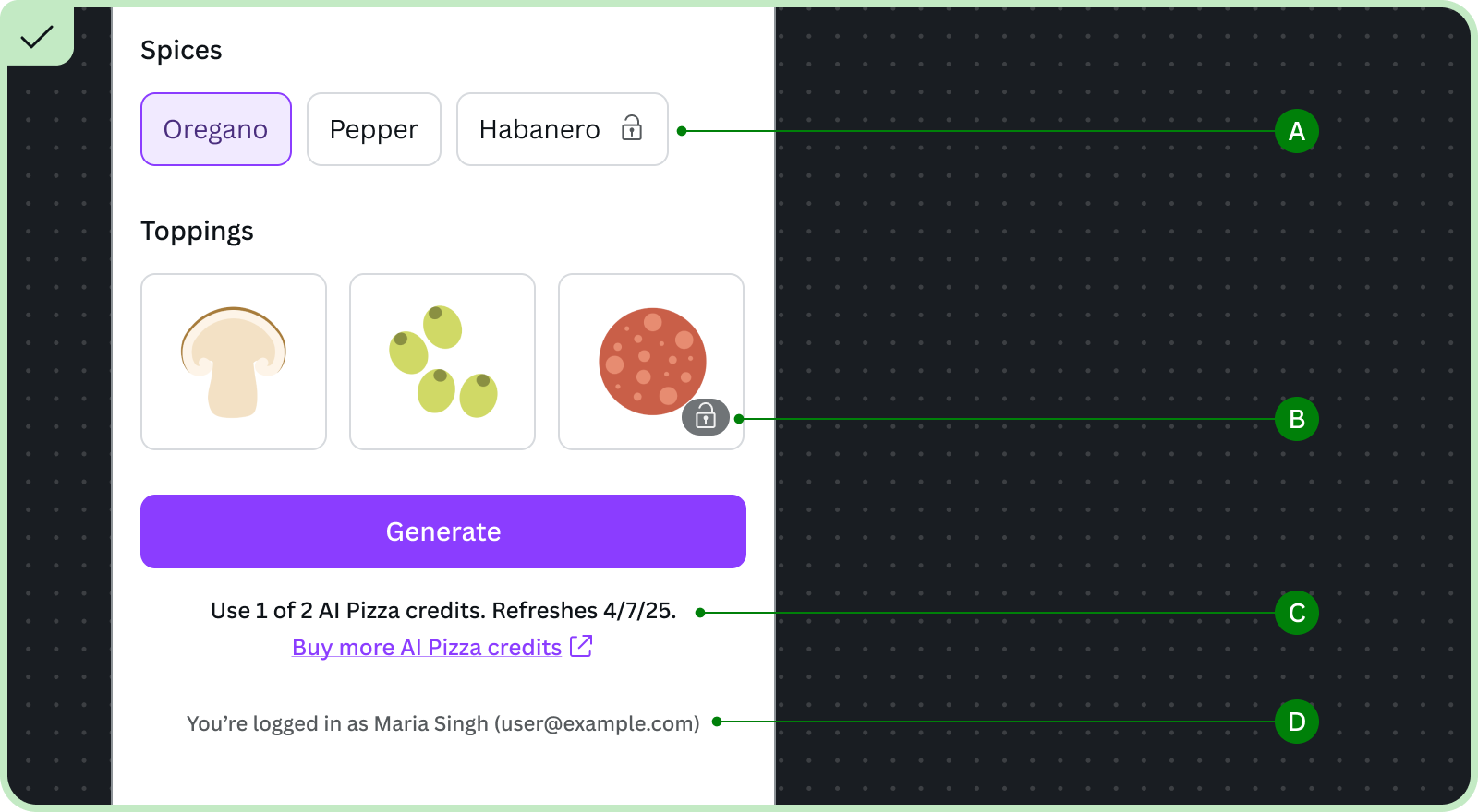
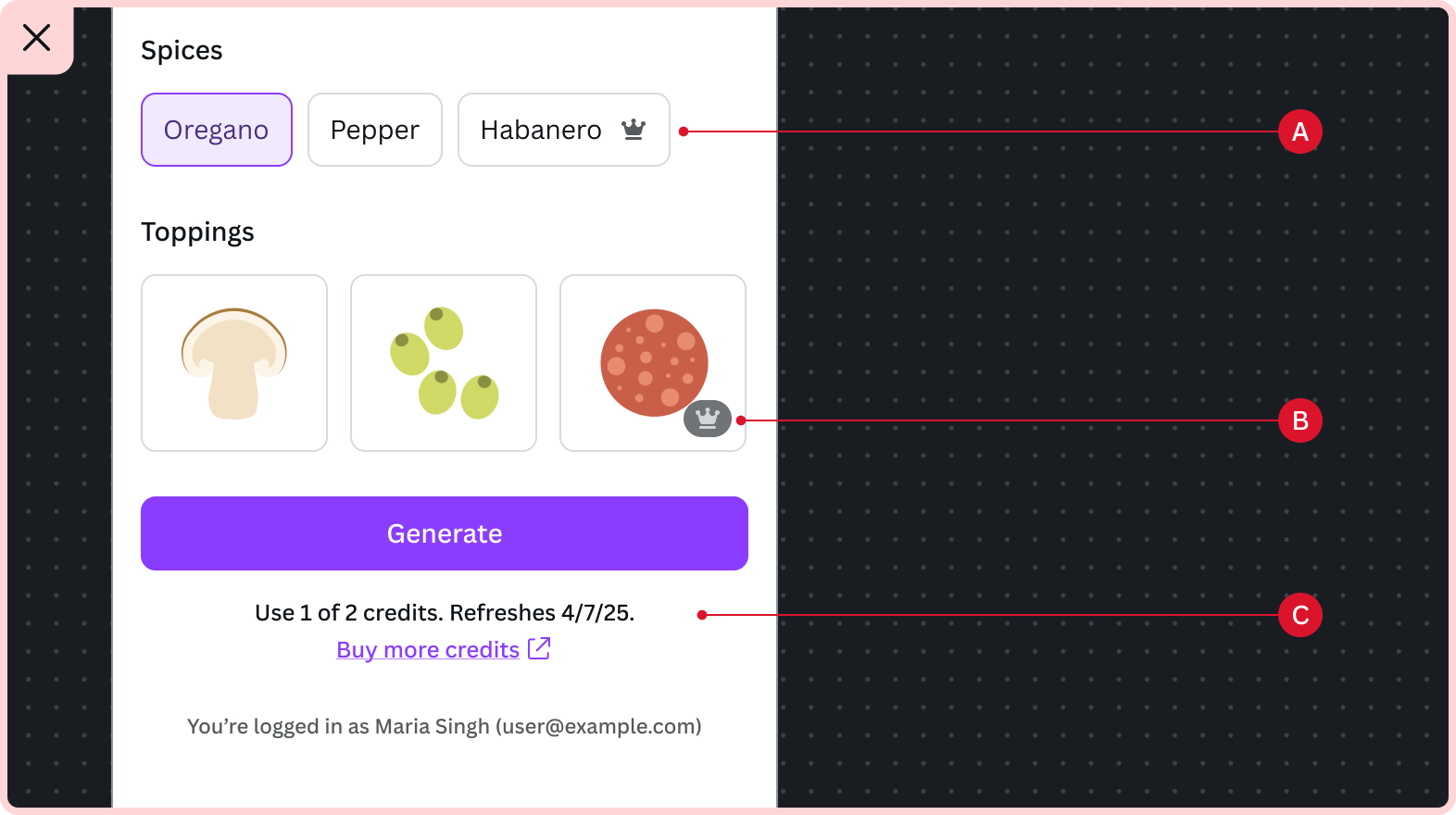
Credit-limited AI apps
To align with Canva's direction towards an uncapped fair usage experience, users should not see credit counts.
Free user experience
We let Canva Free users know how many times they can try the feature. This allows users to experience the value of the app and motivate them to upgrade to Pro when their free usage run out.
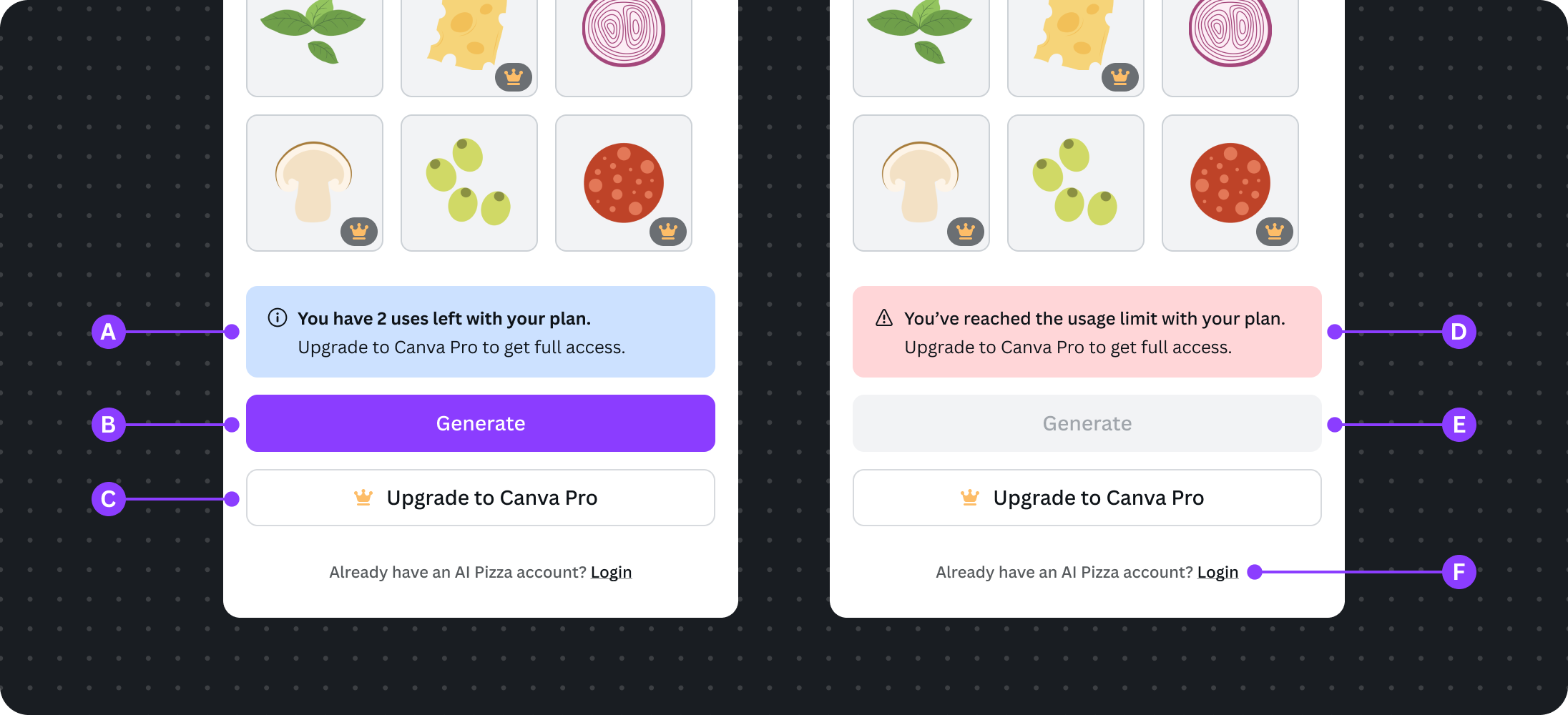
A Users see the number of uses they have left in an informational alert, instead of a credit count. It is calculated based on credits remaining and cost per generation.
B Primary button label must include the term "generate", which aligns with Canva's AI feature's microcopy
C Free users see the upgrade button
D Free users see the critical alert when their free uses run out, with a link to trigger the upgrade dialog
E The primary button is disabled, because the free usage has run out
F Free users who are already paying for the app off-platform, and don't want to pay for Canva to use this feature, have the option to login/connect to their existing off-platform account to continue using this feature
Subscribed user experience
Users on paid Canva plans shouldn't see any messaging about usage limits. In rare cases when a user hits a monthly limit, stop them from using the feature and progressively disclose the usage limit information.
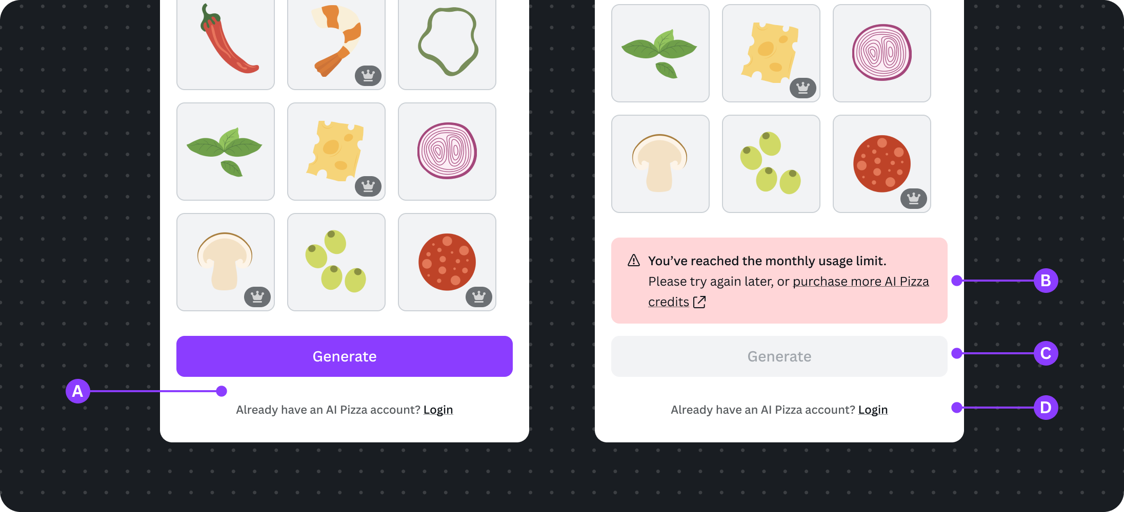
A Don't show any information about the usage limit
B Users who hit the monthly limit should see the critical alert message, informing them to either wait until the plan cycle to refresh their usage, or go off-platform to purchase more usage.
C Primary button is disabled
D Users with an existing off-platform account can choose to login to use their existing credits
Users signed in to their existing off-platform account
Users have the option to log in to their off-platform credits and access to premium features (if applicable). This opts them out of the Canva Premium Apps experience.
A All Canva pro badges and premium crown icons must be removed when the user is logged into your platform, because these features are now not enabled by the Canva plan
B The off-platform credit count is shown below the primary button. Your platform's name must be mentioned to specify to the user that these are not Canva credits. Secondly, don't show payment links or similar call-to-actions if the current platform doesn't support payment flows (see How to check if the app can link to a payment flow).
C Primary button is disabled when the off-platform credits run out
D When the user's off-platform credits run out, they can choose to go off-platform to get more
To implement this flow, the app must meet these requirements:
- The app need to maintain a separate credit count for users on paid Canva plans and off-platform subscribers. This allows Canva to differentiate whether the usage is attributed to the bundled Canva usage or off-platform credits. We won't track off-platform credits during usage calculation for payouts.
- Check if the current environment allow payment flows before showing a off-platform payment link and corresponding text
Provide freemium app experience
Premium apps can provide a freemium experience. This allows users to experience and explore the value of the app, and motivate them to upgrade to a paid Canva plan to unlock premium features.
Free features available to users should remain free and not be retracted, and premium features should be an add-on. This ensures users are still able to produce great output and design from the start.
At the same time, UI should remain the same for Free and Pro users. Users should only experience differences when they see locked features, such as premium assets or advanced settings, rather than a sweeping change across the entire app. This creates a seamless and predictable experience when the user upgrades their Canva plan.
Do's
For Canva Free users:
A Allow users to select free features
B Visually distinguish premium features. They should be immediately visible and trigger the upgrade dialog on user click.
C Provide an upgrade button for users to open the upgrade dialog
For users on paid Canva plans:
D Maintain a consistent experience between free and paid users, and apply subtle visual changes to indicate premiums features that are now available
E Remove the upgrade button for subscribed users
Don'ts
A Don't create a drastically different UI between free and subscribed users
B Don't hide premium features for free users
C Don't stop free users from using free features
D Don't leave out highlighting premium features that subscribed users have access to
UI requirements
The App UI Kit includes the following types of icons for freemium or credit-based apps:
PremiumCrownIconProBadge
These icons visually indicate the user's access with color variants. Free users will see yellow to draw their attention, and users on paid Canva plans will see grey to let them know they have access to this premium feature.
Use these icons to highlight premium features of your app. It helps free users diagnose what is available to them on a free account, and draw in users on paid plans towards the additional features they have access to, and affirm the value of their Canva plan.
This section describes the guidelines that apps must follow when using these icons.
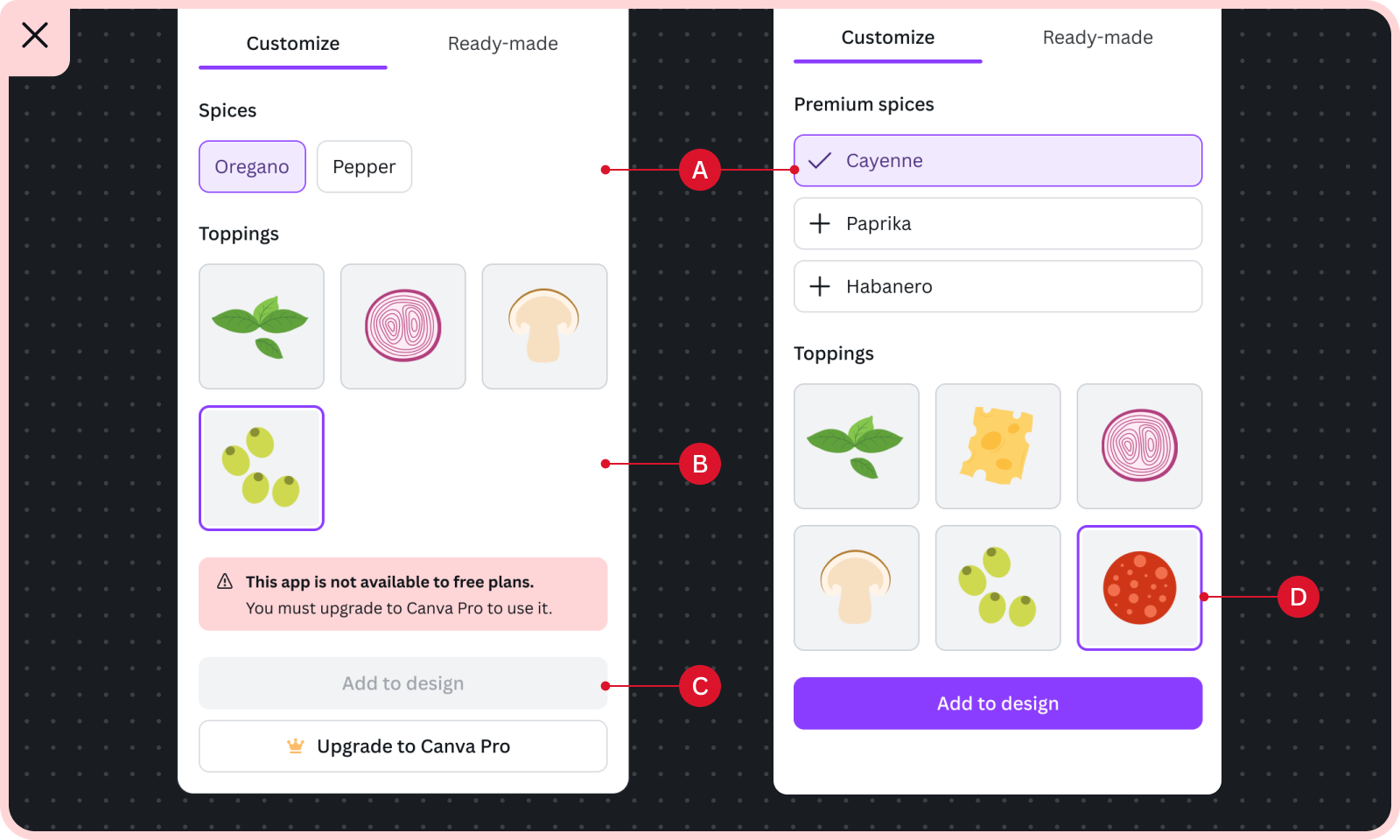
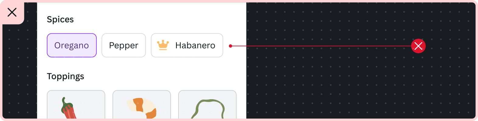
Premium crown icon
This icon must only be used to highlight premium features that are part of the Premium App Program.
The premium crown icon is used in a few different UI patterns. Its position, either before or at the end of the text, differs depending on where it's used:
- In a label: include the icon immediately after the label text
- In a button: include the icon immediately before the text
Include the icon immediately after the label text
When all input components under a label provide premium features, the premium crown icon are added after the label text. This aligns with Canva's native design pattern and provides better readability when the user scans the labels.
Free users are prompted with an upgrade dialog when they interact with the related input components under them.
Color selector labels
Premium features utilizing color selectors rely on their labels to describe the feature and visualize the differentiation.
Free users see the yellow premium crown icon. Clicking on the color selector will trigger the upgrade dialog.
Users on paid Canva plans see the grey premium crown icon and can use the color selector.
Form field labels
Form fields rely on the label to signify that it's a premium feature. Interacting with the related form input or control will trigger the upgrade dialog.
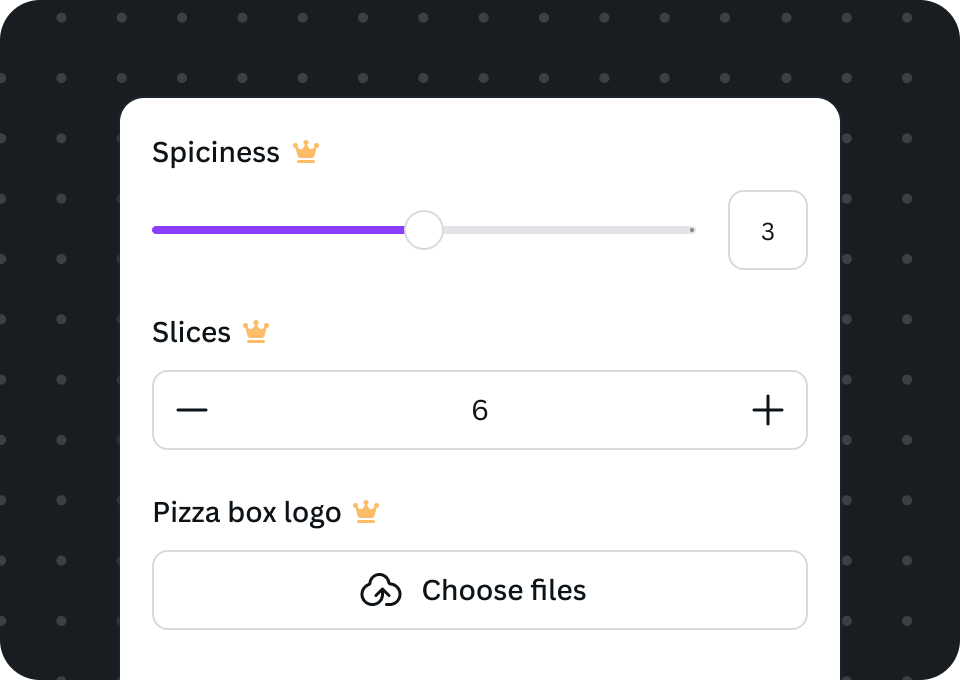
Free users see the yellow premium crown icon appended to the form field label. Clicking on the form input or control will trigger the upgrade dialog.
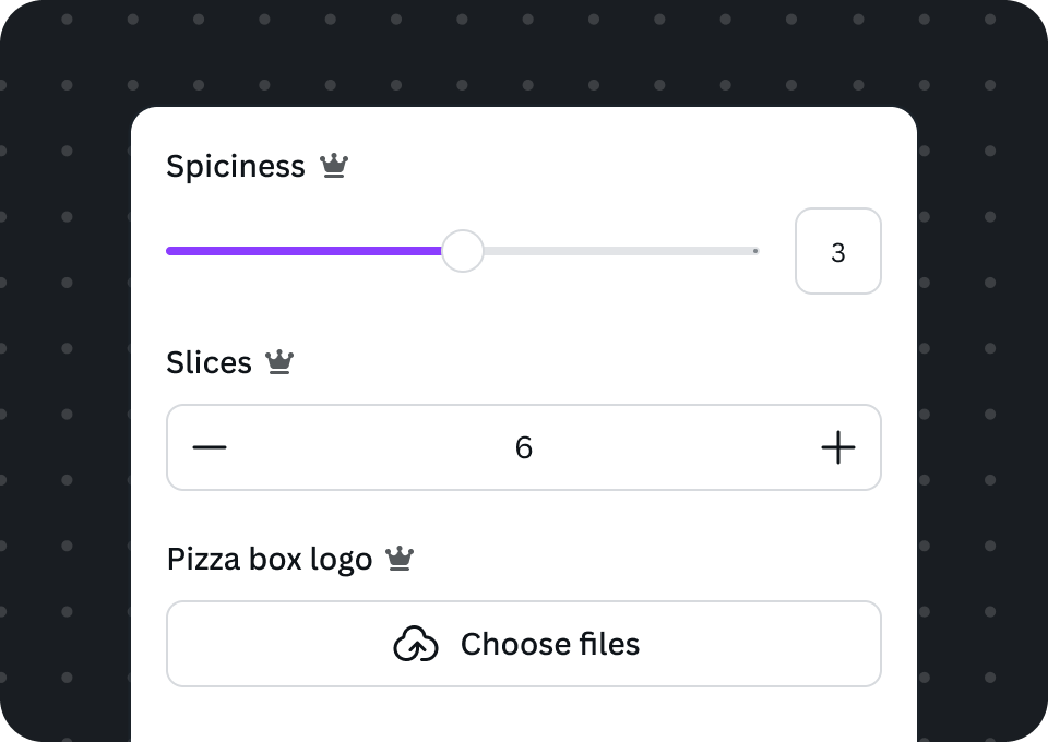
Users on paid Canva plans see the grey premium crown icon and can change the values freely.
Do
A Include the premium crown icon inlined at the end of the label text
B Do trigger the upgrade dialog when a free user interacts with the related input component
Don't
A Don't include the icon in the label when the related inputs have both free and premium options
B Don't trigger the upgrade dialog when the user clicks on the icon
C Don't disable the control or input component unless necessary based on the current context (an action is needed to re-enable it)
Switch labels
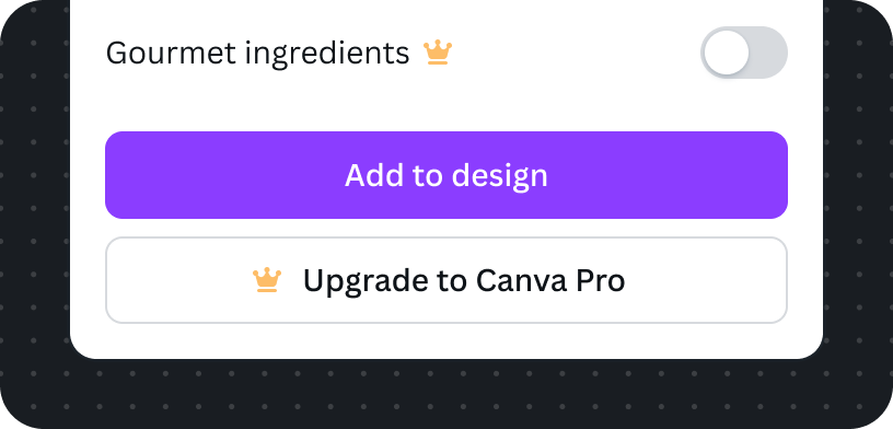
Free users see the yellow premium crown icon appended to the label. Clicking the switch triggers the upgrade dialog.
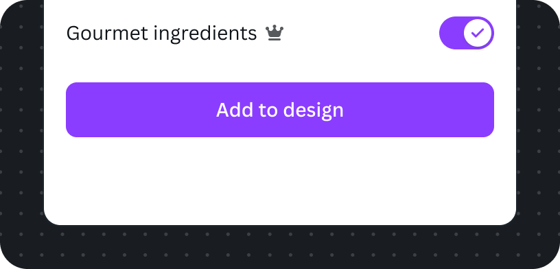
Users on paid Canva plans see the grey premium crown icon and can use the premium feature.
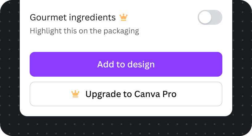
If additional helper description is absolutely necessary, still include the icon next to the label.
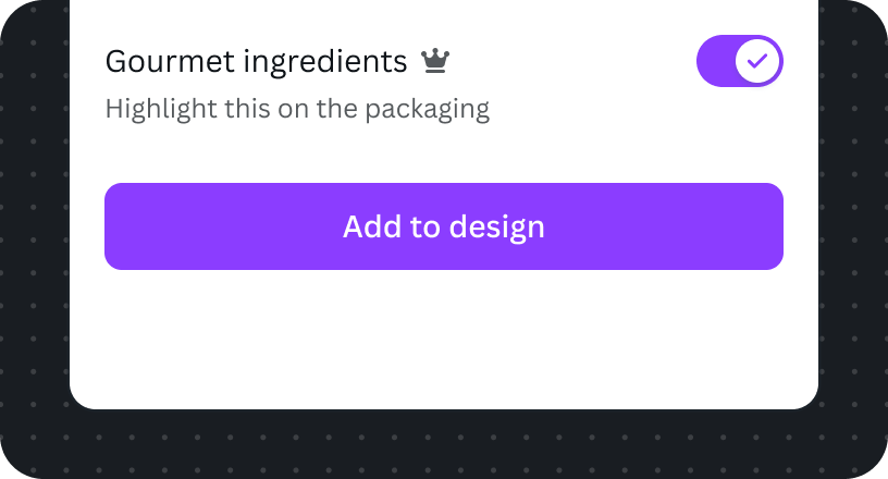
Also maintain consistent icon position for users on a paid Canva plans.
Added to the end of each option item
Premium crown icons are used to signify one or more premium options for checkboxes, segmented controls, and select.
Checkbox and checkbox group
Checkbox groups are stacked lists, so the premium crown icon is positioned to the far end of the premium option.
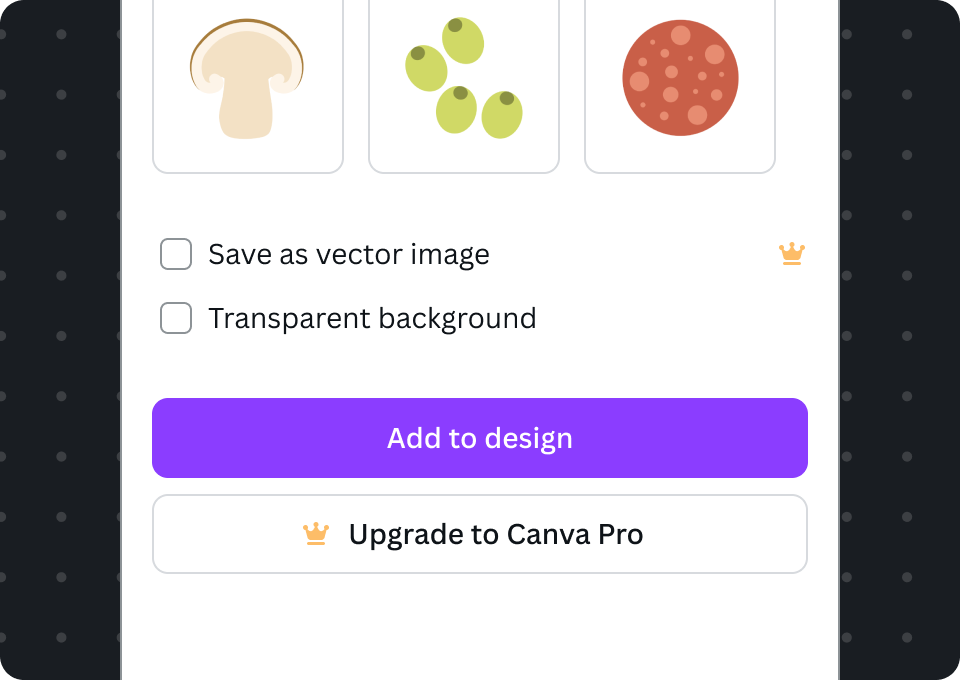
Free users see a checkbox with a yellow premium crown icon. Clicking on the checkbox will trigger the upgrade dialog.
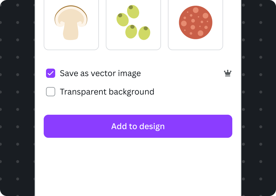
Users on paid Canva plans see the grey premium crown icon and are able to enable it.
Radio and radio group
The same icon position treatment is applied for stacked radio groups.
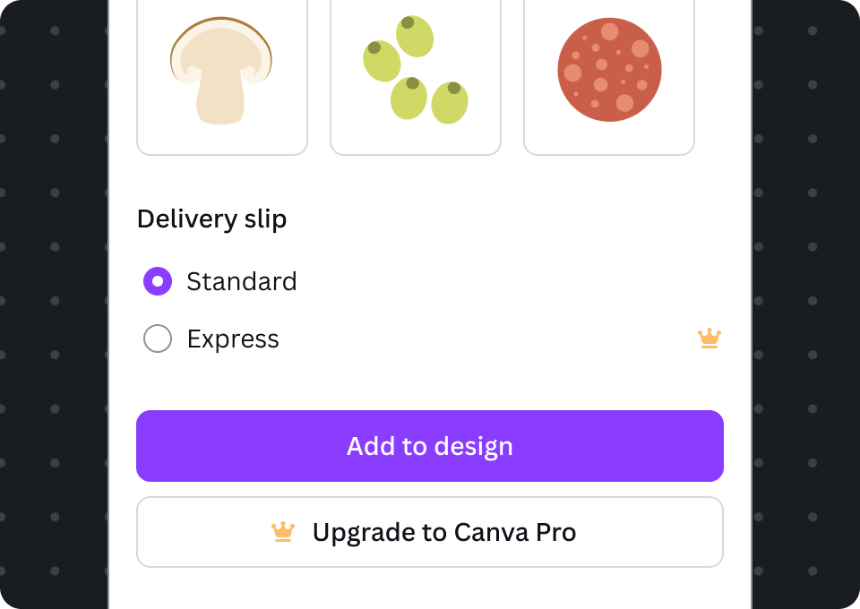
Free users see a radio with a yellow premium crown icon. Clicking on the radio will trigger the upgrade dialog.
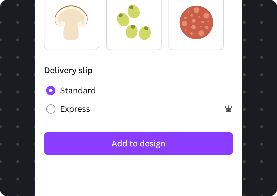
Users on paid Canva plans see the grey premium crown icon and are able to enable it.
Segmented control
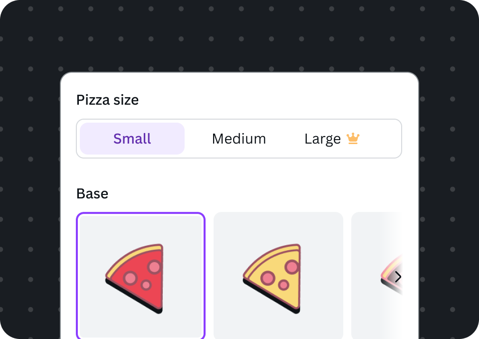
Free users see premium options with a yellow premium crown icon appended to it. Clicking on any of the premium options will trigger the upgrade dialog.

Users on paid Canva plans see the grey premium crown Icon and are able to select it.
Select
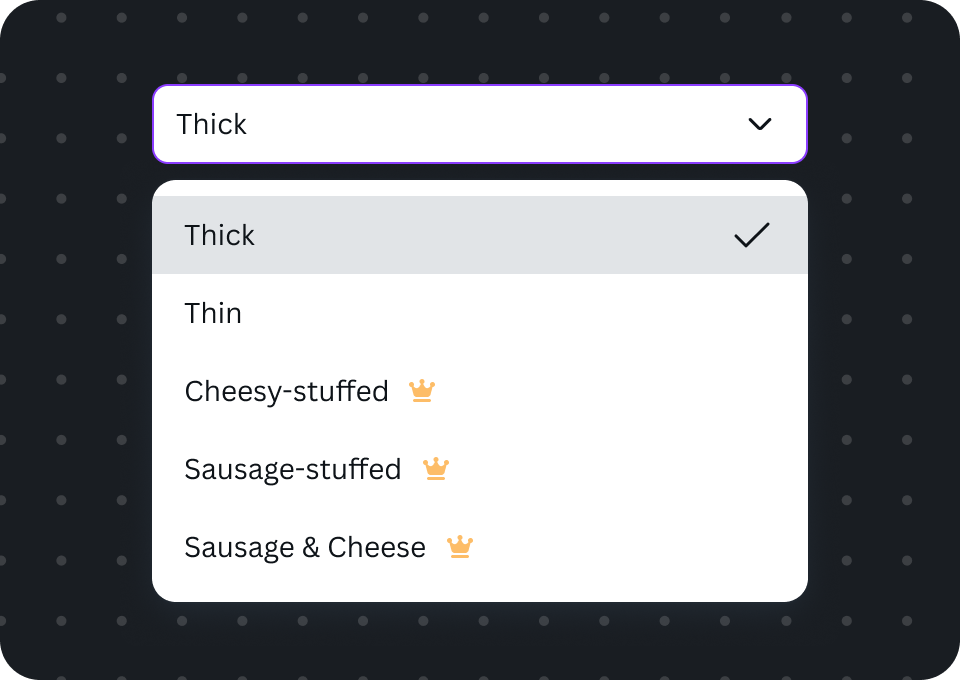
Free users see premium options with a yellow premium crown icon appended to it. Clicking on any of the premium options will trigger the upgrade dialog.
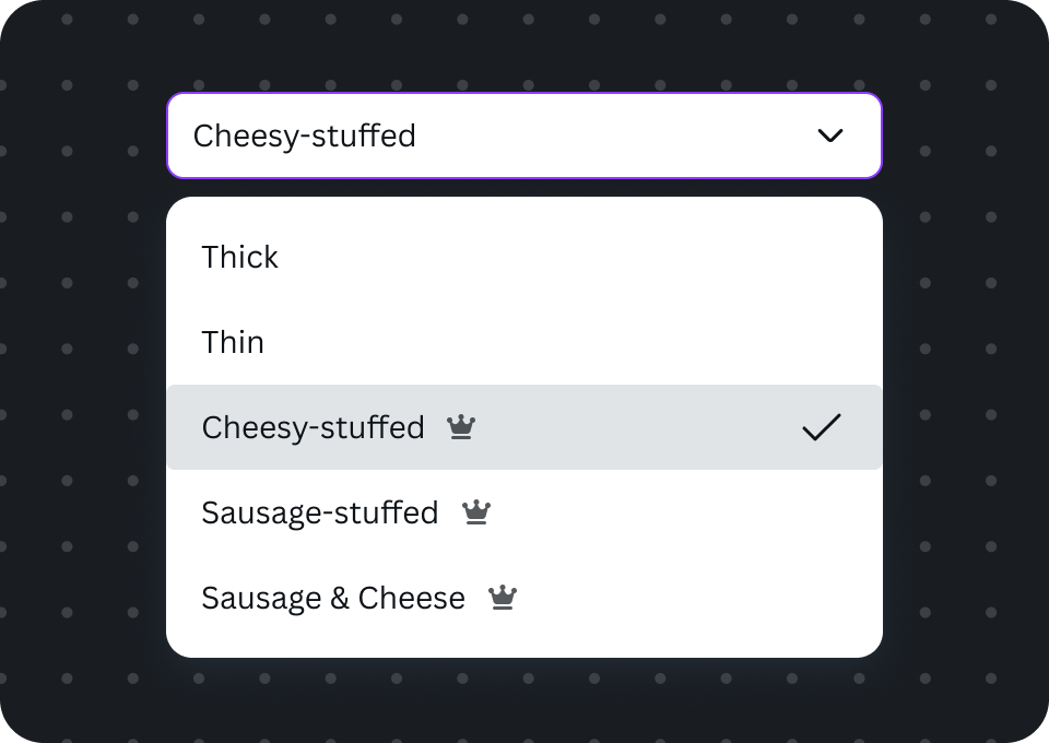
Users on paid Canva plans see the grey premium crown icon and are able to select it
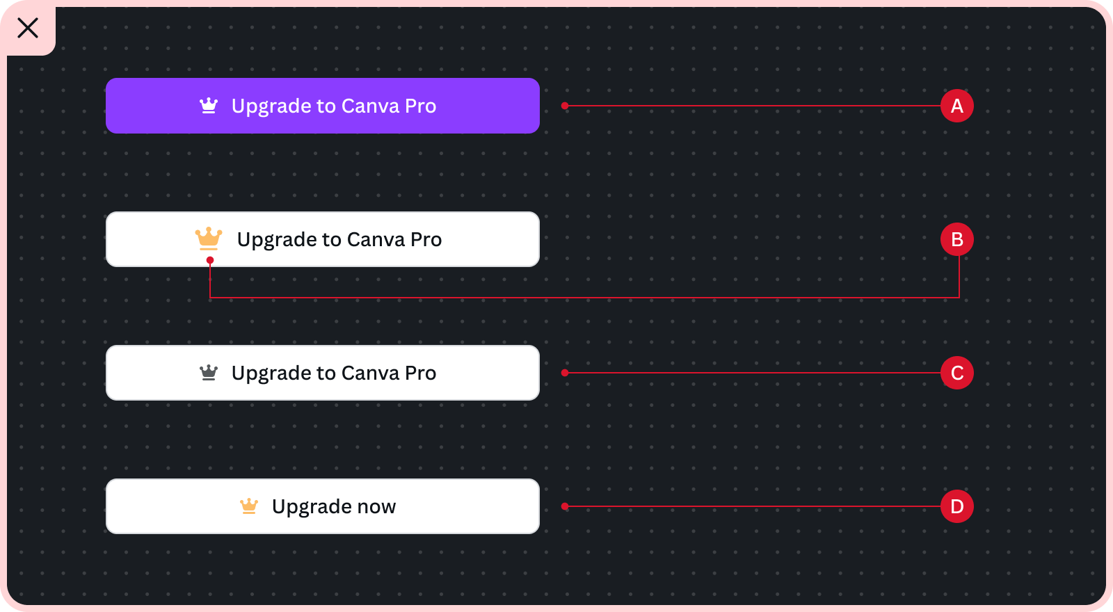
In upgrade buttons
Premium crown icons may also feature as the beginning decoration in upgrade buttons. When clicked, the upgrade dialog should appear. Use Upgrade to Canva Pro as button text.
Free users see the upgrade button
Users on paid Canva plans don't see an upgrade button so there isn't a need to display the grey crown.
In a menu list
Premium crown icons may also be featured in a list style within a drop down menu. The Pro crown should be positioned at the right end of the premium menu item. For free users, interacting with the premium item should trigger the upgrade dialog.
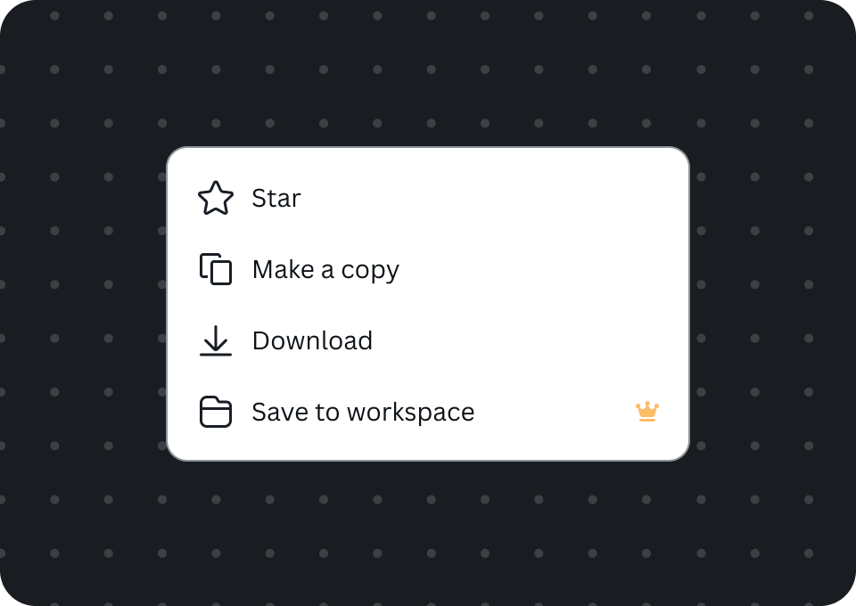
Free users see a yellow premium crown icon on the right end of the menu item
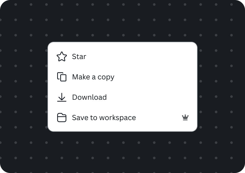
Users on paid Canva plans see grey crown and are able to interact with the menu item.
In font pickers
Canva's built-in font picker features the premium crown icon to signify premium fonts. This is a dialog that offers the most consistent and familiar user experience, with the upgrade flow already configured when a free user interacts with a premium font.
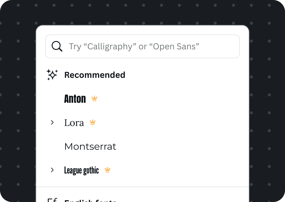
Free users see a yellow crown next to premium fonts
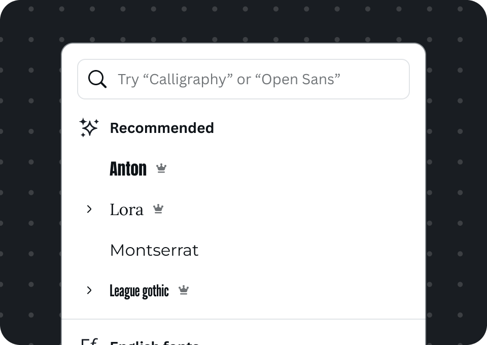
Users on paid Canva plans see the grey crown and can select premium fonts
Custom font picker
There may be cases where a custom font picker interface is necessary. When displaying premium fonts, it should follow the same pattern as shown in the built-in font picker.
Do
- Do append the icon to the premium font's name
- Do trigger the upgrade flow when the user selects a premium icon
Don't
- Don't allow free users to select premium fonts
In pills
Place the premium crown icon as an end decorator to highlight premium selections.
Inline pills
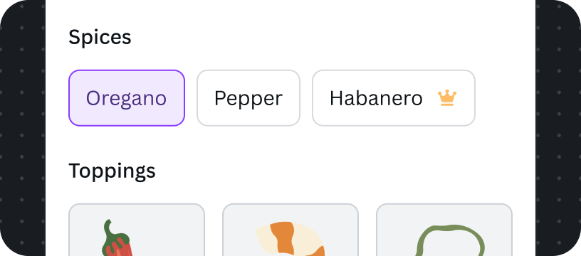
Free users see the yellow icon at the end of the Pill
Users on paid Canva plans see the grey icon, and they can select it.
Stacked pills
Free users see a yellow premium icon at the end of the pill
Users on paid Canva plans see a grey premium icon.
Do
- Do append the icon as a decorator at the end
Don't
- Don't position the icon before the text
- Don't change the icon's dimensions and colors
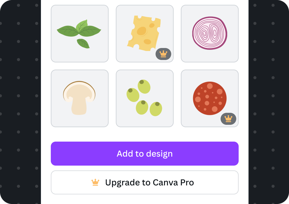
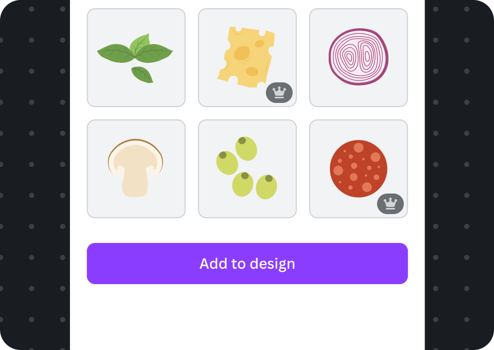
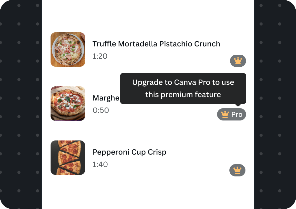
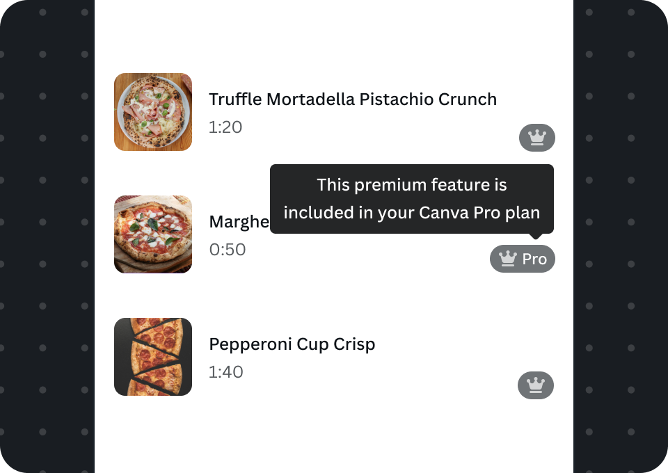
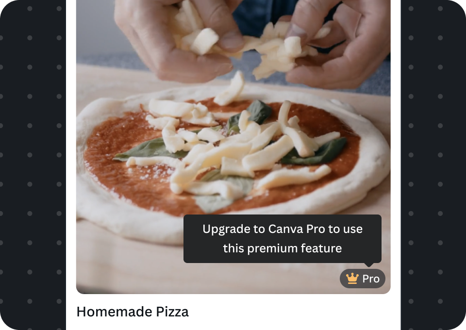
Pro badges
Pro badges are often overlaid on cards, and reveal pro text when hovered. Free users should be prompted with the upgrade dialog when they interact with the feature.
In cards
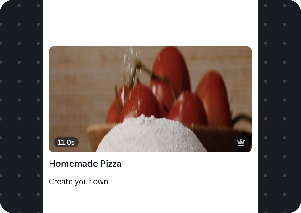
Pro badges are used in cards to signify a feature or content is premium to both free users and users on paid Canva plans. Always position the pro badge in the lower right corner of cards by using the bottomEnd and bottomEndVisibility props within the ImageCard, EmbedCard, VideoCard, and AudioCard.
Free users see the pro badge with yellow icon. Subscribed users see the pro badge with grey icon.
Audio cards
Free users
Users on paid Canva plans
Embed cards

Free users

Users on paid Canva plans
Image cards
Free users

Users on paid Canva plans
Video cards

Free users
Users on paid Canva plans
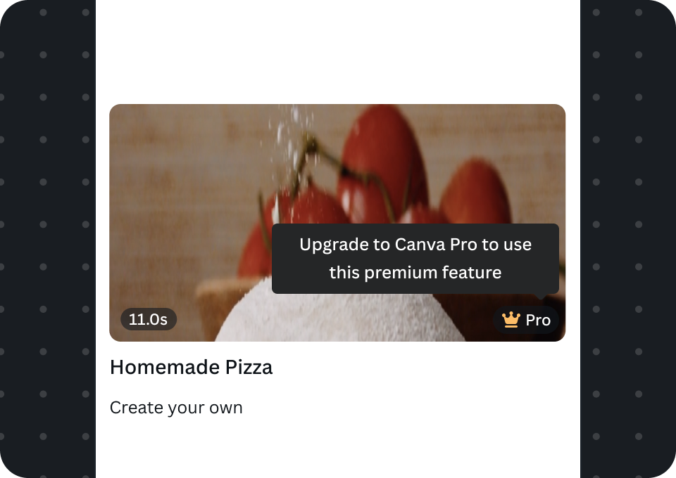
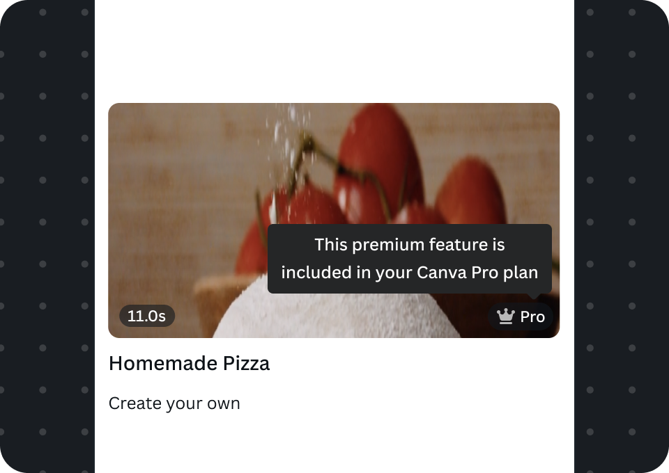
Show tooltip and "Pro" text when hovered
Tooltips and Pro text appear when badges are hovered in Canva desktop. This should communicate the user's current Canva plan and whether the feature is available to use.
For free users, the tooltip informs them they're interacting with a premium feature, which they can access after upgrading. For paid users, the tooltip informs them it's a premium feature included in their plan and they can use it.
Audio cards
Free users
Subscribed users
Embed cards
Free users

Users on paid Canva plans
Image cards
Free users

Users on paid Canva plans
Video cards
Free users
Users on paid Canva plans
Disassociate the crown icon from off-platform logins
The crown icon must only be used for premium features enabled by a paid Canva plan. When a user logs in to use features enabled by your off-platform subscription, you must use a different UI. The crown icon is part of Canva's native experience and this design pattern clearly informs the user what's included as part of their Canva plan.
Do
When a user is logged in to their off-platform account:
A Use a different UI, such as an 'unlocked' icon, to indicate a premium feature enabled by off-platform login, not by Canva
B Use a different badge to indicate a premium feature enabled by off-platform login
C Prefix credits with the app's name to emphasize these are off-platform credits, not Canva's
D Show the user they're logged in
Don't
When a user is logged in to their off-platform account:
A Don't use the crown icon
B Don't use the pro badge
C Don't forget to emphasize these credits are from the off-platform account
We don't have an established guideline for off-platform icons yet, so you're not limited to only use the padlock icon. As long as it doesn't conflict with Canva's crown icon pattern, use a design that provides the best possible user experience.
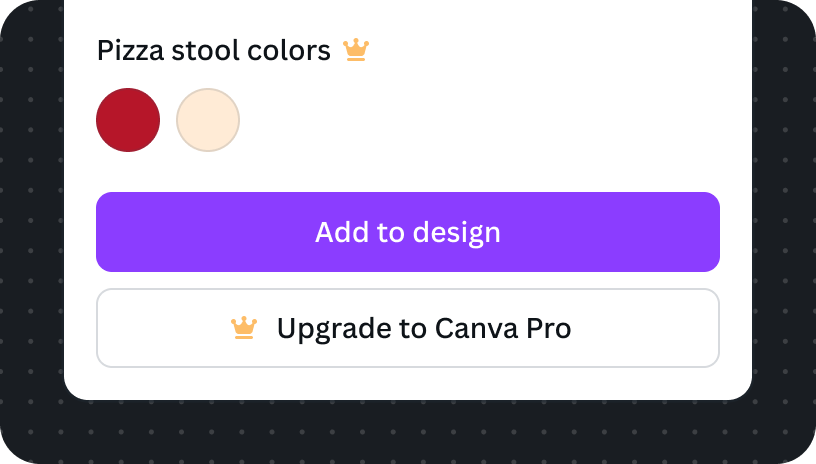
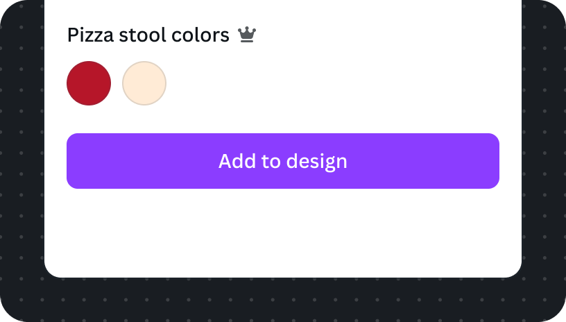
Upgrade button as a secondary action for free users
We should provide free users with an upgrade button. When users want subscribe to access premium features they should be able to easily perform the upgrade action. Although premium features are visually highlighted with the Premium Crown Icon, the upgrade button provides a clear action specific to performing an upgrade.
Do
A Ensure there's only one primary action
B Free users see upgrade button, in the secondary variant, immediately beneath the primary action
Exception: when your apps provides more than one action
If your app has more than one action you can opt-out of adding the upgrade button. We want the user to be focused on using the app's capabilities, so when there are multiple buttons we should ensure the app is easy to use, and avoid overloading the user with too many buttons.
Don't
A Upgrade should not appear as a primary action and distract the user from using the app's main feature
B Don't change the icon size
C Don't show this to subscribed users
D Don't change the button text