Layout
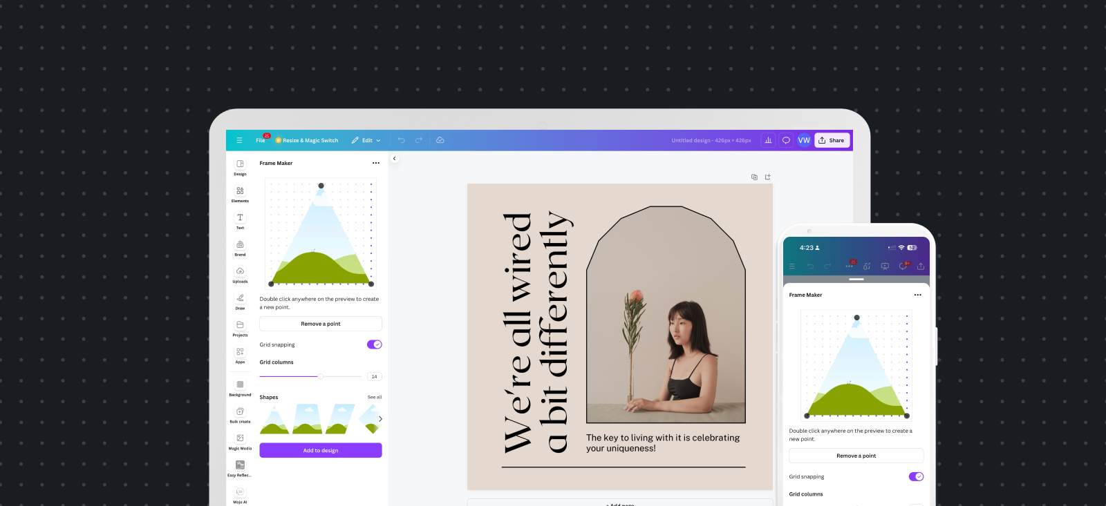
Apps are displayed in the app panel, part of the editor side panel. On desktop devices, the panel is roughly 350px wide and positioned (depending on the writing direction of the language in which you use Canva) to the left or right of the main editor. On mobile, the panel adjusts to the full width of the device.
Make sure to test your layout on devices of different widths to ensure you have appropriate text and content sizes across breakpoints, even on very narrow mobile viewports.
Arrange components vertically
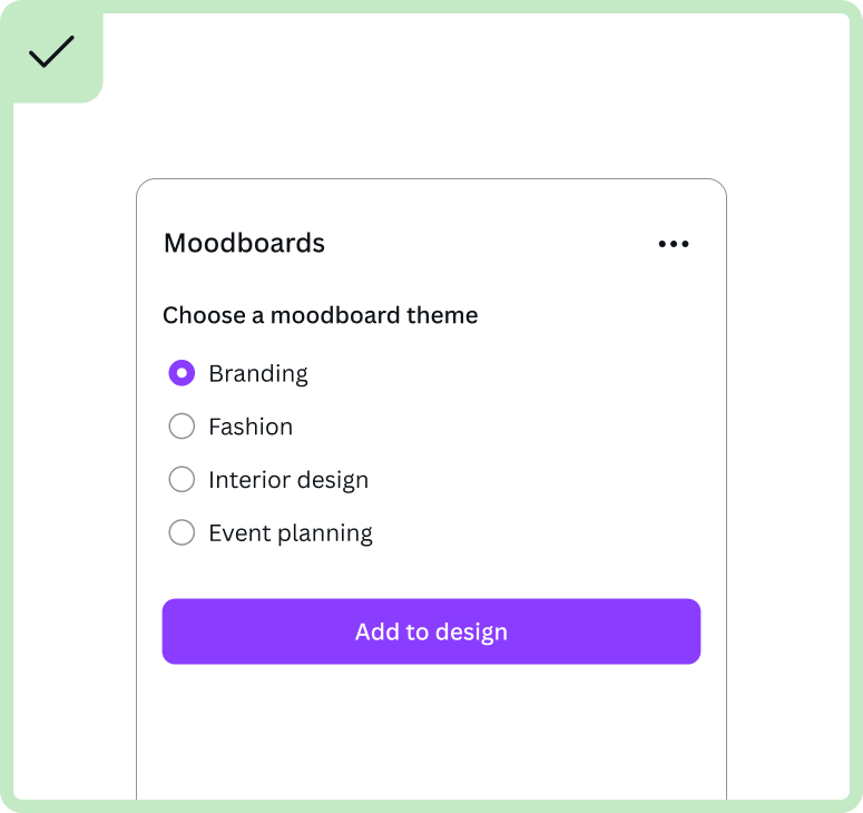
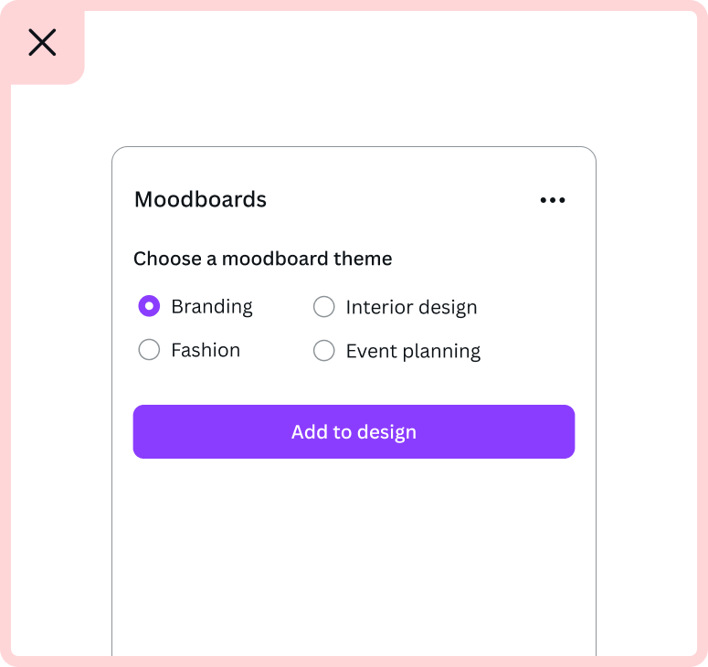
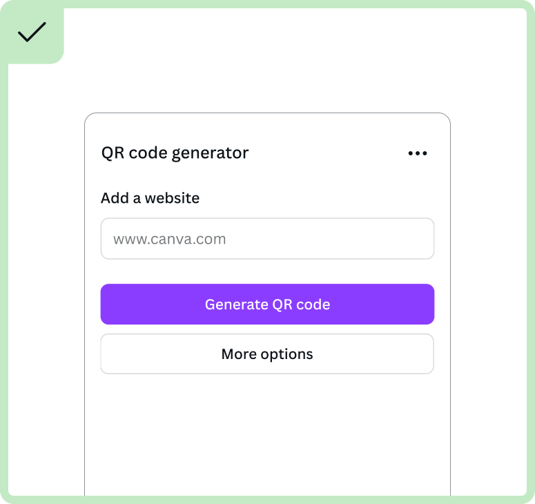
Because the width of the app panel can be narrow, we recommend stacking your components in a row layout instead of a column format, which can cause a narrow space to feel even more narrow. Don't be afraid to use vertical scrolling if there's overflow.
The best way to do this is with the App UI Kit's Rows component.
Use a grid layout for images
One exception to the previous rule is when your app shows a gallery of images or videos. In these cases, it's best to show a grid or inline layout, with more than one gallery item per row.
You may wish to use the App UI Kit's Columns component for these use cases, or build your own grid layout.
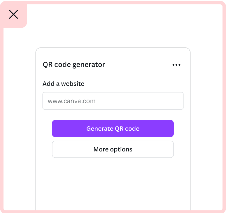
Use full-width buttons and components
Using the full width of the app panel for components like buttons and text boxes helps with the visual balance of your app. It can make your app feel simpler, cleaner, and easier to scan or read.
Avoid horizontal scrolling
UI elements may be too wide for the app's iframe, causing horizontal scrolling. Double-check to make sure there's no way for this to happen.
A subtle example of how this can happen is when an element, such as a textarea, is resizable. In these cases, constrain the max width of the element.
Avoid cropped elements
If an element doesn't cause horizontal scrolling, it may be cropped by the edges of the iframe. For example, without appropriate padding on the edges of the app, the outlines of elements may be cropped.
Avoid sticky elements
Generally speaking, avoid using sticky positioning. An exception to this rule is when it's important for an element (and the information it contains) to be visible at all times.
Avoid nested scrollbars
If an app has two or more scrollbars — one scrollbar for the iframe and additional scrollbars for elements inside the iframe — it can be a confusing and overly busy user experience.
To avoid nested scrollbars, take inspiration from Canva's Design tab. This tab has scrollable elements, but only one scrollbar. This works by increasing the height of the “scrollable” element as you scroll down the page, rather than making the element itself scrollable.