Errors & messaging
Crafting error messages
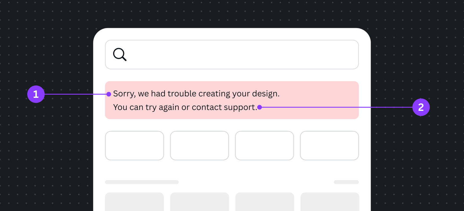
The two key components of an error message:
-
Tell users what went wrong. Be specific, but only when it helps.
Vague messages such as "We encountered an unknown error" or "Something went wrong" can be frustrating for users. We should also avoid being too specific, because general users can feel alienated by messages that mention "504 gateway timeout error".
If you don't know what went wrong, explain what you do know. You can usually say that what the user expected to happen, hasn't happened – for example, "We couldn't load your folders."
-
Tell them how to fix it (or what to do next). Let the user know what steps they can take to solve the problem – like trying again, or reloading the page.
Best practices
Using error messages
An error message should be a last resort. If a particular action (for example, clicking on a certain button) leads to an error, disable that action instead.
Avoid jargon
Use language that everyone from a 10-year-old to a grandmother will understand. Technical language may help explain an error to your fellow engineers, but it doesn't help our users.
Use humor and "cute" words sparingly
Messages that say "whoops!" are fine when a user does something wrong, but when it's a technical problem – like something not saving properly, for example – it looks like this frustrating issue isn't being taken seriously. Creating helpful error messages should be your priority. If you would like to add a bit of humor, make sure it improves the user experience.
Be positive
Words like "error" and "problem" can fill users with fear. Instead of writing "Bad request. Password is invalid", try something more positive, such as "That password wasn't right. Try again?" Never blame a user for an error.
Use contractions
For example, use "you're" and "we're". These sound more human and less robotic, which makes error messages seem less scary.
Avoid exclamation marks
These can make messages seem alarming or frivolous.
Example errors
Form and input
Scenario | Message | Why it works |
|---|---|---|
Incorrect date input value | The date input value is in the past. | This message is shown when a date input value, such as credit card expiry, has passed. It’s short because users only need this much information to know what to do next. |
Password reset link expired | Your password reset link expired. Please request a new one. | Tell the user what happened, then clearly inform them of what to do next. |
Auth
Scenario | Message | Why it works |
|---|---|---|
Server error | We couldn’t connect to {app name}. Our team knows we have a problem, and they’re already busy working on a fix. Check back soon to give this another try. | This message appears when an unexpected server error occurs. It acknowledges this is a server problem, so users know the cause, and the only solution is to come back later. |
Permission denied | We couldn’t connect to {app name}. We don’t have the necessary permissions. Please grant {access type(s)} access for this app to work. | This error occurs when users don’t grant sufficient permissions for your app to carry out its primary feature. It’s transparent about what permissions it needs and why they’re needed. |
Temporarily unavailable | We couldn’t connect to {app name}. Try again in a few moments. | This error occurs when there’s a server overload. Keep this message short, without specific technical details, but explain that users can try again soon. |
Catch-all fallback messaging | We couldn’t connect to {app name}. Try again in a few moments. | This is the fallback message to catch all possible errors. The messaging is short, and covers errors scenarios that don’t require error response effort, as well as error types that we can’t anticipate. |