Design guidelines
Fundamentals
Toasts
Guidelines for displaying short time-based notification
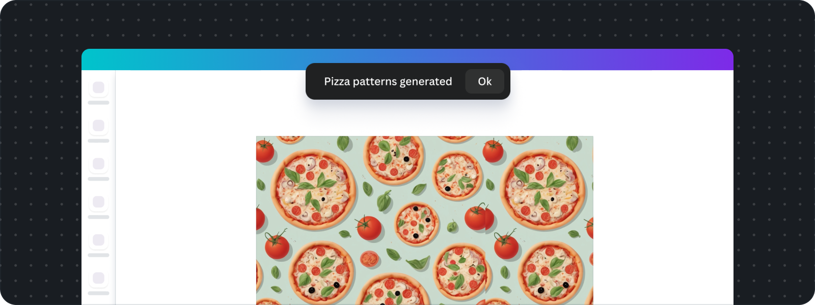
The toast component is a notification element triggered using the Notification API. It's designed to communicate brief, important messages—especially when your app's UI isn't currently active or visible (e.g., when the app is suspended). Toasts appear centered at the top of the screen and automatically dismiss after a short duration. They support a simple message and an Ok button for acknowledgment.
General guidelines
- Use when the app UI is unavailable:
- Toasts are ideal for communicating the status of background processes or actions when your app's UI isn't currently visible or mounted.
- When the app UI is visible, use alerts instead.
- Keep it brief and time-bound:
- Toasts are ephemeral by design. They auto-dismiss without user interaction—defaulting to 5 seconds, with a maximum allowed duration of 10 seconds.
- Only one toast can be shown at a time.
- Limit content to short messages:
- Toasts should contain a concise message—typically one line.
- Multiple lines may be used sparingly. Avoid complex or detailed content.
Do
- Keep messages short and clear: Aim for a single, concise sentence that users can read and understand quickly.
- Show only one toast at a time: Avoid stacking or queuing multiple messages—new toasts should replace the previous one.
- Adjust duration only when necessary: Extend the timeout only if the message can't reasonably be understood within the default 5 seconds (e.g., accessibility or longer content needs).
Don't
Here are the scenarios when you shouldn't use toast, and what you should do instead:
Scenario | What to do instead |
|---|---|
User input is required | Provide form input and actions in the app. You can't add interactive components in the toast. |
To confirm successful completion of an action that's already visually obvious | Avoid duplicate messaging. If the UI already changes to reflect the action (e.g., a design is saved, or an item is added to a list), additional toast is redundant and unnecessary. |
To queue multiple messages at once | Toast is limited to one message at a time. Try to condense to a concise message in the toast. If you need to display a backlog of actions you can render it in your app UI. |
To show long or detailed content | Toasts should be brief. If your message requires explanation, links, or multiple actions, render the details in your app UI. |
For user onboarding or announcements | Toast is reserved for system or app-level feedback, not promotional content. These details should only be done in your app UI. |
When accessibility timing is important | Avoid relying solely on toast for crucial info. Use an accessible region in the main UI that can be reviewed with screen readers or alternative tools. |