Design Publisher
This guide helps you design apps that use the Design Publisher intent to publish Canva designs to external platforms. You'll learn to design your app to publish seamlessly to external platforms, allowing users to configure, preview, and publish—all without leaving their creative workflow in Canva.
Video demonstrating the Design Publisher intent
Building with Design Publisher intent offers significant advantages:
- Easy setup: Canva handles the complex parts—export processing, page selection, media delivery, and output type selection.
- App discovery: Your app is discoverable by users contextually within Canva, increasing engagement and usage with your platform.
- Built for scale: Integrate across Canva surfaces. Whether users access Canva from desktop, mobile, or future surfaces, your app will have a seamless user experience.
- Focus on what matters: Spend your time building platform-specific features and optimizations, not wrestling with Canva integration mechanics.
Design Publisher foundations
These foundations guide the design of Design Publisher intent apps, ensuring a native experience across all surfaces—settings, preview, and post-publish—within Canva and your platform.
Identify your use case
Design Publisher intent accommodates various publishing experiences across industries and workflows.
- Social media: Publish visual content to Instagram and YouTube with platform-specific previews and the option for immediate publishing or scheduling externally on your platform, eliminating manual uploads to multiple platforms.
- External asset libraries: Publish designs to digital asset management systems (DAMs) and cloud storage enhances centralized content storage, organized file management with versioning, metadata, and tagging, and streamlines the workflow from design to publication.
- Enterprise workflows: Publish to business platforms, CRM systems, marketing automation tools, and enterprise content management, while integrating into existing business processes and remaining compatible with current workflows and approval processes.
- Digital publishing and displays: Publish to various digital platforms includes interactive digital magazines, virtual publications, multi-location digital signage, screen management, and scheduled content distribution and rotation.
And many more use cases to come as we continue to expand the capabilities of Design Publisher intent.
Complete the end-to-end journey
Understanding and building the complete experience helps you to ensure your app design enables users to achieve their publishing tasks.
- Complete design: The user has completed their work and is ready to share or publish it.
- Select publish option: The user opens an entry point, such as the share menu, and your app appears as a publishing option alongside other apps and native Canva features.
- Configure publish settings: The user enters platform-specific publish settings through your app.
- Preview: Checks how their design might appear on your platform.
- Publish: Publishes their design to your platform.
- Post-publish: View the published result on your platform.
You control 4 critical touchpoints in this flow:
- Declaring output types in the Canva-managed UI: What content formats your platform supports.
- Rendering App Settings UI: Platform-specific settings for users to configure.
- Rendering App Preview UI: Visual preview of what the published result might look like in your platform.
- Providing Post-publish URL: External link to view published content.
Understanding this flow helps you design each surface as part of a cohesive, integrated experience that feels native to both Canva and your platform.
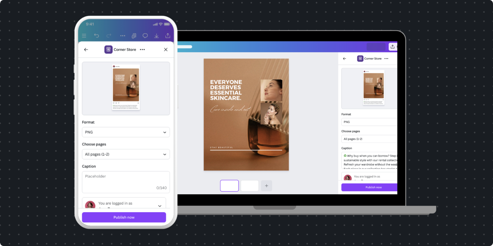
Anatomy and boundaries
A Design Publisher intent app consists of three core surfaces that work together to create a seamless publishing experience. Each surface has specific responsibilities and requirements.
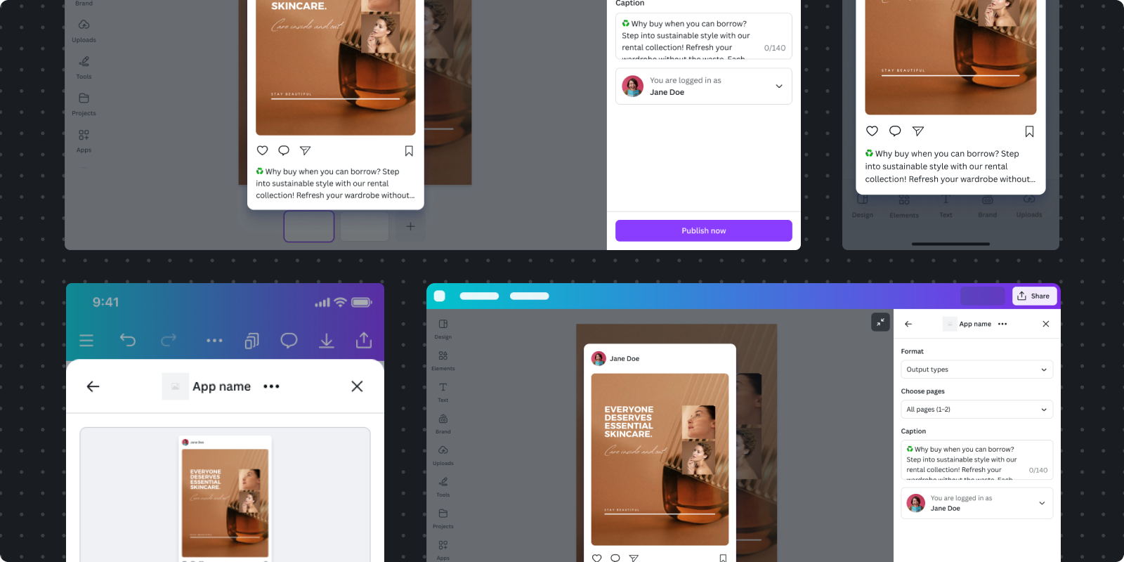
Right hand side panel
The right hand side panel is the primary interface where users configure their publishing settings. It's divided into two distinct sections: Canva-managed UI and your App Settings UI.
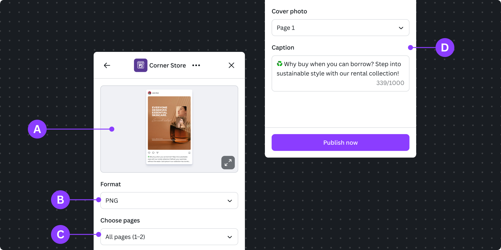
Canva-managed UI
Composed of settings controlled by Canva for proper export configuration. It includes:
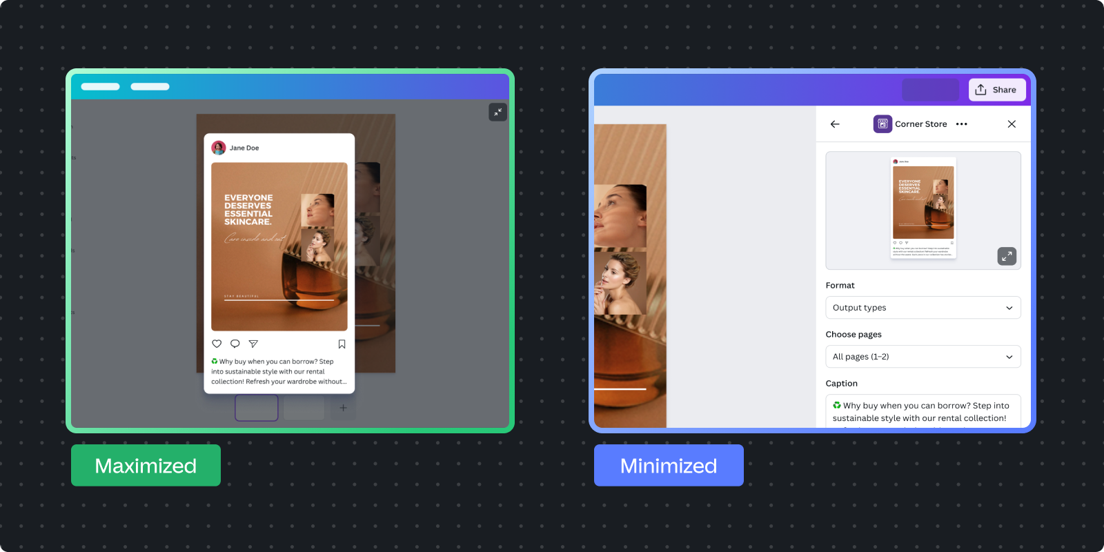
A Minified preview: Shows a minimized preview UI when the maximized preview is collapsed, with the option to expand it again. Note: For mobile, only minified preview is shown.
B Output type selection: Drop-down for output types (e.g., post square, post portrait, carousel) with validation against options.
C Page selection: Interface to select pages for export (e.g., single page for image/video, range for video keyframes) with validation to avoid incompatible selections.
App Settings UI
D Platform-specific settings: Composed of publishing settings specific to your app's platform requirements.
Do's
- Do adhere to Canva's spacing, padding, typography, and color tokens by using the UI kit
- Do have concise forms with essential fields only.
- Do use progressive disclosure for advanced options.
- Do mirror platform terminology for familiarity
- Do use verbs to indicate actions for clear, actionable labels for buttons.
- Do provide inline validation with helpful error messages.
Recommended practices for better settings experience:
- Do indicate character limits for text fields.
- Do use smart defaults based on analysis or past behavior.
- Do logically group related settings to reduce cognitive load.
- Do limit flyouts and overlays, preferring inline expansion and stacked layouts.
Don'ts
- Don't add competing primary calls-to-action; the Publish button is managed by Canva.
- Don't create new components unless absolutely necessary.
App preview UI
The App Preview UI builds user confidence by showing how their design will appear on your destination platform.
Users should be able to verify that everything appears correct before publishing. The App Preview UI should reassure them that settings are correctly applied, give an indication of the published result (though not pixel-perfect), and gracefully handle long loading times for media, especially videos, to build trust through transparency.
In contrast to the App Settings UI, which is constrained to the Canva design system, the App Preview UI is more flexible to align with your platform's design system.
Do's
- Do provide representative preview that indicates how the design will appear on your platform. The preview should be recognizable as your platform's style.
- Do use a transparent background. The preview container should have a transparent background so the Canva Editor shows through the semi-transparent overlay.
- Do handle all preview states gracefully:
- Loading: Show loading bar while preview generates
- Thumbnail: Show preview thumbnail initially for platform-specific requirements and performance (especially important for videos).
- Upgrading: Ensure the thumbnail and loading bar are still visible while the full media asset is being generated.
- Ready: Display the final preview
- Error: Show clear error message with recovery options
- Do maintain Canva fundamentals. Because the preview is rendered to look like your platform, it must maintain the design fundamentals as Canva:
- Accessibility
- Localization
- Light and dark mode
- Graceful offline support
- Responsive design (works with different viewport sizes and mobile devices)
- Do provide real-time updates: Preview should reflect current publish settings immediately. When users change caption, visibility, or other settings, the preview updates without requiring a refresh and minimal delay.
- Do communicate that previews are approximate: If your platform's legal or design guidelines require it, include explicit messaging that the final published result may differ from the preview.
Don'ts
- Don't add functionality: The preview is a static representation of the published result. Use the App Settings UI to make changes to the preview.
- Avoid unnecessary elements: Keep preview focused on the content. Don't introduce additional navigation, actions, or functionality beyond previewing the result.
Post-publish dialog
After clicking publish, Canva displays a confirmation dialog to close the loop and provide next steps.
Canva-managed dialog
Canva automatically displays a dialog to show:
Publish in progress
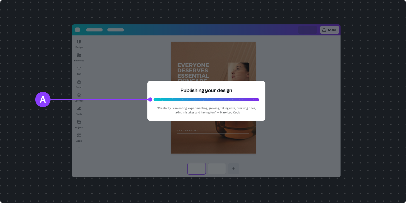
A Publishing progress indicator
Publish success
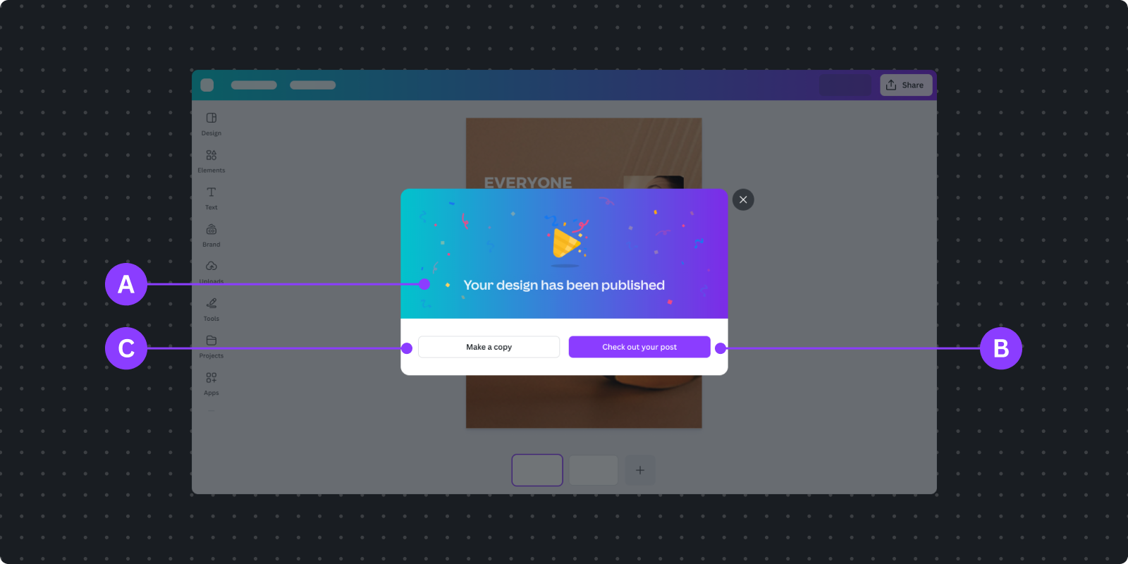
A Success message
B Primary action button (which you can extend with an URL)
C User can optionally choose to make a copy to work on a new design
Post-publish URL in primary button
It's recommended to extend the post-publish experience by providing a URL to your platform. This URL becomes the primary action button in the success dialog. It should link to the actual final state of the published content. For example:
Use case | Link to |
|---|---|
Social media | View published post |
Scheduled content | Where the scheduled item can be viewed or managed |
External library | The asset in the library or collection |
Enterprise system | The campaign, project, or workflow where the content appears |
Design patterns
These patterns address common publishing scenarios and provide guidance for creating streamlined user experiences in your app.
Authentication
Users need clear visibility into which account they're publishing to, and log out to switch accounts as needed.
Clear account indication
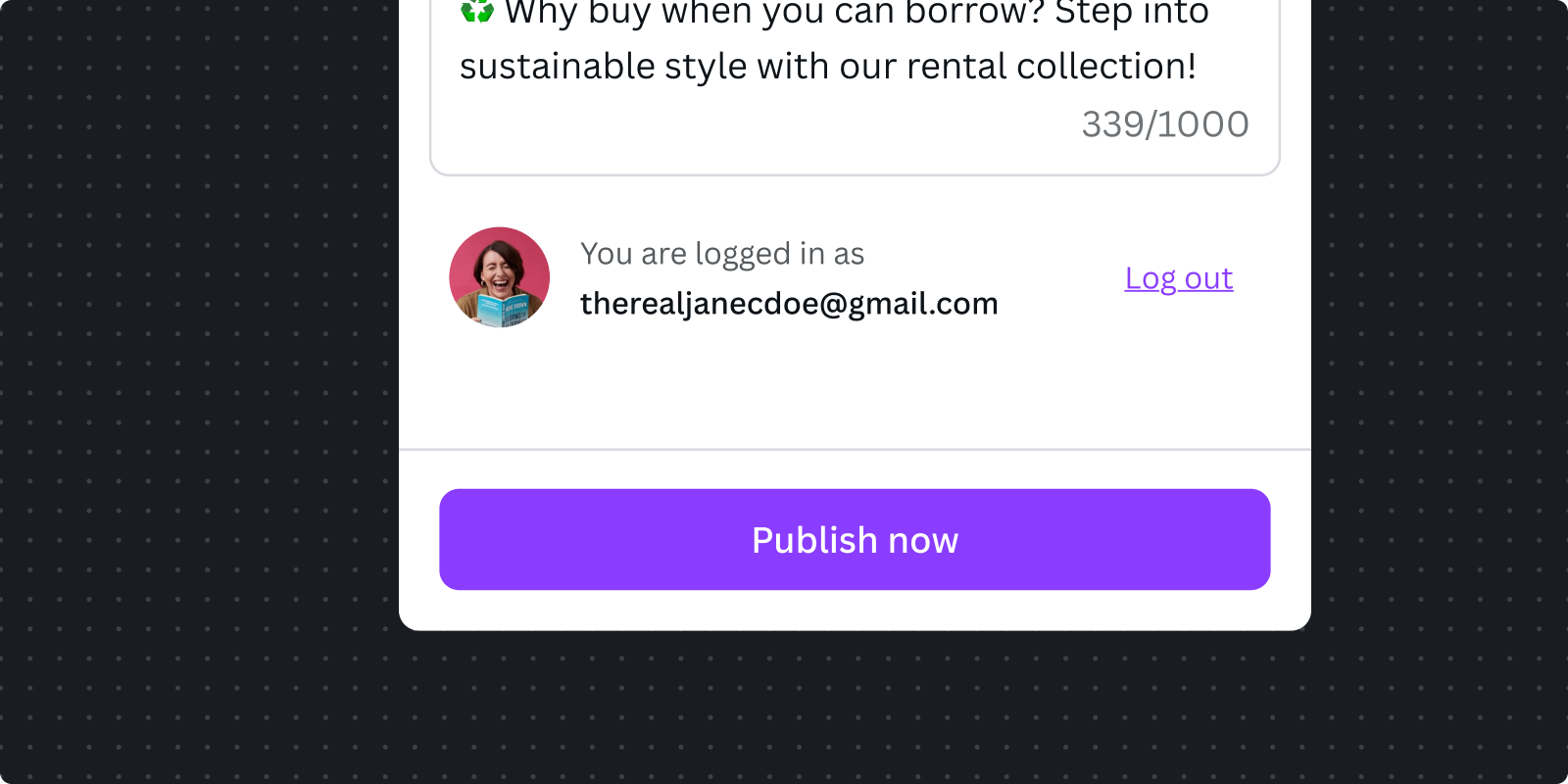
In your Settings UI, prominently show which account is currently active:
- Use recognizable identifiers (social media handles for social platforms, not email addresses).
- Display account avatar or profile picture when available.
- Keep account info visible while configuring settings.
Trigger when needed
You should allow users to continue using your app as much as possible until they need to authenticate to complete the flow. If there are form fields that depend on authentication, you should set expectations that these fields will be disabled until authentication is complete.
Complex authentication flows
If your platform has complex authentication requirements, you need to provide users with guidance on how to complete the authentication flow. For example:
- Personal vs. business accounts (for example, Instagram professional)
- Verification steps (for example, YouTube Creator verification)
Generally, you should allow users to continue using your app as much as possible until they need to authenticate to complete the flow. Refer to Authentication for best practices.
Instant publish vs. scheduling
Users need to understand clearly when their content will appear on your platform. Design your interface to communicate timing unambiguously.
The Design Publisher intent doesn't support Canva native scheduling yet, so you need to provide a way for the user to input the timing to schedule on your platform.
For instant publishing
By default, Design Publisher intent is designed to publish content immediately. You only need to make this more explicit if your platform supports scheduling.
For scheduled publishing
When your platform supports scheduling you need to provide a way to schedule and explicitly convey the timing to the user.
- Display the timezone clearly with date time input.
- Reflect the scheduled time in preview if your platform shows this.
- Use the user's local timezone by default with the ability to change.
- Link to the scheduled content in the post-publish dialog.
Preview loading states
Users should never wonder what's happening. Loading states provide feedback, set expectations, and maintain user confidence during processing.
During preview generation
Previews load at different times depending on content complexity:
For images
Do's
- Do show placeholder image while loading. You can use your platform's placeholder image.
- Do transition smoothly when ready.
For videos
Do's
- Do show placeholder image, if possible.
- Do display the loading progress bar.
Don'ts
- Don't use circle spinner, because videos are typically longer to load.
Error handling
Do's
- Do inform the user with error messaging, and allow them to resolve it by trying again (in case of errors that block the process from completing).
Don'ts
- Don't use circle spinner, because it doesn't provide a clear message of the error.
Testing and validation
Export format validation
Test that your app correctly handles all declared output types across different design scenarios. Verify that exported media meets your platform's specifications for dimensions, file size, and format. Test edge cases like single-page vs. multi-page designs, mixed content types in carousels, and extremely long or short videos.
Preview accuracy
Validate that preview UI indicates how content will appear on your platform. Test preview generation with various design complexities, page counts, and media types. Ensure loading states transition smoothly and error states provide helpful recovery guidance. Verify that preview updates in real-time when users change settings.
Authentication flows
Test complete authentication cycles including login, token refresh, and logout scenarios. Verify that users can switch accounts seamlessly and that authentication state persists appropriately. Test error handling for expired tokens, failed authentication attempts, and network interruptions during the auth flow.
Settings validation
Verify that all form fields validate correctly and provide helpful inline error messages. Test character limits, required fields, and conditional logic for fields that depend on other selections. Ensure smart defaults populate appropriately and remember previous user choices when appropriate.
Cross-platform compatibility
Test your app across desktop and mobile viewports to ensure responsive design works correctly. Verify that flyouts and overlays (if used) adapt appropriately for mobile constraints. Test on different browsers to ensure consistent behavior and appearance across Chrome, Safari, Firefox, and Edge.
Performance benchmarks
Measure preview generation time for different content types and complexity levels. Test with slow network connections to ensure graceful degradation. Profile memory usage during media processing and optimize critical rendering paths. Benchmark your app with realistically sized designs and media files to ensure responsive performance.
Implementation checklist
App correctly implements Design Publisher intent with appropriate output types and export validation
Settings UI uses App UI Kit components, shows essential fields only, and includes clear authentication state
Preview UI provides representative indication, handles all states, and updates in real-time
Error and loading states provide specific, actionable feedback at the appropriate context
App maintains Canva fundamentals (accessibility, internationalization, light/dark mode, responsive design)
Performance is optimized for preview generation and works smoothly across network conditions
Post-publish URL links to the published content on your platform