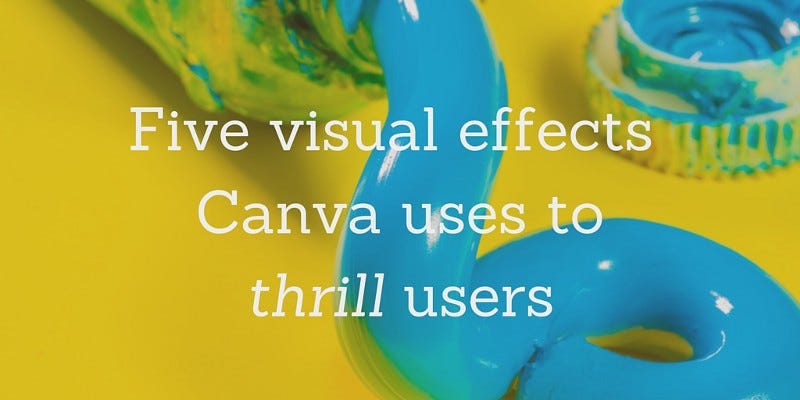
Visual Effects
5 visual effects Canva uses to thrill users
This article details five visual effects found in the Canva web application that exist to help achieve these goals of simplicity and fun.
Originally published by Chris Doble at product.canva.com(opens in a new tab or window) on May 16, 2016
Canva(opens in a new tab or window) is a graphic design tool built with the goal of helping everyone in the world create beautiful designs. That's a pretty ambitious goal because there's a huge number of people in the world and they all have varying levels of design experience — from professional designers to people who haven't used computers much before. To help all of them, Canva(opens in a new tab or window) must be simple.
Not only must it be simple, it must be fun. It's inevitable that an inexperienced designer will get frustrated. Maybe their design doesn't look how they imagined or maybe they don't know how to put their idea onto the page. Our hope is that a fun product will encourage users to persevere through this frustration and come out the other side with something they're proud of.
This article details five visual effects found in the Canva web application that exist to help achieve these goals of simplicity and fun. For each effect, I'll explain its design rationale, step through its implementation in CSS/JS, and provide a link to a CodePen demo.
Cursor trails
The first effect is found on Canva's login and signup pages(opens in a new tab or window). As the user moves their cursor around the page, the background is revealed. It's almost like rubbing steam off a mirror.
Why did we implement this effect? The signup page is likely to be a user's first interaction with Canva, so we want to make a good first impression. We want to intrigue them and show that Canva will be much easier and more playful than other software they might have seen.
Implementation
The effect is achieved by constructing a mask from the user's cursor movement, applying this mask to an image, and rendering the masked image over a blurred and darkened background.
Let's step through the implementation.
-
Create an in-memory canvas with dimensions equal to the window. This canvas will be used as the mask.
-
Attach a mousemove handler to the document. When called, it stores the cursor's coordinates and the current timestamp.
-
Join the mouse coordinates into a path and stroke it on the mask canvas with a blurred shadow(opens in a new tab or window).

-
Fade path segments to transparent after one second.
-
Vary the width of path segments based on cursor speed (calculated as the distance between adjacent points). Slow movement results in thick lines, fast movement results in thin.

-
Prepare a blurred and darkened version of the image that is to be revealed and make it the page background.
-
Add a canvas to the document with dimensions equal to the window.
-
Render the original image to the document canvas.
-
Render the mask canvas to the document canvas using the destination-in compositing operation(opens in a new tab or window) — this masks existing canvas content.
More/close button
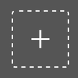
The first step to designing in Canva is choosing a design type, e.g. presentation, poster, or social media graphic. Users encounter this second visual effect in the design type selector. They are initially presented with a short list of frequently used design types, but can click a "More" button to see all options in a full-screen view. On clicking this button, it animates to become a close button at the top right of the screen.
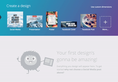
We implemented this effect for two reasons. Firstly, the data required to render the full list of design types isn't present on page load — it must be fetched via AJAX. Showing this animation gives users something interesting to look at while the request is in flight, improving the perceived performance.
Secondly, the animation draws users' attention to the close button, implicitly teaching them how to exit the full-screen view. Without the animation, they may not notice the close button and could become stuck.
Implementation
-
Transition from a dashed to solid border. But border-style isn't an animatable property, so how is this possible? An :after pseudo element shares all of the button's styles except it has a solid border. On hover and when transitioning to close, this pseudo element fades in, making the button's border solid.
-
Transition to border-radius: 50%, turning the button into a circle.

-
Shrink the width and height from 84px to 36px and slightly reduce the font-size.

-
Rotate 135 degrees, turning the plus into a cross.

-
Measure(opens in a new tab or window) the button's current position in the window.
-
Change the button's position from static to fixed in preparation for moving to the top right of the screen.
-
Set the button's right and top properties to lock it to the position measured in step 5.
-
Wait for these changes to propagate by calling requestAnimationFrame twice.
-
Clear the button's right and top properties, causing it to transition to its final position.
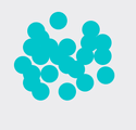
Bubble progress indicator
After the user has chosen a design type we poke the server to create a design. This usually takes a second or two, so we show a progress indicator.

It's obvious why this was introduced: to indicate progress. Without it, it's not clear what's happening — the page goes blank and the user wonders "Did Canva break?" or "Did I accidentally open a new tab?"
Implementation
The implementation is quite simple. It requires a container div for the large circle, child spans for the small circles, two animations, and a sprinkling of JavaScript to simplify repetition of the effect.
-
Show the small circles using an animation from transform: scale(0) to transform: scale(1).

-
Position them using left and top so they're not sitting on top of each other.

-
Stagger their appearance using animation-delay.
-
Vary their dimensions using width and height to better fill the circle.

-
Animate the large circle after all the small circles have appeared. Its background-color fades in to fill gaps, it grows 40% larger, and then fades out.

-
Combine the animations and add overflow: hidden to the container (and -webkit-mask-image for Safari).
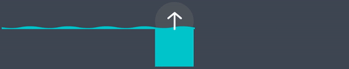
Porthole progress indicator
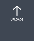
Users can upload images to Canva and use them in their designs — up to 50 can be uploading simultaneously and that can take a while to complete. The next effect is another progress indicator. It's styled to look like a porthole and it shows the overall progress of all uploads.

This indicator is always visible while uploads are processing, allowing users to navigate to other parts of the Canva editor and continue working on their design. It disappears with a transition users are likely to notice in their peripheral vision, notifying them that their uploads are complete.
Implementation
-
Show the progress indicator by fading the "Uploads" label to opacity: 0, scaling the porthole background to its natural size, and translating the icon down 10px to center it vertically.

-
Repeat an SVG background horizontally to create the water surface. An animation continually moves it to the right to simulate waves.
-
Using JavaScript, apply a transform: translateY(…) to the waterline such that it corresponds to upload progress.
-
Add overflow: hidden (and -webkit-mask-image for Safari).
Observant users might spot an Easter egg while their images are uploading.

This little duck went from off-hand comment ("Wouldn't it be funny if a rubber duck floated past?") to shipped feature because we wanted to give Canva personality, make it fun and to reward observant users with a small Easter egg that might brighten up their day.
It's implemented as an :after pseudo element that animates across the porthole when a particular class is present. If JavaScript's Math.random() smiles upon the user, the class is added and the duck appears.
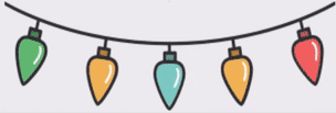
Christmas lights
The final visual effect is another Easter egg. It can be found in the "upload folders" feature, appearing when a folder is given a special name.
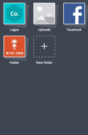
Like the rubber duck, this Easter egg was added to give Canva personality and make it fun. We hope that users will unintentionally discover it and they will love the product even more.
Implementation
-
Use border-image to show the Christmas lights, and border-image-repeat: round to ensure they are strung from corner to corner at all widths (like real Christmas lights).
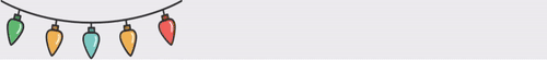
-
Use border-image-slice: 50% 0 to show the top half of the image on the top border and the bottom half on the bottom border (notice the different coloured bulbs).
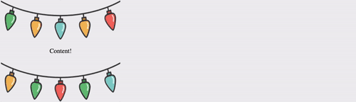
-
Apply an animation that alternates between the top and bottom borders.
-
Change the animation's timing function to step-start so it doesn't show intermediate border widths. This effectively results in a two frame sprite sheet using border images.
Conclusion
Those are just a few of the interesting visual effects we've implemented in Canva. While their implementations may be specific to our product, their design rationales are universal — all products should feel performant, let users get on with their jobs, and be fun to use.