Data-Driven Segmentation
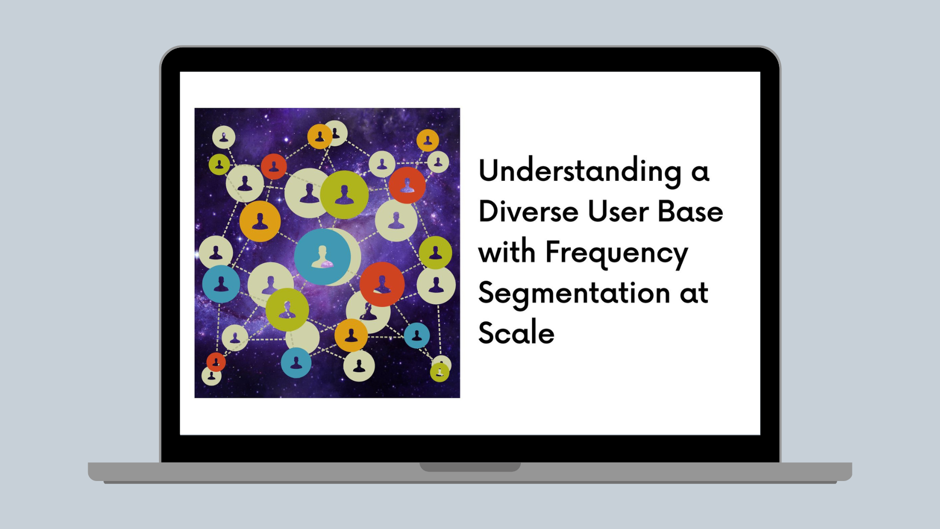
Understanding a Diverse User Base with Frequency Segmentation at Scale
How we developed a bespoke frequency-recency segmentation to understand our users' diverse usage patterns.
At Canva, our mission is to empower everyone to design anything. Over the years, the definition of "anything" has expanded: from social media material, resumes, and cards, to infographics, presentations, print, and video. Canva's user base is also diverse, with widely varying needs and usage patterns. We have marketers who make multiple social media posts per week, and casual users who only return every few months when they need to design a birthday card or invitation.
Canva continues to expand, most recently into the productivity space (see our new worksuite launches from Canva Create 2022(opens in a new tab or window)), and we hope that people can fulfill even more design needs through Canva and return to our product more frequently.
In this blog post, we'll walk through how Data Analytics is helping to steer this company's strategy. First, we'll cover how we segment users on a spectrum of less to more frequent, and how we account for inactivity. We'll then explain how we operationalized these segments, and some exciting applications we see across the company.
Buy-Till-You-Die models
To quantify the opportunity for nudging users towards a more frequent need, and to track whether we were successfully doing this over time, we needed to assign frequency buckets to each user. That is, which users typically use Canva weekly, monthly, or longer? Looking at existing research in this space, we came across Buy-Till-You-Die (BTYD) models(opens in a new tab or window). BTYD models are used in non-subscription settings (for example, someone purchasing from an e-commerce shop) to predict the number of purchases a customer will make in the future given their past transactions. For us, each day a user is active can be thought of as a purchase, and we're interested in estimating how often the user will be active (purchase) in the future.
The BTYD model we tested was the Beta-Geometric/Negative-Binomial (BG-NBD) model(opens in a new tab or window), which can be quickly fitted across millions of records using a few user-level features (other versions of BTYD models, like the Pareto/NBD model(opens in a new tab or window), require compute-intensive Bayesian model fitting). The inputs required were:
- Total days active: The number of days the user was previously active over their entire lifetime since signup.
- Days since first active: The number of days since the user was first active in the product.
- Last active time: The timestamp when the user was last active in the product.
The model can then output each user's Expected days active in the next N days.
Evaluating BG-NBD on Canva's use case
To assess model fit, we first computed user activity data up to a snapshot date, measured users' actual activity in a holdout period after that date, and finally measured the absolute error in the predicted versus actual active days. We had to make a couple of design decisions about our dataset, though:
- Evaluation period: We needed to choose an appropriate period for out-of-sample evaluation of the model. Because many users use Canva on longer time scales, the ground truth of their future activity might be incorrect if we choose a shorter period (seasonality also influences this).
- Mix of user tenures: Depending on the snapshot date chosen, we'd get a different mix of user tenures; in particular, due to retention effects, more tenured users make up a larger share of the user base as time goes on. As a result, the evaluation results might skew toward how well the model predicts the behavior of tenured users.
We chose a 400-day holdout period to account for a full year of activity, plus any holidays that occur at different times (for example, Easter). To address the second issue, we performed stratified sampling based on user tenure — this ensured evaluation results were stable and generalizable across the user base.
The mean absolute error rates seemed reasonable on the first pass — ranging from seven active days for our longest-tenured bucket of users, to 16 active days for newer users. It also made sense that the model could better predict future activity the more days a user was observed. But it's also common when evaluating BTYD models to split errors by historical frequency. For example, how well does the model predict future activity for historically very active versus less active users? Here's where we noticed an interesting pattern for historically less active users, which we show in the following error distribution plot.
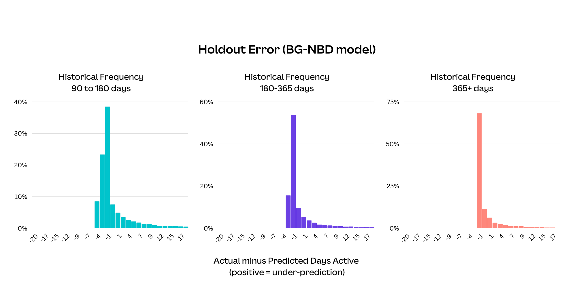
For users who were active on average once every 90—180 days, 180—365 days, and 365+ days, there is a long tail of the model underestimating future activity. Users who began using Canva more often are the likely cause of this. Because BG-NBD only takes the overall average frequency as input, it doesn't react quickly to users' frequency changes.
A key aim for us was to confidently identify movements to more frequent usage, so this was a major drawback for the BG-NBD model. So instead we designed a custom model that would give us more control over how to represent user activity.
Sliding-window frequency
We started by thinking of frequency as an average of inter-activity times instead of the total activity length divided by the total active days. The following is a visualization of the inter-activity timeline of an individual user.
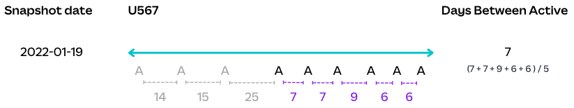
To capture frequency changes as they occur, we estimate future frequency as the average of the last five inter-activity lengths. Our choice of the window size comes from inspecting the stability of frequency scores over time at the user level, and the desire to recognize movements to weekly frequency (a key aim of the Canva Worksuite) within an experiment period, which is at most 5—6 weeks. In general, we think the window size would change depending on the product, how the company operates, and how this frequency score will be used in practice.
The following are examples of real users' inter-activity history and predictions for future frequency under the BG-NBD model and our sliding window approach.
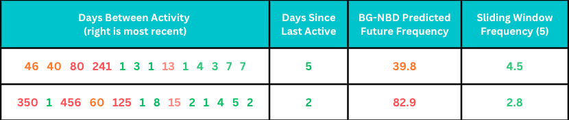
Both users have started to use Canva much more frequently, often multiple times a week, with inactivity periods of at most two weeks. BG-NBD estimates that these users would return once every month or once every quarter because of the influence of the large inter-activity lengths from the past. By contrast, our sliding window approach leads to much more intuitive estimates.
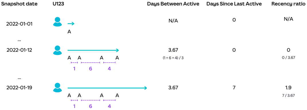
Recency ratio
Another group of users to consider is those who were active in the past but currently have a large period of inactivity. In the formulation of the BG-NBD model, there is a component that measures the likelihood of a user exhibiting any activity at all (based on their days since last active), which discounts the predicted future days active. We needed a similar mechanism based on our sliding window frequency statistic.
We decided on a simple but intuitive recency ratio: days since last active divided by estimated frequency. A ratio of one or below means the user currently behaves in line with their historical frequency, so we have reason to believe they'll return to Canva in the future. A ratio above one suggests the user has reduced their frequency or completely churned from the product.
To check that the formulation was statistically sound, we assessed its ability to predict churn. Creating a formal definition of churn for active users is difficult because of users having different cadences of use, but for this framework we defined it as having no activity within the next 400 days. We then fit a (univariate) power curve to map the recency ratio to a churn probability.
The dataset was created by binning the recency ratios observed in our training period. For each bin, we calculated the average recency ratio, and the proportion of users that had any activity in the 400-day holdout period. The power curve generally fits well across different recency ratio values. And user-level predictions achieved an ROC-AUC score of 0.73, which is comparable to the BG-NBD model's score of 0.76. Importantly, we found that the parameters of the curve remained similar even when fit across different periods, giving us confidence in the robustness of the model. This also means the curve doesn't need to be re-fit frequently from an operational perspective.
An interpretable frequency-recency segmentation
Now that we had fit-for-purpose methods to estimate future frequency and inactivity, we planned to define a prediction function for the expected future days active, and map this prediction directly to weekly, monthly, quarterly, and longer frequency buckets. However, we realized this would hide valuable information:
- Less frequent users: For users classified into a less-frequent bucket, are they using Canva consistently (albeit infrequently), or are they likely churners? We might not want to target users with high churn probabilities, so this distinction was important.
- Potential churn users: Can we distinguish between borderline churn probability users who used to be weekly users versus less frequent users and tailor messaging or offers accordingly?
- New users: Where are new users who are very active during their first week for a specific task but then leave, placed? Does this add noise to our weekly segment and make it less interpretable?
Instead, we decided to create segments based on combinations of frequency, recency, and tenure values:
- Frequency: We bucketed the sliding-window frequency value into weekly, monthly, quarterly, and longer than quarterly. Note we don't adjust the frequency based on the probability of churn; we want to preserve each user's activity before they potentially churned or started using the product less frequently.
- Recency: Based on a cut-off for the churn probability (and hence recency ratio), we divided users into alive versus potential churn. We can be more fine-grained here, but found having two categories helped reduce complexity for reporting and was adequate for targeting.
- Tenure: We separated users within their first month because frequency patterns take time to emerge. Many of these new users have fewer than six active days, and while we can still calculate frequency scores for them, these estimates are likely to be more volatile and noisy.
This resulted in the following human-interpretable segments we could reason about and research further.
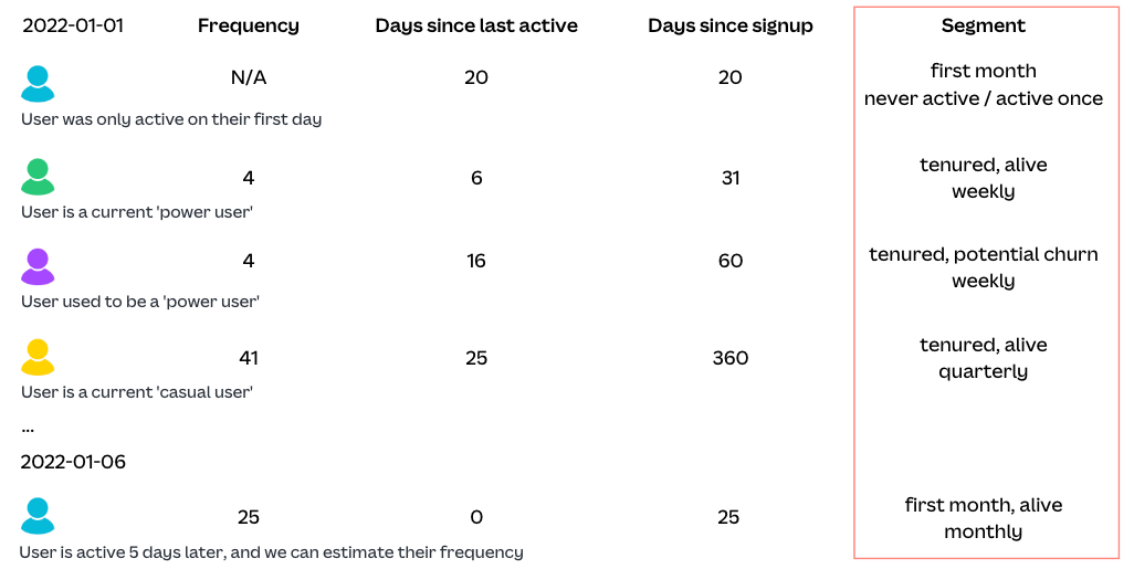
Note we also separate out users who have never been active or have only been active on one day. This is because estimating their future frequency requires additional information and modeling and we'd likely have different strategies when targeting these users anyway. For example, we promote tutorials that help them to complete their first design, instead of showcasing advanced features.
Operationalizing frequency-recency segmentation
We implemented this segmentation pipeline in our Snowflake warehouse using SQL and dbt(opens in a new tab or window). We could implement our frequency and recency features entirely in SQL, allowing us to easily scale the pipeline to hundreds of millions of Canva accounts, measuring not only users' current snapshots but also movements between segments throughout their lifetime. Having a full history of movements for every user, in particular, enables high-value analyses such as finding the frequency shift drivers, and identifying heterogeneous treatment effects in A/B experiments. We'll go into more detail below about how we've used Frequency Segmentation in our Product and Growth orgs.
Our use cases broadly fall under four pillars: tracking dashboards, exploratory analyses, experimentation, and product and marketing targeting.
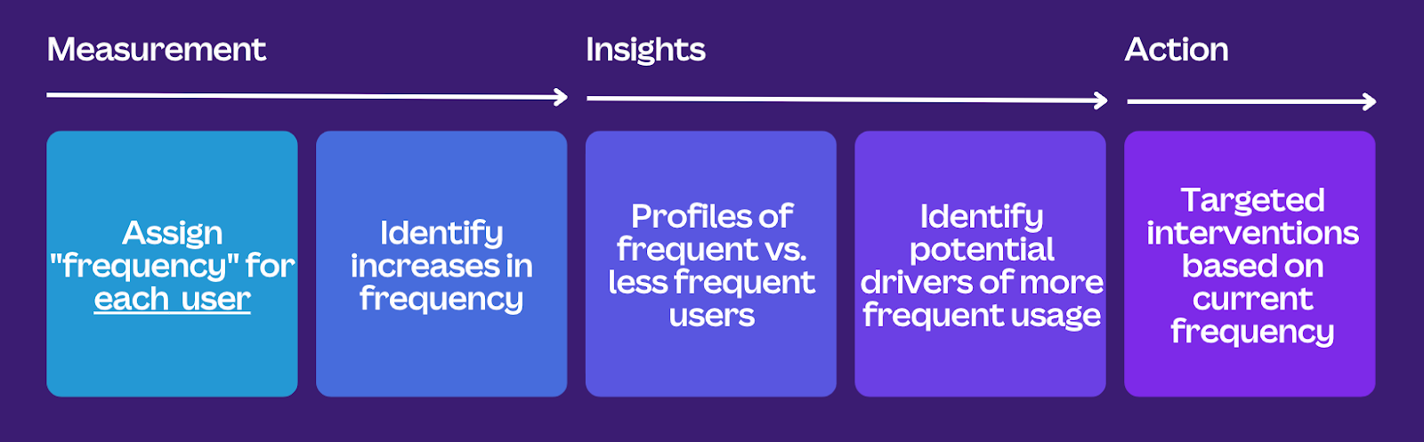
Tracking dashboards
As a first step, we built new dashboards to track the frequency composition of our user base over time. This provided visibility into usage frequency at Canva, for example the proportion of Alive Weekly, Monthly, Quarterly, or Longer Than Quarterly users, as well as the transition rates between different buckets over time.
Exploratory analyses
Next, we performed simple descriptive analyses to understand the frequency distributions of different user segments, which helped confirm some high-level, intuitive hypotheses. For example, users on our paid plans are more frequent users than those on free plans, and users with a predominantly social media-focused use case are our most frequent users.
In addition, we partnered with both Machine Learning Engineers and Design Researchers to derive additional quantitative and qualitative signals about frequency transitions. Working with our Machine Learning Engineers, we developed propensity models to identify the top drivers of positive and negative frequency transitions. Meanwhile, our Design Researchers interviewed users who recently transitioned to a more frequent bucket to understand their actions and motivations. Together, these insights helped us form further hypotheses on product nudges that may help drive users towards more frequent usage.
Experimentation
We have an ongoing program of work to validate these new product hypotheses with A/B experimentation. We developed new experiment metrics that measure transitions to more frequent buckets, so we can identify changes that successfully move the needle on frequency movements.
Where relevant, we also segment metrics by power versus casual users, to understand whether they respond differently to specific product changes. For example, we recently found that our Learn & Play tutorials successfully drove increased usage of certain tools for our power (Alive Weekly) users, but not for casual (Alive Quarterly or Longer Than Quarterly) users. In response, we're investigating how best to target and personalize the experience for users depending on their frequency of use.
Product and marketing targeting
To target our product flows and marketing, the core idea is to leverage real time frequency of use information, to surface tools, templates, tips, and other content at the right time, for the right user, in a relevant and contextual manner. We have much more work to do in this area, so watch this space!
What's next?
Top of mind for us is propagating this segmentation framework across Canva, as both an analytics and a personalization tool. This might mean tweaking the modeled behavior (for example, understanding and benchmarking typical frequencies for our newer design types like Whiteboards and Docs). There are also many methodology improvements we'd like to explore, such as using statistical models to increase the accuracy of churn predictions, and time-series analysis to get a finer understanding of usage patterns (for example, users with bursts of activity).
Acknowledgements
Our work here largely builds on the original research by Nick J. Hughes(opens in a new tab or window) and James Frankel(opens in a new tab or window) looking at user retention and how frequency-of-use drives user growth. Another huge thanks goes to our partners in Product and Growth: Christophe Capel(opens in a new tab or window) and Anshul Patel(opens in a new tab or window), who sponsored this analytics effort and provided valuable feedback on practical use cases for the framework and how to gain adoption. We also thank Tom Schlosser(opens in a new tab or window), Paul Tune(opens in a new tab or window), and Grant Noble(opens in a new tab or window) for their thoughtful reviews of this post.
Interested in improving our products with data? Join Us!(opens in a new tab or window)