App Component
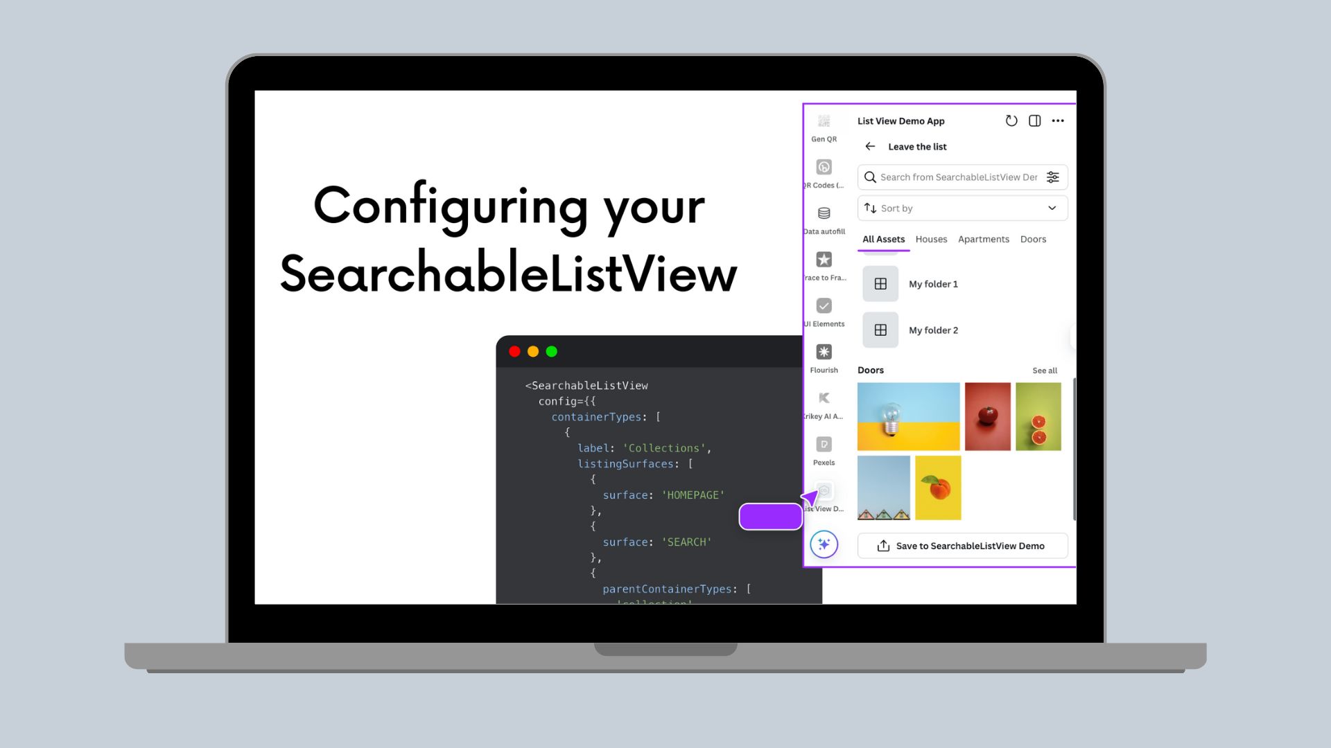
Configuring your SearchableListView
Your guide to all of the properties of the SearchableListView app component configs
SearchableListView is a super powerful component available in the Canva Apps Components. It started off powering digital asset management(opens in a new tab or window) uses cases, but we have discovered it can be used in a much wider variety of implementations, from supporting real estate marketing, Ads content creation, and more. You can quickly get access to the SearchableListView component by using the DAM template available in the Canva CLI.
Looking at the configurations alone of the SearchableListView component may seem overwhelming. Using our Storybook(opens in a new tab or window) can help you visualize how changing each property impacts the layout, but you may still have more questions about the properties. We’re here to help break it down.
Let’s dive into the config property for SearchableListView.
Service Name
serviceName is the name used to display in the component header.
serviceName: “Demo App”
More Information Message
moreInfoMessage enables you to provide additionally information about the app such as limitations or clarifications on usages. It is optional, and accepts a text string.
moreInfoMessage: "This app is for demo purposes only",
Resource Types
resourceTypes lets you to define which individual assets or files that are part of your list. These can include Images, Videos, Audio, or Embeds. This should be an array of strings.
resourceTypes: ["IMAGE"],
Resources Per Page
resourcesPerPage defines the page size of resources (images, videos, embeds, audio files) requested on load. This accepts a whole number.
resourcesPerPage: 50,
Layouts
layouts defines how those resources files/assets are displayed. There are certain allowed combinations. This property accepts an array of strings, but there's a limited set of layouts you can define. Layouts can be List, Masonry, or Full Width. List and Masonry can be used together, but full width layouts can't be combined with any other layout type.
layouts: ["MASONRY", "LIST"],
Container Types
containerTypes are used to define how assets should be organized, and are optional. If you don't need folders, sections, or containers, you can omit this property. Containers allow you to add structure to your list view. Without them, your list will simply just display all the assets.
Container types take in an array of objects. A container object contains value, label, listingSurfaces, searchInsideContainer properties. Label and value take in a string. The label will be the display value for the container. The value is used to sort the data.
containerTypes: [{value: “”,label: “”,listingSurfaces: [{}],searchInsiderContainer: { enabled: BOOL },},...]
listingSurfaces takes in an array of objects that include the surface and optional parentContainerTypes. The surfaces can be HOMEPAGE, SEARCH, and CONTAINER. These define where a container can be.
- If you include Search, that container type will show up in search results
- If you include Homepage, that container type will show up on the homepage of the app
- If you include Container, that container type can show up inside other containers
- If you include Container, you will also need to specify the
parentContainerTypeproperty which accepts an array of strings from the Container Typesvalues. This determines what containers that container type can show up in. For example, maybe folders can be inside other folders, but section can't be in any other containers.
- If you include Container, you will also need to specify the
listingSurfaces: [{surface: “CONTAINER”,parentContainerTypes: [“”],}]
searchInsideContainer defines if search is enabled inside that container.
containerTypes: [{value: "section",label: "Sections",listingSurfaces: [{surface: "HOMEPAGE"},{surface: "SEARCH"}],searchInsideContainer:{enabled: false},},{value: "folder",label: "Folders",listingSurfaces: [{surface: "HOMEPAGE"},{surface: "CONTAINER",parentContainerTypes: ["folders"]}],searchInsideContainer:{enabled: false},}],
Containers Per Page
containersPerPage defines the page size of containers requested on load. This accepts a whole number.
containersPerPage: 10,
Tabs
tabs lets you to define custom implementations of container and resources. When you define tabs, it will overwrite the default layout of the list, meaning container types unless specified won't automatically show up as a panel. This is useful when the default resource or containers from your data source don’t directly match the best flow or layout for your users.
Tabs accepts an array of objects, where each object will define label, value, type, and containerTypes or resourceTypes if needed. Tabs can include just containers, just resources, or both. If you do specify the type as container, you will need to include the container types that tab will include.
tabs: [{label: “”,value: “”,type: “”,}]
The value will be the displayed name of the tab to the user, the value being the id for filtering and sorting. The types can include RESOURCES, CONTAINERS, and OVERVIEW.
- Overview will include both resources and all container types.
- Containers must have an array of strings of the
containerTypesto include. Use thevalueprovided in thecontainerTypesarray to specify which should be included. You can only include 1 container type. - Resources have an optional property of
resourceTypes. if not specified, all resource types will be included. You can use theresourceTypesarray to include only 1 resource type or a smaller subset of all available resources.
tabs: [{label: "All Assets",value: "all",type: "RESOURCES",},{label: "Houses",value: "house",type: "CONTAINERS",containerTypes: ["folder"]},{label: "Apartments",value: "apt",type: "CONTAINERS",containerTypes: ["section"]},{label: "Doors",value: "door",type: "RESOURCES",resourceTypes: ["IMAGE"]},]
Search
search property lets you to define how the search will work with your dataset. You can set properties to enable search and any custom filtering you need. You can choose to remove the search bar by setting it to not enabled. If you enable search, you can define the filterFormConfig to support custom filter drop-down in the search bar.
Search takes in an object that has properties of enabled and an object of filterFormConfig that has properties of an array of filters and of containerTypes. Filters supports an array to define how to display the filter, the options, and the key-label pairing.
search: {enabled: BOOL,filterFormConfig: {filters: [{}],containerTypes: [“”],}}
If you want the search bar to appear in your app, set the enabled property to true.
Once the search bar appears, you can enable the filtering capability inside search by defining filters in the filterFormConfig . This will make a filter icon appear on the right end of the search bar. Here users can toggle on filters.
filterFormConfig: {filters: [{}],containerTypes: [“”],}
You can specify an array of filters. A filter has the following properties: filterType, key, label, options, allowCustomValue and customValueInputType.
filterType can be CHECKBOX, PILLS, or RADIO. Checkbox and Pills allows for multiple selections, while Radio will allow for only 1 selection. Radio will always include a default All option that you don’t need to specify.
The key value is the value of the field to filter on. The label is the value that will appear to the end user, so make sure it is clear.
options is going to define an array of label-value pairs for the filter to display. The value is the value the query for, while the label is the value displayed to the user. You can include as many options as needed.
allowCustomValue accepts a boolean to determine if the end user should be able to provide their own text input for the filter. This can only be used with Checkbox and Radio filters. If you set it to true, a free entry form field will show. For Checkbox, this will automatically show up as a free text entry field supporting comma separated values. For Radio filters, you also need to define the customValueInputType. This can be a DATE_RANGE, SIZE_RANGE, or PLAIN_TEXT. The Radio filter will then show a Custom radio option where the user can enter the value or range.
filters: [{filterType: “”,key: “”,label: “”,options: [{label: “”,value: “”},...],allowCustomValue: BOOL,customValueInputType: “”,},....]
containerTypes for the search filter config enables a drop-down to filter by container. Once configured, a drop-down field will be added to the filters to search by all of that containter type or a specific one. It accepts an array of strings of values from the containerTypes defined earlier. Only 1 container type is accepted in the array.
search: {enabled: true,filterFormConfig: {filters: [{filterType: "RADIO",key: "size",label: "Size",allowCustomValue: true,customValueInputType: "SIZE_RANGE",options: [{label: 'Large',value: 'large'},{label: "Medium",value: "medium"}]}],containerTypes: ["folder"],},},
Sort Options
sortOptions enables custom sorting options for your end user. If sort options isn't defined, the sort drop-down won't appear. If the sort options array is defined, a drop-down with all the options will be automatically rendered. Sort options takes in an array of label-value pairs.
DEV NOTE: This component doesn't handle the sort for you. You will still need to create functions in your backend to handle the sort. SearchableListView will update the findResources in the sort property to include the string of the selected sort. You can access that selection to handle the sort query. Sorting must be performed in the backend.
sortOptions: [{value: “”,label: “”,},...],
The label is the text that will be displayed to end users. The value is the string passed to the sorting querying, so you will need to include the field to sort and the ASC or DESC descriptors.
sortOptions: [{value: "created_at DESC",label: "Creation date (newest)",},{value: "created_at ASC",label: "Creation date (oldest)",},...],
Export
export lets you to quickly save your designs back to your source system. When enabled, a button to save back to your service will automatically be added to the bottom of the side panel. Export has the properties of enabled, estimatedUploadTimeMs, containerTypes, requireContainerSelected and acceptedFileTypes.
export: {enabled: BOOL,acceptedFileTypes: [“”],containerTypes: [“”],requireContainerSelected: BOOL,estimatedUploadTimeMs: NUMBER,},
enabled accepts a boolean value of true or false to determine if export capabilities are enabled. If you need export with your app and are using this component, it is best to enable this and handle export inside the component.
acceptedFileTypes accepts an array of strings of file extensions to allow for export. You can specify one or many file types, include image, audio, video, and document files. This will default to allow for all file types, so you if don't need to limit the export of file types, you don't have to specify the values.
containerTypes will allow a users to export back to a specific container, such as a folder, in your source. This is an array of strings, but only one container type can be specified.
If you include the containerTypes, you can decide if saving to a container is required by setting the requireContainerSelected property. This value defaults to true, so if you define the container type but not the require property, users will by default have to save to a container. If you want to disable the requirement, make sure to include this property and set it to false. If you don't want to change the default behavior, you can leave it as is.
When a user starts an export, a progress bar will show. You can provide an estimatedUploadTimeMs value to control how long the progress bar will grow for. If you have a long running export process, it will be helpful to show users a longer loading screen by specifying an accurate value here.
All of the properties of export are optional if export is enabled.
export: {enabled: true,}
Exit
If you need an exit button or backwards navigation capabilities to exit the list view, you can implement exit. This will add a back navigation on the homepage of the searchable list view component. For exit, you need to define it’s properties of enabled and text as well as callback function for how to handle the exit button click called onExit. Enabled will toggle the exit button to shows up with the label provided in the text field. You callback of onExit will instruct your app on how to handle the exit functionality. You can use this as a log out or as a return to a different page. This implementation allows for the most flexibility.
exit: {enabled: true,text: "Leave the list",onExit: () => {},},