Content Publisher Intent
Meet the Content Publisher Intent - Part 2
Building Settings UIs and UI patterns for asset organization
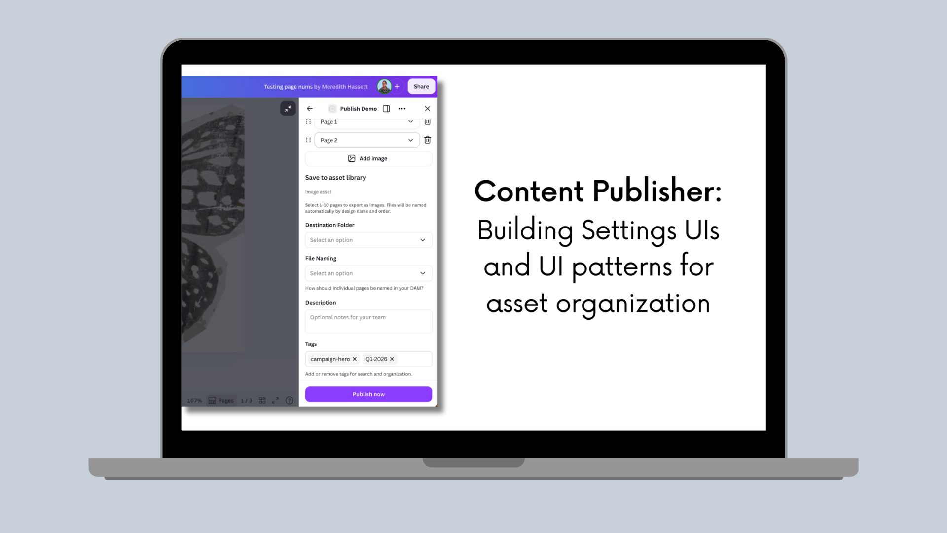
In Part 1, we explored how data flows through the Content Publisher intent and how to design publishRef structures for different types of DAM systems. Now it's time to bring those structures to life with intuitive user interfaces.
This post covers how to build Settings UIs that collect asset metadata from users and serialize it into publishRef, along with advanced patterns for searchable navigation, tag structure suggestions, and context-aware defaults.
Series Overview:
Part 1: Understanding data flow and structure for publishing
Part 2 (this post): Building Settings UIs and UI patterns for asset organization
Part 3: Complete implementation, Preview UIs, and backend integration
Building a Basic Settings UI
Here's a complete Settings UI that collects metadata and saves it to publishRef:
import { Rows, FormField, Select, TextInput } from "@canva/app-ui-kit";import { useState, useEffect } from "react";import type { RenderSettingsUiRequest } from "@canva/intents/content";interface AssetSettings {folder: string;category: string;tags: string[];}const SettingsUi = (request: RenderSettingsUiRequest) => {const { updatePublishSettings, invocationContext } = request;// Initialize from existing publishRef if availableconst initialSettings: AssetSettings = invocationContext.publishRef? JSON.parse(invocationContext.publishRef): { folder: '', category: '', tags: [] };const [settings, setSettings] = useState<AssetSettings>(initialSettings);// Save to publishRef whenever settings changeuseEffect(() => {const isValid = settings.folder && settings.category;updatePublishSettings({publishRef: JSON.stringify(settings),validityState: isValid ? 'valid' : 'invalid_missing_required_fields'});}, [settings, updatePublishSettings]);return (<Rows spacing="2u"><FormField label="Destination Folder" value={settings.folder}><Selectoptions={[{ label: 'Marketing/Q1-2024', value: '/marketing/q1-2024' },{ label: 'Brand Assets', value: '/brand' }]}onChange={(value) => setSettings(prev => ({ ...prev, folder: value }))}/></FormField><FormField label="Category" value={settings.category}><Selectoptions={[{ label: 'Marketing', value: 'marketing' },{ label: 'Social Media', value: 'social' }]}onChange={(value) => setSettings(prev => ({ ...prev, category: value }))}/></FormField><FormField label="Tags" value={settings.tags.join(', ')}><TextInputplaceholder="e.g., campaign, Q1"onChange={(value) =>setSettings(prev => ({...prev,tags: value.split(',').map(t => t.trim()).filter(Boolean)}))}/></FormField></Rows>);};
Key Points
- Initialize from publishRef: Restore previous settings from invocationContext.publishRef
- Serialize settings: JSON.stringify() before passing to updatePublishSettings
- Control publish button: Set validityState based on required fields
- Update continuously: Call updatePublishSettings whenever settings change
Page Selection for DAM Use Cases
For DAM systems, users often want to publish each page as a separate image asset. Here's how to configure and handle this.
Important: During Settings UI rendering, files haven't been exported yet, so you won't have access to contentMetadata (like design title or page numbers). You're just collecting user preferences for how to organize files. The actual contentMetadata becomes available later in publishContent() when files are ready.
Step 1: Configure Output Type for Multiple Files
In getPublishConfiguration(), allow multiple files to be selected:
async function getPublishConfiguration() {return {status: 'completed',outputTypes: [{id: 'individual_images',displayName: 'Individual Images',mediaSlots: [{id: 'images',displayName: 'Images',fileCount: { min: 1, max: 50 }, // Allow selecting 1-50 pagesaccepts: {image: { format: 'png' }}}]}]};}
What happens:
- Canva shows its page selector UI to users
- Users can select which specific pages to include
- Each selected page exports as a separate PNG file
When allowing multiple files to be selected, you can only select 1 file format per type. In this example, all images are being output as a PNG file. You could replace the format with jpg and all images would be output as a JPEG file.
Step 2: Add Naming Options in Settings UI
Let users choose how individual page files should be named:
interface DAMSettings {folder: string;category: string;namingPattern: string;prefix?: string;}export const SettingsUi = ({updatePublishSettings,}: RenderSettingsUiRequest) => {const [settings, setSettings] = useState<DAMSettings>({folder: '',category: '',namingPattern: 'page-number'});const setAndPropagateSettings = useCallback((updatedSettings: PublishSettings) => {setSettings(updatedSettings);updatePublishSettings({publishRef: JSON.stringify(updatedSettings),validityState: validatePublishRef(),});},[updatePublishSettings],);return (<Rows spacing="2u"><FormField label="Destination Folder"control={(props) => (<Selectstretch={true}options={[//dynamically populate from your source system]}value={settings.folder}onChange={(folder) => setAndPropagateSettings({ ...settings, folder })}/>)}/><FormFieldlabel="File Naming"description="How should individual pages be named in your DAM?"control={(props) => (<Selectstretch={true}options={[{label: 'Use page numbers',value: 'page-number',description: 'Design Title - Page 1, Page 2...'},{label: 'Sequential numbering',value: 'sequential',description: 'Design Title - 01, 02, 03...'},{label: 'Custom prefix',value: 'custom',description: 'Add your own prefix'}]}value={settings.namingPattern}onChange={(namingPattern) => setAndPropagateSettings({ ...settings, namingPattern })}/>)}/>{settings.namingPattern === 'custom' && (<FormField label="Filename Prefix"control={(props) => (<TextInputplaceholder="e.g., campaign-hero"value={settings.prefix || ''}onChange={(prefix) => setAndPropagateSettings({ ...settings, prefix })}/>)}/>)}</Rows>);};
During Settings UI rendering, you don't have access to contentMetadata yet (files aren't exported until publish). You're just collecting the naming pattern preference, which you'll apply later in publishContent().
Step 3: Process Each Page in publishContent
Use the naming pattern when uploading to your DAM:
async function publishContent(request: PublishContentRequest) {const settings = JSON.parse(request.publishRef || '{}') as DAMSettings;const files = request.outputMedia[0]?.files ?? [];console.log(`Publishing ${files.length} selected pages`);for (const file of files) {// Canva provides metadata about which page this file came fromconst canvaMetadata = file.contentMetadata;const pageInfo = canvaMetadata.pages[0];// Generate filename based on user's choicelet filename: string;switch (settings.namingPattern) {case 'page-number':filename = `${canvaMetadata.title} - Page ${pageInfo.pageNumber}.png`;break;case 'sequential':const paddedNum = String(pageInfo.pageNumber).padStart(2, '0');filename = `${canvaMetadata.title} - ${paddedNum}.png`;break;case 'custom':filename = `${settings.prefix}-${pageInfo.pageNumber}.png`;break;}// Upload each page as individual assetawait uploadToDAM({downloadUrl: file.url,folder: settings.folder,filename: filename,category: settings.category,metadata: {originalDesignTitle: canvaMetadata.title,pageNumber: pageInfo.pageNumber,totalPagesInDesign: canvaMetadata.pages.length,width: file.widthPx,height: file.heightPx}});}return {status: 'completed',externalUrl: `https://yourdam.com/folder/${encodeURIComponent(settings.folder)}`};}
Important Notes on Page Selection
✅ Canva handles page selection UI - You don't need to build a page picker. Users select pages through Canva's native UI before reaching your Settings UI.
✅ You receive selected pages as separate files - If a user selects pages 1, 3, and 5 from a 10-page design, you'll receive 3 files in outputMedia[].files[].
✅ Each file knows its source page - Use file.contentMetadata.pages[0].pageNumber to know which page each file came from.
✅ contentMetadata is only available in publishContent() - Files aren't exported until publish, so you can't access design title or page info in Settings UI.
✅ File count matches selection - If your media slot has fileCount: { min: 1, max: 50 }, users can select 1-50 pages.
When you have access to what data
Stage | publishRef | contentMetadata | Exported Files |
|---|---|---|---|
Settings UI | Read/Write | Not yet | Not yet |
Preview UI | Read only | Not yet | Not yet |
publishContent() | Read only | Available | Available |
Common Settings UI Patterns
Pattern 1: Searchable Folder Selection
For DAMs with nested, large, or complex folder structures, you can enable search in your folder selector.
<FormField label="Destination Folder"control={(props) => (<Selectstretch={true}searchable={{filterFn: (query, options) =>options.filter((opt) =>(opt.label ?? "").toLowerCase().includes(query.toLowerCase()),),inputPlaceholder: intl.formatMessage({defaultMessage: "Search folders…",description: "Placeholder for folder search input",}),}}options={[//populate with your DAMs folders]}value={settings.folder}onChange={(folder) => setAndPropagateSettings({ ...settings, folder })}/>)}/>
Pattern 2: Tag Pills
Using a Pill Input over a free Text Input can help users verify which tags they are applying while also enabling you to add defaults.
<FormFieldlabel={intl.formatMessage({defaultMessage: "Tags",description: "DAM: label for tags",})}description={intl.formatMessage({defaultMessage: "Add or remove tags for search and organization.",description: "DAM: tags help",})}control={(props) => {const pills = tagsToPills(settings.tags ?? "");return (<PillsInputariaLabel={intl.formatMessage({defaultMessage: "Tags",description: "DAM: tags aria label",})}value={pills.map((pill, index) => ({...pill,onRemoveClick: () => {const next = pills.filter((_, i) => i !== index);setAndPropagateSettings({...settings,tags: pillsToTags(next),});},}))}inputValue={tagInputValue}onInputChange={setTagInputValue}onPillAdd={(value) => {const trimmed = value.trim();if (!trimmed) return;const next = [...pills, { value: trimmed }];setAndPropagateSettings({...settings,tags: pillsToTags(next),});setTagInputValue("");}}onLastPillRemove={() => {if (pills.length === 0) return;const next = pills.slice(0, -1);setAndPropagateSettings({...settings,tags: pillsToTags(next),});}}placeholder={intl.formatMessage({defaultMessage: "Add a tag…",description: "DAM: tags input placeholder",})}/>);}}/>
Pattern 3: Custom Fields
If your DAM or external system requires any specific metadata, you can add additional fields and settings in your PublishSettings and enable users to enter all required information or use preset defaults. Make sure to update your validity check to confirm everything is filled in.
export const SettingsUi = ({updatePublishSettings,}: RenderSettingsUiRequest) => {const [fieldValues, setFieldValues] = useState<Record<string, any>>({});return (<Rows spacing="2u"><FormField label="Copyright"control={(props) => {<TextInputvalue={fieldValues.copyright || ''}onChange={(value) => {const updated = { ...fieldValues, copyright: value };setFieldValues(updated);request.updatePublishSettings({publishRef: JSON.stringify({ customFields: updated }),validityState: 'valid'});}}/>})/><FormField label="Usage Rights"control={(props) => {<Selectvalue={fieldValues.usageRights || ''}options={[{ label: 'Internal Only', value: 'internal' },{ label: 'External Approved', value: 'external' }]}onChange={(value) => {const updated = { ...fieldValues, usageRights: value };setFieldValues(updated);request.updatePublishSettings({publishRef: JSON.stringify({ customFields: updated }),validityState: 'valid'});}}/>})/></Rows>);};
Pattern 4: Validating Settings
Control when the publish button is enabled:
function validateSettings(settings: AssetSettings): boolean {// Check required fieldsif (!settings.folder || !settings.category) return false;// Check business rulesif (settings.tags.length > 10) return false;// Check size limitif (JSON.stringify(settings).length > 32000) return false;return true;}// In Settings UIuseEffect(() => {const isValid = validateSettings(settings);request.updatePublishSettings({publishRef: JSON.stringify(settings),validityState: isValid ? 'valid' : 'invalid_missing_required_fields'});}, [settings]);
Understanding validityState
'valid': All required fields filled, publish button enabled'invalid_missing_required_fields': Required fields missing, button disabled'invalid_authentication_required': User needs to authenticate first
Responding to Context Changes
If your app needs to publish multiple formats (such as "Video and Image" or "Image and Email"), you can define multiple output types and render different settings UI based on the needs for each format.
As a reminder: only one file type is allowed per media slot, and you can only publish one output type at a time.
Add a listener for output type changes to adapt your UI accordingly.
const SettingsUi = (request: RenderSettingsUiRequest) => {const [currentOutputType, setCurrentOutputType] = useState(request.invocationContext.outputType);useEffect(() => {const disposer = request.registerOnContextChange({onContextChange: (context) => {if (context.reason === 'publish_settings') {setCurrentOutputType(context.outputType);// Adapt UI based on new output type}if (context.reason === 'publish_error') {// Show error from failed publishshowError(context.error);}}});return disposer; // Cleanup}, []);return (<Rows spacing="2u"><Text>Publishing as: {currentOutputType?.displayName}</Text>{/* Your settings fields */}</Rows>);};
Best Practices
-
Initialize from
publishRefconst initial = invocationContext.publishRef? JSON.parse(invocationContext.publishRef): defaultSettings;TSX -
Validate continuously
const isValid = settings.folder && settings.category;updatePublishSettings({publishRef: JSON.stringify(settings),validityState: isValid ? 'valid' : 'invalid_missing_required_fields'});TSX -
Keep
publishRefsmall// ❌ Don't store large data{ folder: '/path', fullDesignData: '...' }// ✅ Store only what you need{ folder: '/path', category: 'marketing', tags: ['campaign'] }TSX -
Handle Page Selection
Let Canva handle the page picker UI. You just need to:
- Define a min, max, or exact
fileCountin your publish configuration- Process each file in
publishContent() - Use
contentMetadata.pagesto know which page each file came from
- Process each file in
What's Next
In Part 3, we'll complete the implementation:
- Setting up the full Content Publisher intent
- Building Preview UIs that show selected pages
- Implementing
publishContent()with real upload logic - Error handling and success responses