Content Publisher Intent
Meet the Content Publisher Intent - Part 3
Complete implementation, Preview UIs, and publishing
In Part 1, we explored how data flows through Content Publisher and designed publishRef structures. In Part 2, we built Settings UIs to collect that data. Now we'll complete the implementation by bringing it all together in publishContent().
This is where your custom settings (publishRef) combine with Canva's design metadata (contentMetadata) to upload assets to your DAM.
Series Overview:
Part 1: Understanding data flow and structure for publishing
Part 2: Building Settings UIs and UI patterns for asset organization
Part 3 (this post): Complete implementation, Preview UIs, and publishing
Complete content publisher setup
Here's the full implementation of a Content Publisher intent:
// src/intents/content_publisher/index.tsximport { prepareContentPublisher } from "@canva/intents/content";import type { ContentPublisherIntent } from "@canva/intents/content";import { createRoot } from "react-dom/client";import { AppUiProvider } from "@canva/app-ui-kit";import { SettingsUI } from "./settings_ui";import { PreviewUI } from "./preview_ui";const contentPublisher: ContentPublisherIntent = {// Step 1: Define what file formats your DAM acceptsgetPublishConfiguration: async () => {return {status: 'completed',outputTypes: [{id: 'individual_images',displayName: 'Individual Images',mediaSlots: [{id: 'images',displayName: 'Images',fileCount: { min: 1, max: 10 }, // Max 10 files per publishaccepts: {image: { format: 'png' }}}]}]};},// Step 2: Render Settings UI to collect publishRef datarenderSettingsUi: (request) => {const root = createRoot(document.getElementById("root") as Element);root.render(<AppUiProvider><SettingsUI request={request} /></AppUiProvider>);},// Step 3: Render Preview UIrenderPreviewUi: (request) => {const root = createRoot(document.getElementById("root") as Element);root.render(<AppUiProvider><PreviewUI request={request} /></AppUiProvider>);},// Step 4: Publish to your DAMpublishContent: async (request) => {return await handlePublish(request);}};prepareContentPublisher(contentPublisher);
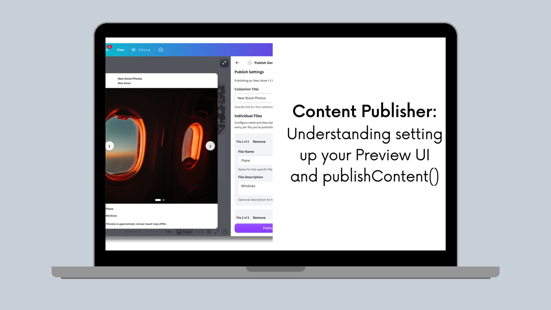
Building the Preview UI
The Preview UI is where users confirm their settings before publishing. It's more nuanced than it appears - you need to consider viewport constraints, different content types, and how your preview adapts to both popped-in and popped-out states.
Understanding preview UI constraints
Popped-in vs Popped-out:
- Popped-in (side panel): Narrow viewport (~360-400 px), limited vertical space, preview sits alongside the design
- Popped-out (full screen): More space available, preview can be larger and more detailed
Your preview must work in both contexts. Users can toggle between them, so design responsively.
Basic Preview UI structure
// src/intents/content_publisher/preview_ui.tsximport {Rows,Text,Badge,Title,Grid,Box,Alert,ProgressBar,Placeholder,LoadingIndicator} from "@canva/app-ui-kit";import type { RenderPreviewUiRequest, PreviewMedia } from "@canva/intents/content";import { useState, useEffect } from "react";export const PreviewUI: React.FC<{ request: RenderPreviewUiRequest }> = ({ request }) => {const { invocationContext, registerOnPreviewChange } = request;// Get initial dataconst [state, setState] = useState({previewMedia: invocationContext.previewMedia || [],settings: invocationContext.publishRef? JSON.parse(invocationContext.publishRef): {},outputType: invocationContext.outputType});// Listen for preview updates (user changes design or settings)useEffect(() => {const disposer = registerOnPreviewChange(({ previewMedia, publishRef, outputType }) => {setState({previewMedia,settings: publishRef ? JSON.parse(publishRef) : {},outputType});});return disposer;}, [registerOnPreviewChange]);return (<Rows spacing="2u">{/* Show metadata from publishRef */}<MetadataSummary settings={state.settings} />{/* Show preview content - adapt based on output type */}<PreviewContentpreviewMedia={state.previewMedia}outputType={state.outputType}settings={state.settings}/></Rows>);};
Adapting previews by content type
Different content types benefit from different preview treatments. Here's the pattern:
const PreviewContent: React.FC<{previewMedia: PreviewMedia[];outputType: OutputType | undefined;settings: any;}> = ({ previewMedia, outputType, settings }) => {// Social media - show in a platform-specific frame (Instagram feed, Twitter card, etc.)if (outputType?.id.includes('instagram') || outputType?.id.includes('social')) {return <SocialMediaPreview previews={previewMedia} settings={settings} />;}// Email - show in email client mockup, consider mobile/desktop toggleif (outputType?.id.includes('email')) {return <EmailPreview previews={previewMedia} settings={settings} />;}// Documents - show first page thumbnail with page countif (outputType?.id.includes('pdf') || outputType?.id.includes('document')) {return <DocumentPreview previews={previewMedia} settings={settings} />;}// DAM assets - show grid of all selected pagesif (outputType?.id === 'individual_images') {return <AssetGridPreview previews={previewMedia} settings={settings} />;}// Default - show previews in a simple gridreturn <GenericPreview previews={previewMedia} />;};
Build the specific preview component based on your use case, following the considerations listed above.
Things to consider when building your Preview UI
-
Does your content render differently on mobile vs desktop?
- Examples: emails, web pages, newsletters
- Solution: Add a device toggle (mobile/desktop) in your preview UI
- This is for previewing how your content will look on different devices, not for controlling the Canva panel (mobile users only see minified preview)
-
Is your output a multi-page document?
- Examples: PDFs, presentations
- Solution: Show first page thumbnail with clear indication "Preview shows first page only"
- Include page count information from preview metadata
-
Are you publishing multiple individual assets?
- Examples: DAM uploads, multi-page designs as separate images (max 10 files)
- Solution: Show grid of thumbnails, adapt columns based on viewport width
- Narrow panel (< 400 px): Stack vertically or 1 column
- Medium (400-700 px): 2 columns
- Popped-out (> 700 px): 2-3 columns depending on item count
-
Does your platform have a recognizable visual style?
- Examples: social media posts, email clients
- Solution: Wrap preview in a mock frame that represents your platform (Instagram feed, email client, and so on)
- Keep it simple - just enough to be recognizable, not pixel-perfect
-
Do you need to show user-configured settings alongside the preview?
- Examples: captions, hashtags, publishing schedules, destination folders
- Solution: Display settings from
publishRefin a summary box near the preview - Use
<Badge>for tags,<Text tone="tertiary">for labels
-
Will your previews take time to generate?
- For images: Use
<Placeholder>component while loading - For videos: Use
<ProgressBar>(not circle spinner) - For documents: Use
<Placeholder>for first page - Always handle error states with
<Alert tone="critical">
- For images: Use
-
Does your viewport matter?
- Test in both popped-in panel (~ 350-400 px) and popped-out (> 700 px)
- Adapt layout: fewer items, smaller text, 1-2 columns in narrow panel
- Use responsive grid that adjusts to viewport width
-
Are you working with videos?
- Start with thumbnails (
status: 'thumbnail') - Show play button overlay
- Only upgrade to full video on user click using
requestPreviewUpgrade() - During upgrade (
status: 'upgrading'), show<ProgressBar>over thumbnail
- Start with thumbnails (
Examples of handling different preview states
Previews go through multiple states. Handle each properly according to Canva's guidelines:
import {LoadingIndicator,ProgressBar,Alert,Placeholder,Box,Rows,Text} from "@canva/app-ui-kit";const PreviewThumbnail: React.FC<{ preview: any }> = ({ preview }) => {// Loading state - different for videos vs imagesif (preview.status === 'loading') {// Videos use ProgressBar (not circle spinner - they take longer to load)if (preview.kind === 'video') {return (<Boxpadding="2u"background="neutralSubtle"borderRadius="medium"><Rows spacing="1u"><ProgressBar /><Text size="small" align="center" tone="tertiary">Generating video preview...</Text></Rows></Box>);}// Images use Placeholder componentif (preview.kind === 'image') {return (<Placeholdershape="rectangle"aspectRatio={1}borderRadius="medium"/>);}// Documents use Placeholderif (preview.kind === 'document') {return (<Placeholdershape="rectangle"aspectRatio={8.5/11} // Letter sizeborderRadius="medium"/>);}}// Error state - use Alert component (not spinner)if (preview.status === 'error') {return (<Alert tone="critical"><Text size="small">Preview generation failed: {preview.message}</Text></Alert>);}// Image ready - show the previewif (preview.kind === 'image' && preview.status === 'ready') {return (<Box border="control" borderRadius="medium" overflow="hidden"><imgsrc={preview.url}alt="Preview"style={{ width: '100%', height: 'auto', display: 'block' }}/><Box padding="1u" background="neutralSubtle"><Text size="small">{preview.widthPx} × {preview.heightPx}px</Text></Box></Box>);}// Video thumbnail - show play indicatorif (preview.kind === 'video' && preview.status === 'thumbnail') {return (<Box position="relative" borderRadius="medium" overflow="hidden"><imgsrc={preview.thumbnailUrl}style={{ width: '100%', height: 'auto' }}/>{/* Play icon overlay */}<Boxposition="absolute"style={{top: '50%',left: '50%',transform: 'translate(-50%, -50%)',background: 'rgba(0,0,0,0.6)',borderRadius: '50%',padding: '8px'}}><PlayIcon color="white" /></Box>{preview.durationMs && (<Boxposition="absolute"style={{ bottom: '8px', right: '8px' }}padding="0.5u"background="rgba(0,0,0,0.8)"borderRadius="small"><Text size="small" style={{ color: 'white' }}>{formatDuration(preview.durationMs)}</Text></Box>)}</Box>);}// Document thumbnailif (preview.kind === 'document' && preview.status === 'thumbnail') {return (<Box border="control" borderRadius="medium" overflow="hidden"><imgsrc={preview.thumbnailUrl}alt="Document preview"style={{ width: '100%', height: 'auto' }}/><Box padding="1u" background="neutralSubtle"><Text size="small">First page • {preview.widthPx} × {preview.heightPx}px</Text></Box></Box>);}return null;};function formatDuration(ms: number): string {const seconds = Math.floor(ms / 1000);const mins = Math.floor(seconds / 60);const secs = seconds % 60;return `${mins}:${String(secs).padStart(2, '0')}`;}
Showing settings summary
Display the settings user configured, keeping it concise for narrow panels:
const MetadataSummary: React.FC<{ settings: any }> = ({ settings }) => {if (!settings || Object.keys(settings).length === 0) return null;return (<Box padding="2u" background="feedbackInfoSubtle" borderRadius="medium"><Rows spacing="1u"><Text variant="bold" size="small">Publish Settings</Text><Text size="small">{settings.folder} • {settings.category}</Text>{settings.tags?.length > 0 && (<Rows spacing="0.5u" direction="horizontal">{settings.tags.map((tag: string) => (<Badge key={tag} size="small">{tag}</Badge>))}</Rows>)}</Rows></Box>);};
Video preview optimization
Videos should start as thumbnails and upgrade on demand:
const VideoPreview: React.FC<{preview: any;requestPreviewUpgrade: (ids: string[]) => void;}> = ({ preview, requestPreviewUpgrade }) => {const handleClick = () => {if (preview.status === 'thumbnail') {requestPreviewUpgrade([preview.id]);}};return (<Box onClick={handleClick} style={{ cursor: 'pointer' }}>{preview.status === 'thumbnail' && (<Box position="relative"><img src={preview.thumbnailUrl} style={{ width: '100%' }} /><PlayButton /> {/* Overlay to indicate it's clickable */}</Box>)}{preview.status === 'upgrading' && (<Box position="relative"><img src={preview.thumbnailUrl} style={{ width: '100%', opacity: 0.7 }} /><Box position="absolute" style={{ bottom: 0, left: 0, right: 0 }} padding="1u"><ProgressBar /></Box></Box>)}{preview.status === 'ready' && (<video src={preview.url} poster={preview.thumbnailUrl} controls style={{ width: '100%' }} />)}</Box>);};
Preview UI limitations
Files aren't exported yet during preview, so you can't access contentMetadata. Use publishRef settings instead.
// ❌ WRONG - contentMetadata not availableconst PreviewUI = () => {const title = file.contentMetadata.title; // ERROR!};// ✅ CORRECT - use publishRef settingsconst PreviewUI: React.FC<{ request: RenderPreviewUiRequest }> = ({ request }) => {const settings = request.invocationContext.publishRef? JSON.parse(request.invocationContext.publishRef): {};return <Text>Publishing to: {settings.folder}</Text>;};
Previews are read-only
Don't add interactive controls - preview is for viewing only:
- ❌ Wrong: Edit buttons, text inputs, settings controls in preview
- ✅ Correct: Static display of content and settings
Must handle all states
Every preview must handle all potential states: loading, thumbnail (videos/docs), upgrading (videos), ready, error
- Use
<Placeholder>for image loading - Use
<ProgressBar>for video loading/upgrading - Use
<Alert tone="critical">for errors
Real-time updates required
Use registerOnPreviewChange to update when user changes settings in Settings UI.
Preview UI checklist
Before shipping, verify your preview:
- Works in narrow popped-in panel (< 400 px width, Canva's ~350 px panel)
- Works in wide popped-out view (> 700 px width)
- Handles 1 preview (single page/file)
- Handles up to 10 previews (if you enable multi-page selection)
- Shows all relevant settings from
publishRef - Uses
ProgressBarfor video loading states (not circle spinner) - Uses
Placeholdercomponent for image loading states - Uses
Alertcomponent for error states (not custom error boxes) - Handles upgrading state for videos (shows progress bar)
- Updates in real-time using
registerOnPreviewChange - Doesn't try to access
contentMetadata(not available) - Communicates that preview is approximate
- Starts videos as thumbnails (upgrade on demand using requestPreviewUpgrade)
- Works on mobile devices
- Provides mobile/desktop toggle for emails/docs (if content renders differently)
- Uses appropriate frame for content type (social/email/document)
- No nested scrollbars - avoid overflow: auto inside preview containers
- Uses App UI Kit components (
Text,Title,Badge,Box, and so on) - Transparent background on preview container
Implementing publishContent()
This is where everything comes together. You have access to both your custom settings and Canva's metadata:
import type {PublishContentRequest,PublishContentResponse} from "@canva/intents/content";interface DAMSettings {folder: string;category: string;tags: string[];namingPattern: 'page-number' | 'sequential';}async function publishContent(request: PublishContentRequest): Promise<PublishContentResponse> {// Parse your settings from Settings UIconst settings = request.publishRef? JSON.parse(request.publishRef) as DAMSettings: null;if (!settings) {return {status: 'app_error',message: 'No publish settings found'};}// Get the exported filesconst mediaSlot = request.outputMedia[0];const files = mediaSlot?.files ?? [];if (files.length === 0) {return {status: 'app_error',message: 'No files to publish'};}try {const uploadedAssets = [];// Process each filefor (const file of files) {// NOW you have access to contentMetadataconst canvaMetadata = file.contentMetadata;const pageInfo = canvaMetadata.pages[0];// Generate filename using settings + contentMetadataconst filename = generateFilename(canvaMetadata.title,pageInfo.pageNumber,settings.namingPattern);// Upload to your DAMconst assetId = await uploadToDAM({// File URL to download from CanvadownloadUrl: file.url,// From your publishRef settingsfolder: settings.folder,category: settings.category,tags: settings.tags,// From Canva's contentMetadataoriginalDesignTitle: canvaMetadata.title,designToken: canvaMetadata.designToken,pageNumber: pageInfo.pageNumber,// From the file itselffilename: filename,width: file.widthPx,height: file.heightPx,format: file.format,mimeType: `image/${file.format}`});uploadedAssets.push(assetId);}// Return successreturn {status: 'completed',externalId: uploadedAssets[0], // First asset IDexternalUrl: `https://yourdam.com/folder/${encodeURIComponent(settings.folder)}`,postPublishAction: {type: 'redirect',url: `https://yourdam.com/folder/${encodeURIComponent(settings.folder)}`}};} catch (error) {console.error('Publish failed:', error);return {status: 'remote_request_failed'};}}function generateFilename(designTitle: string | undefined,pageNumber: number,namingPattern: string): string {const title = designTitle || 'Design';switch (namingPattern) {case 'sequential':return `${title}-${String(pageNumber).padStart(2, '0')}.png`;case 'page-number':default:return `${title}-Page-${pageNumber}.png`;}}async function uploadToDAM(params: {downloadUrl: string;folder: string;filename: string;category: string;tags: string[];originalDesignTitle?: string;designToken?: string;pageNumber?: number;width: number;height: number;format: string;mimeType: string;}): Promise<string> {// Send to your backendconst response = await fetch(`${BACKEND_URL}/api/upload`, {method: 'POST',headers: {'Content-Type': 'application/json','Authorization': `Bearer ${await getAuthToken()}`},body: JSON.stringify(params)});if (!response.ok) {throw new Error(`Upload failed: ${response.status}`);}const result = await response.json();return result.assetId;}
Understanding the file structure
Here's what you receive in publishContent():
Single page design
User publishes a 1-page design:
request.outputMedia = [{mediaSlotId: 'images',files: [{format: 'png',url: 'https://export.canva.com/.../page1.png',widthPx: 1080,heightPx: 1080,contentMetadata: {type: 'design',designToken: 'eyJhbGc...',title: 'Product Launch Hero',pages: [{ pageId: 'abc123', pageNumber: 1 }]}}]}];
Multi-page design (selected pages)
User selects pages 1, 3, and 5 from a 10-page design:
request.outputMedia = [{mediaSlotId: 'images',files: [{format: 'png',url: 'https://export.canva.com/.../page1.png',widthPx: 1080,heightPx: 1920,contentMetadata: {type: 'design',designToken: 'eyJhbGc...',title: 'Social Media Campaign',pages: [{ pageId: 'page1', pageNumber: 1 }]}},{format: 'png',url: 'https://export.canva.com/.../page3.png',widthPx: 1080,heightPx: 1920,contentMetadata: {type: 'design',designToken: 'eyJhbGc...',title: 'Social Media Campaign',pages: [{ pageId: 'page3', pageNumber: 3 }]}},{format: 'png',url: 'https://export.canva.com/.../page5.png',widthPx: 1080,heightPx: 1920,contentMetadata: {type: 'design',designToken: 'eyJhbGc...',title: 'Social Media Campaign',pages: [{ pageId: 'page5', pageNumber: 5 }]}}]}];
Key observations:
- You get 3 files (one per selected page)
- Each file has its own
contentMetadatawith the correctpageNumber - All files share the same
designTokenandtitle(they're from the same design) - The
urlis different for each file
Combining publishRef with contentMetadata
Here's a complete example showing how to use both data sources:
async function publishContent(request: PublishContentRequest): Promise<PublishContentResponse> {// your custom settings from Settings UIconst customSettings = request.publishRef? JSON.parse(request.publishRef): {};const files = request.outputMedia[0]?.files ?? [];if (files.length === 0) {return {status: 'app_error',message: 'No files to publish'};}try {const uploadResults = [];for (const file of files) {// Canva's metadata about the source designconst canvaMetadata = file.contentMetadata;const pageInfo = canvaMetadata.pages[0];// Combine both sources of dataconst uploadParams = {// Download URL for the exported file (CRITICAL: download immediately!)downloadUrl: file.url,// From your publishRef (Settings UI)destinationFolder: customSettings.folder,category: customSettings.category,tags: customSettings.tags,namingPattern: customSettings.namingPattern,// From Canva's contentMetadata (automatic)originalDesignTitle: canvaMetadata.title,designToken: canvaMetadata.designToken,pageNumber: pageInfo.pageNumber,pageId: pageInfo.pageId,// From the file object itselfwidth: file.widthPx,height: file.heightPx,format: file.format};const result = await uploadToYourDAM(uploadParams);uploadResults.push(result);}return {status: 'completed',externalId: uploadResults[0]?.assetId,externalUrl: `https://yourdam.com/folder/${customSettings.folder}`,postPublishAction: {type: 'redirect',url: `https://yourdam.com/folder/${customSettings.folder}`}};} catch (error) {console.error('Publication failed:', error);return {status: 'remote_request_failed'};}}
What your backend receives
When you call your backend API from publishContent(), structure the data to include everything your DAM needs:
// POST /api/upload{"downloadUrl": "https://export.canva.com/.../page1.png",// From publishRef (user's choices)"destinationFolder": "/Marketing/Q1-2024","category": "social","tags": ["campaign", "instagram", "product-launch"],"namingPattern": "sequential",// From contentMetadata (Canva's info)"originalDesignTitle": "Product Launch Hero","designToken": "eyJhbGciOiJIUzI1NiIs...","pageNumber": 1,"pageId": "abc123",// From file object"width": 1080,"height": 1080,"format": "png"}
Download assets immediately
The downloadUrl is temporary and will expire. Your backend must download files immediately when publishContent() is called, or you will lose access to them.
// In your backend (e.g., Express.js)app.post('/api/upload', async (req, res) => {const { downloadUrl, destinationFolder, category, tags, ...metadata } = req.body;try {// Download from Canva IMMEDIATELYconst response = await fetch(downloadUrl);if (!response.ok) {throw new Error(`Download failed: ${response.status}`);}const fileBuffer = await response.arrayBuffer();// Store in your DAM systemconst assetId = await yourDAM.storeAsset({file: Buffer.from(fileBuffer),folder: destinationFolder,category: category,tags: tags,metadata: metadata});res.json({success: true,assetId: assetId,viewUrl: `https://yourdam.com/assets/${assetId}`});} catch (error) {res.status(500).json({success: false,error: error.message});}});
Error handling
Return appropriate errors based on what went wrong:
async function publishContent(request: PublishContentRequest): Promise<PublishContentResponse> {const settings = request.publishRef? JSON.parse(request.publishRef): null;// Validation errorif (!settings || !settings.folder) {return {status: 'app_error',message: 'Missing required settings',localizedMessageId: 'error_missing_folder' // References your translation file};}const files = request.outputMedia[0]?.files ?? [];if (files.length === 0) {return {status: 'app_error',message: 'No files to publish'};}try {// Attempt uploadawait uploadToDAM(files, settings);return {status: 'completed',externalUrl: `https://yourdam.com/folder/${settings.folder}`};} catch (error) {console.error('Upload error:', error);// Network/API errorif (error.message.includes('network') || error.message.includes('timeout')) {return {status: 'remote_request_failed'};}// Custom app error with user-facing messagereturn {status: 'app_error',message: error.message,localizedMessageId: 'error_upload_failed'};}}
Error types
remote_request_failed: Use for network/API errors
return { status: 'remote_request_failed' };
app_error: Use for validation or business logic errors
return {status: 'app_error',message: 'User quota exceeded', // For logging (not shown to user)localizedMessageId: 'error_quota_exceeded' // Shown to user from translation file};
Testing your implementation
Here are some scenarios you should consider testing depending on the settings you have for your publish experience:
-
Single page design
- Verify 1 file in outputMedia[].files
- Check contentMetadata.pages has 1 page
-
Multi-page with all pages selected
- Verify files.length equals total pages
- Check each file has correct pageNumber
-
Multi-page with selective pages
- Select pages 1, 3, 5
- Verify you get exactly 3 files
- Check page numbers are 1, 3, 5 (not 1, 2, 3)
-
Empty publishRef
- Test when user clicks publish without changing settings
- Should handle gracefully
-
Large multi-page design
- Test with a full 10 page design publish
- Verify all uploads complete successfully
Key takeaways
publishRefflows through all stages - Created in Settings UI, available in Preview UI andpublishContent().contentMetadataonly inpublishContent()- Files aren't exported until publish, so metadata isn't available earlier- Combine both data sources - Use publishRef for user choices, contentMetadata for design context
- Download URLs are temporary - Your backend must download files immediately
- Page selection is automatic - Configure
fileCountin media slots, Canva handles the UI
Conclusion
You now have a more thorough understanding of implementing Content Publisher for asset management:
- Part 1 explained the data flow and publishRef design
- Part 2 showed how to build Settings UIs
- Part 3 completed the implementation with publishContent()
The Content Publisher intent provides a clean separation of concerns:
- Canva handles export processing, page selection, and file delivery
- You focus on collecting the right metadata and integrating with your DAM